

Orange County Web + Brand Design
Brand Identity + Video
Sedona Wellness Retreat
01. Behind the Brand
the WELL is a sanctuary imagined for those seeking stillness in a world that never pauses. Rooted in the red clay calm of Sedona, it embodies renewal, balance, and quiet transformation. Each element [sound, scent, light, and word] invites you to come home to yourself. the WELL isn’t simply a retreat; it’s a return.

02. Behind the Design
-
As a conceptual wellness brand, the WELL needed more than a logo, it needed an atmosphere. The goal was to translate serenity into a tangible identity system that could hold space for reflection while feeling intentional and modern. Without a cohesive brand presence, the concept risked blending into the growing field of wellness retreats instead of standing out as a destination for soulful transformation.
-
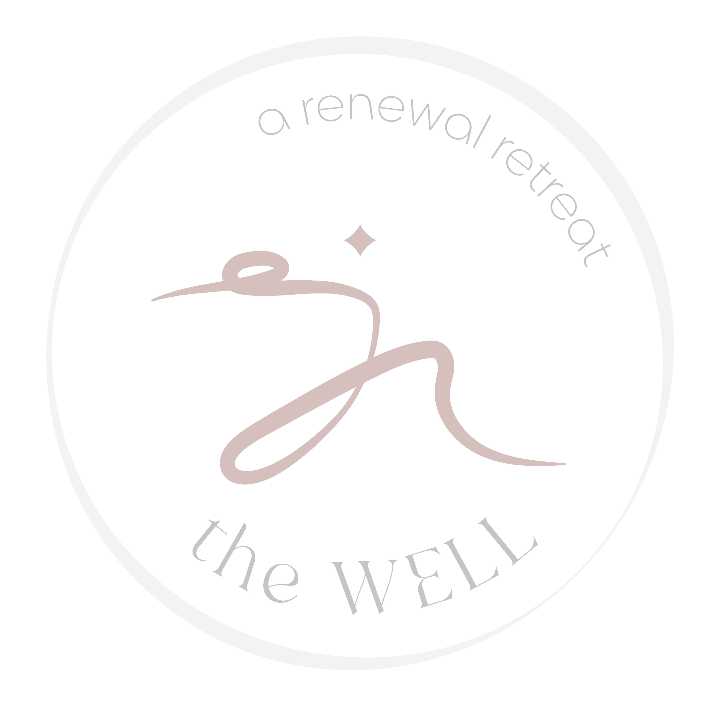
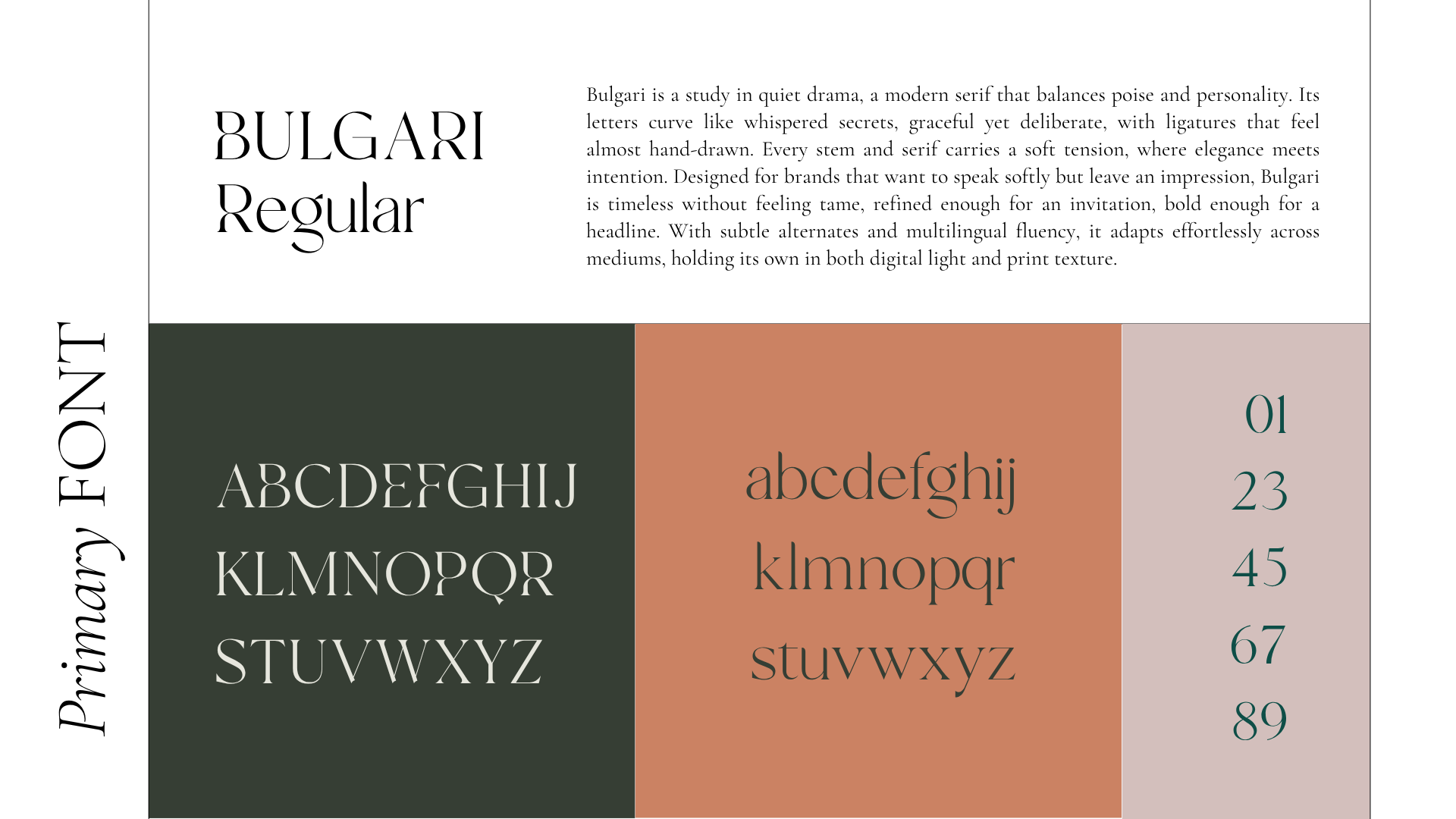
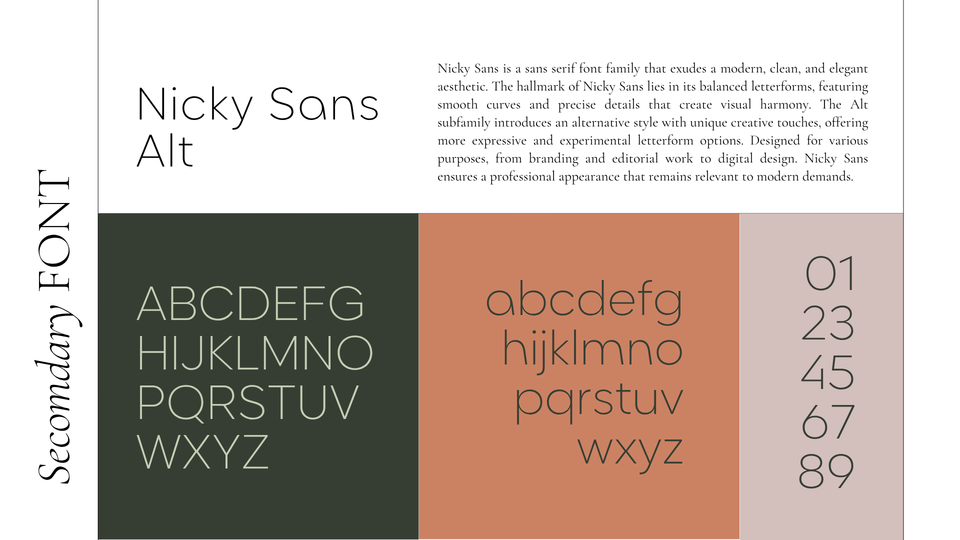
We approached the design as an ecosystem of calm. The branding suite was anchored by refined typography [timeless, yet softened by organic spacing] and a color palette inspired by natural minerals and sunrise tones. The logo became a symbolic vessel: circular, grounded, and fluid.
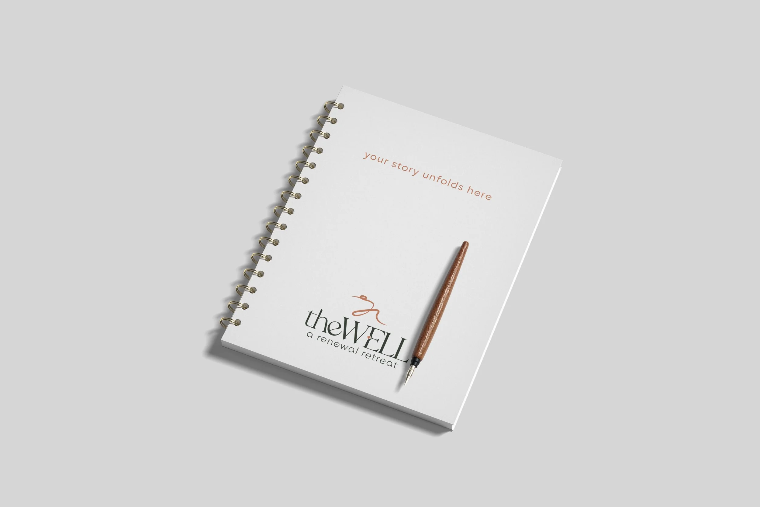
A poetic print brochure guided potential guests through the sensory experience, while a promotional video captured the essence of Sedona’s desert light and the gentle ritual of arrival. Product packaging for the welcome kit extended the experience beyond the retreat itself, turning each item into a tactile reminder of balance and belonging. -
The project drew from the language of nature: sandstone horizons, rippling water, the hush of morning air. Visually, it married minimalist design with cinematic intimacy: vintage textures, soft gradients, and the tactile calm of matte paper and linen. The creative direction balanced stillness and transformation, translating the meditative spirit of Sedona into a cohesive brand narrative that feels as restorative as it looks.
-
Comprehensive Branding Suite (logo, palette, typography system)
Print Brochure Design
Promotional Video + Vertical Cut for Social Media
Product Packaging for Welcome Kit

03. the Color Palette
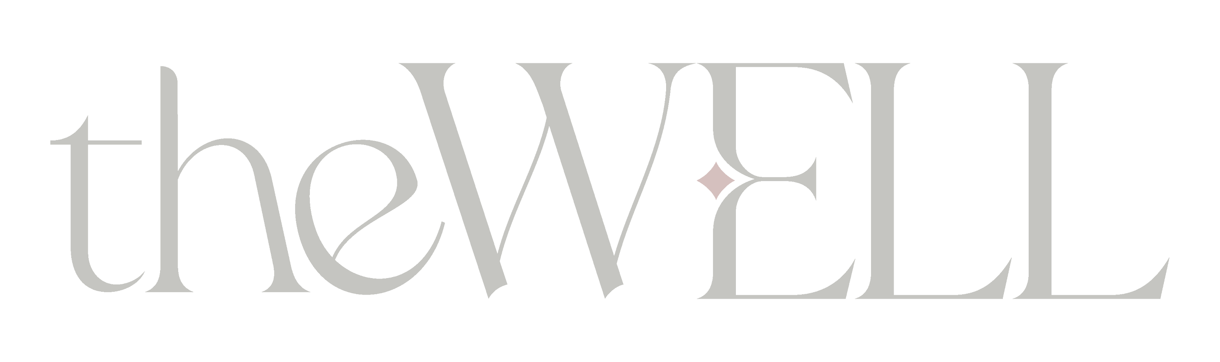
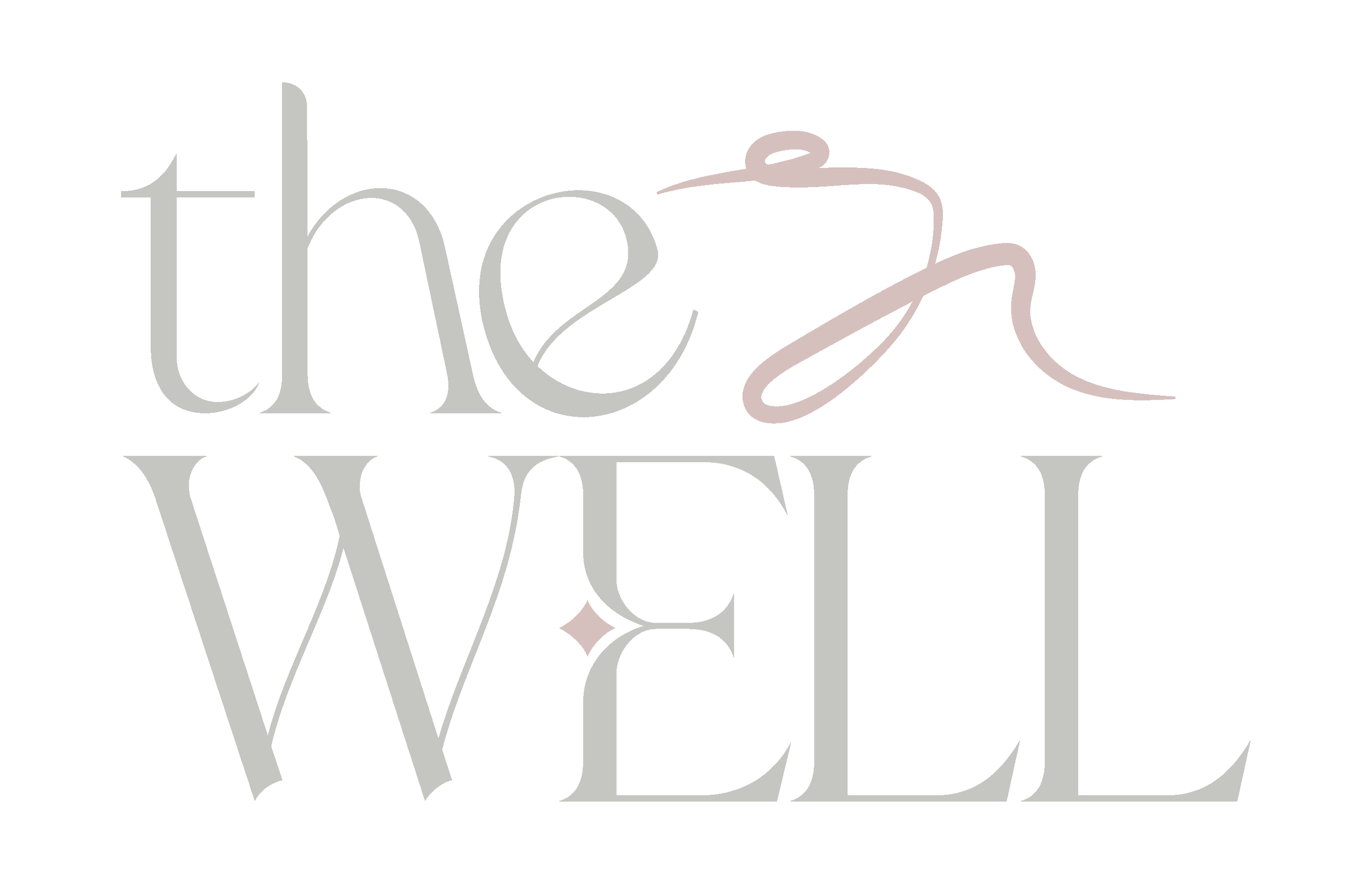
04. the Logos


05. the Typography


STAY a WHILE.
…or START something NEW.
You can dive into the work we might create together, or wander through the words and ideas that shape it.
