Dr. Betsy Chung, Therapist Branding + Squarespace Website
TL;DR: Betsy had spent years wanting a better website, but what she really needed was a brand that finally caught up with the therapist she had already become. I reworked everything from strategy and messaging to her visual identity, headshots, and Squarespace site, so the whole thing finally felt cohesive, confident, and very, very Betsy.
Rebranding a Seasoned Therapy Practice Without Sanding Away the Personality
Brand Strategy + Visual Identity · Messaging · Headshot Photography · Squarespace Web Design · Print DesignBy the time Betsy reached out, she wasn’t trying to figure out who she was as a therapist. She already knew.
She had years of experience, a deeply established approach to her work, and a clear sense of how she wanted clients to feel with her. What she didn’t have was a brand or website that communicated any of that.
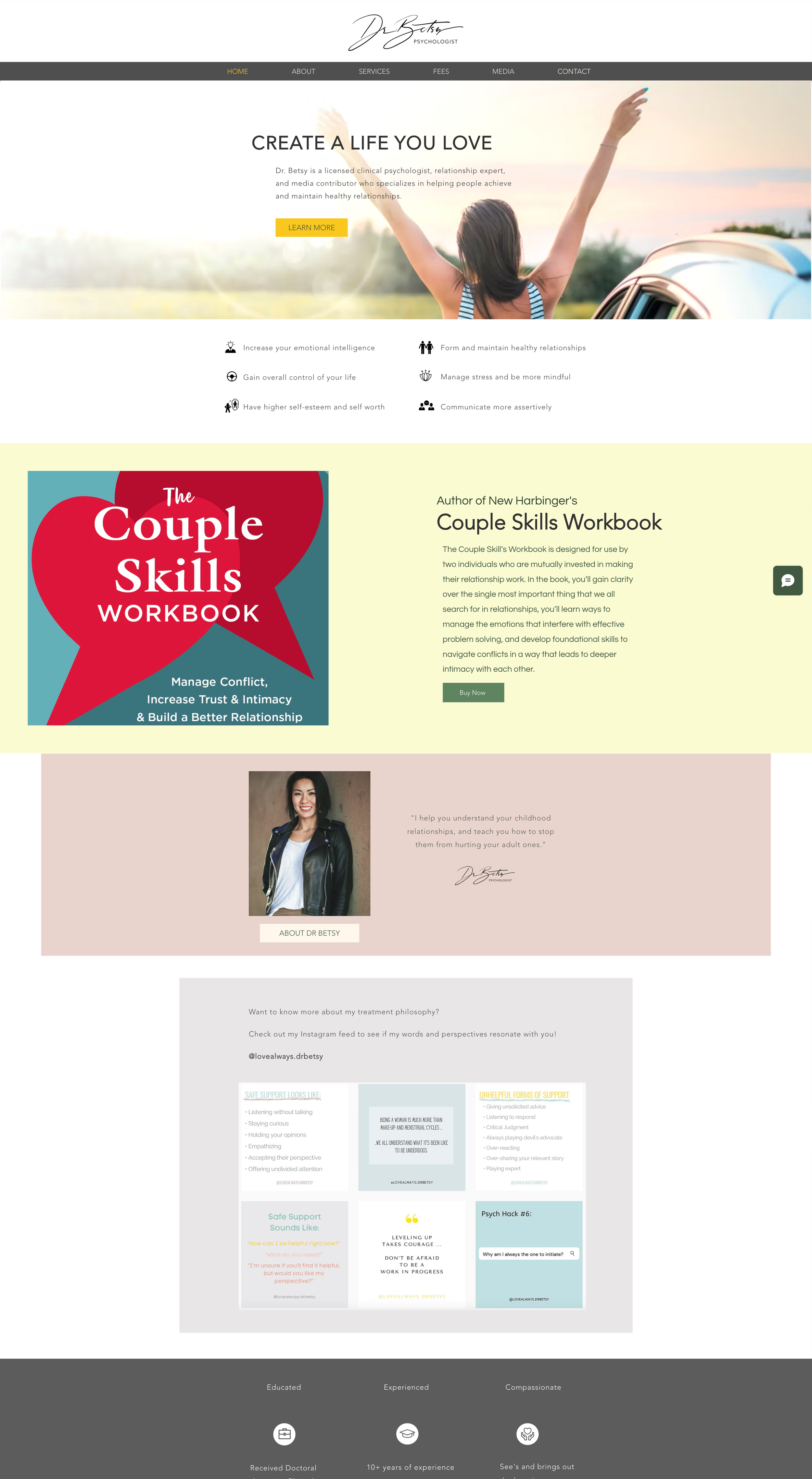
Her existing Wix site and visual identity had become a mix of different colors, styles, and pieces added over time. Nothing was wildly broken, exactly. It just didn’t feel like the seasoned, thoughtful, very specific therapist behind the business.
And that disconnect mattered to her. Betsy worried that if her online presence looked scattered, potential clients might assume the same about her practice.
She also knew she didn’t want a prettier template pasted over the problem. After years of looking at web designers, she was still waiting to find someone she trusted to understand the thing she could feel, even if she couldn’t necessarily design it herself.
That became the real work of this project.
“100% worth the investment. You just totally delivered, every single time. You have such great taste and I was always so excited to see what you had in store for me.”
The goal wasn’t to make Betsy look like a therapist.
It was to make her look like Betsy.
One of the first things that became clear in our conversations was that this brand couldn’t drift into the soft, pastel, endlessly reassuring visual language that shows up so often in therapy branding.
Betsy is incredibly compassionate. She’s also direct. Experienced. Stylish. A little edgy. She tells people the truth, and she creates enough safety for them to actually hear it.
So instead of trying to invent a polished professional persona, I built the brand around what was already there.
We defined a voice that feels warm without becoming soft, approachable without losing authority, and honest without becoming harsh. Her brand strategy centered around three ideas:
Truth With Care
Insight That Changes Patterns
A Relationship You Can Return To
That gave us a foundation for every decision that followed.
Building a visual world that felt like her practice
Betsy described the finished direction as “tasteful, unique, stylish and edgy… safe and compassionate.”
Which is pretty much exactly the tension I wanted the new visual identity to hold.
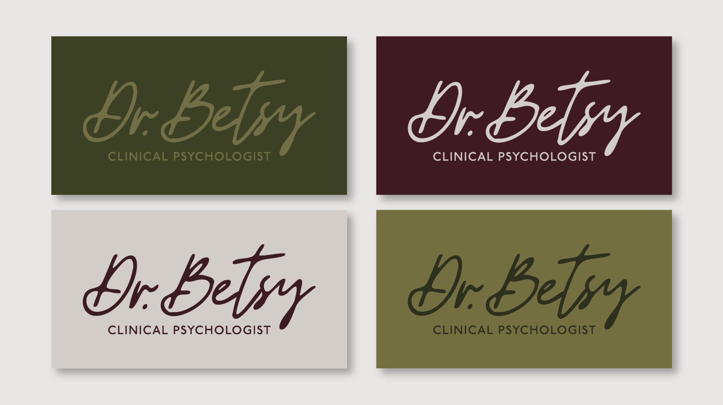
Instead of pale wellness colors, we built the palette around deep olive, moss, black cherry, antique brass, and warm plaster tones; inspired less by a clinical waiting room and more by the feeling of a cozy, warmly lit library.
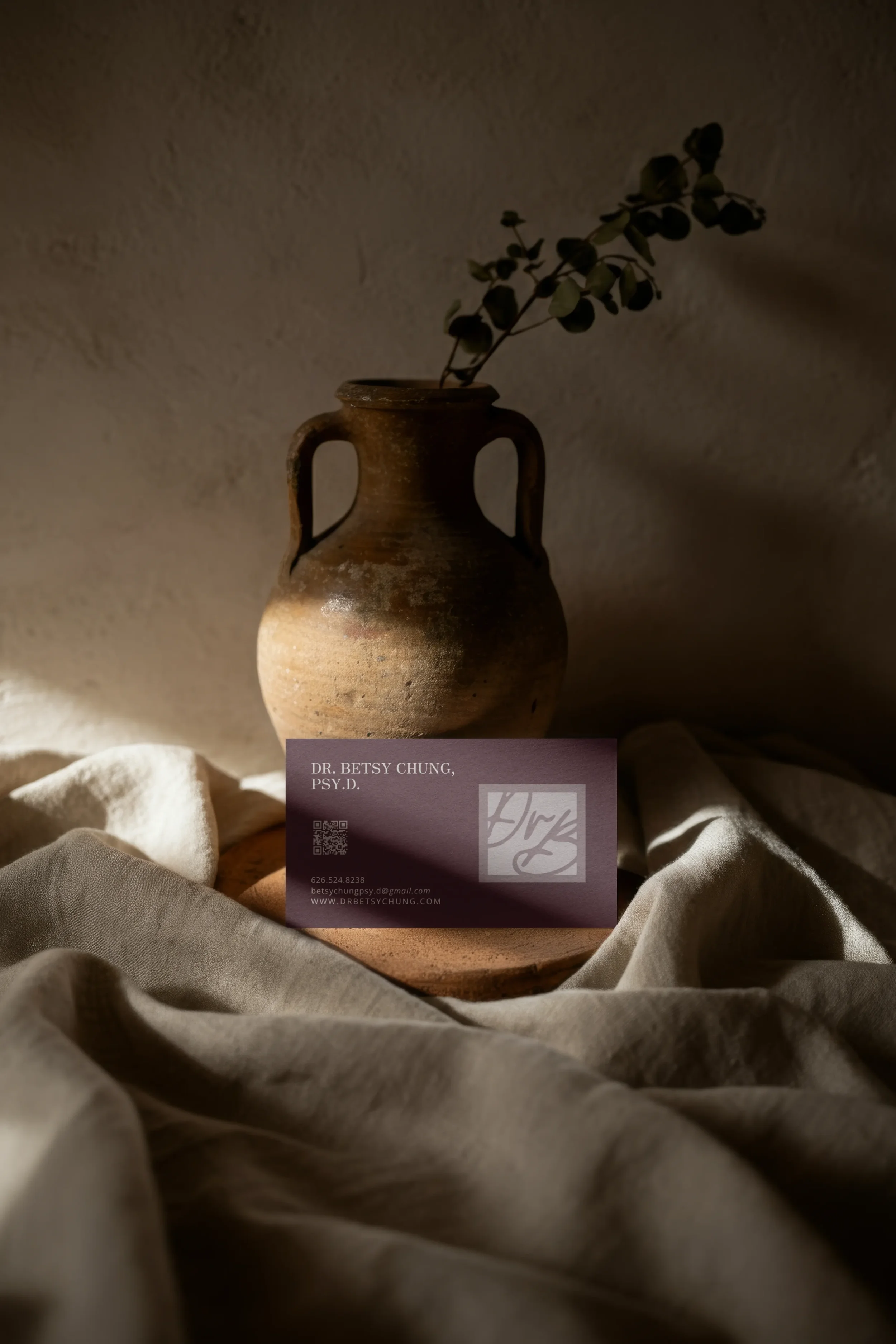
The typography mixes an elegant serif with a restrained sans serif and a handwritten accent. Her primary logo pairs a personal, script-style Dr. Betsy wordmark with the grounding descriptor Clinical Psychologist, while a secondary Love Always, Dr. Betsy mark pulls directly from the way she already communicates online.
That last part matters to me.
The strongest brands usually aren’t hiding in some trend report somewhere. They’re already scattered throughout the business: in the phrases someone uses, the way they sign an email, the room they work in, the things their clients remember about them.
My job is mostly to notice them.
From WIX to a SQUARESPACE website with a point of view
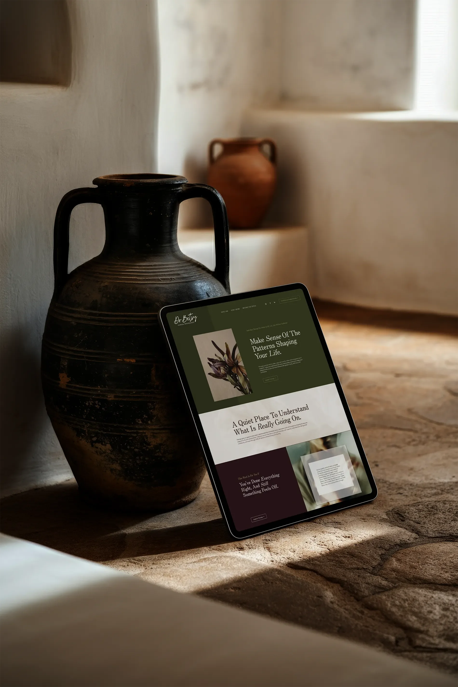
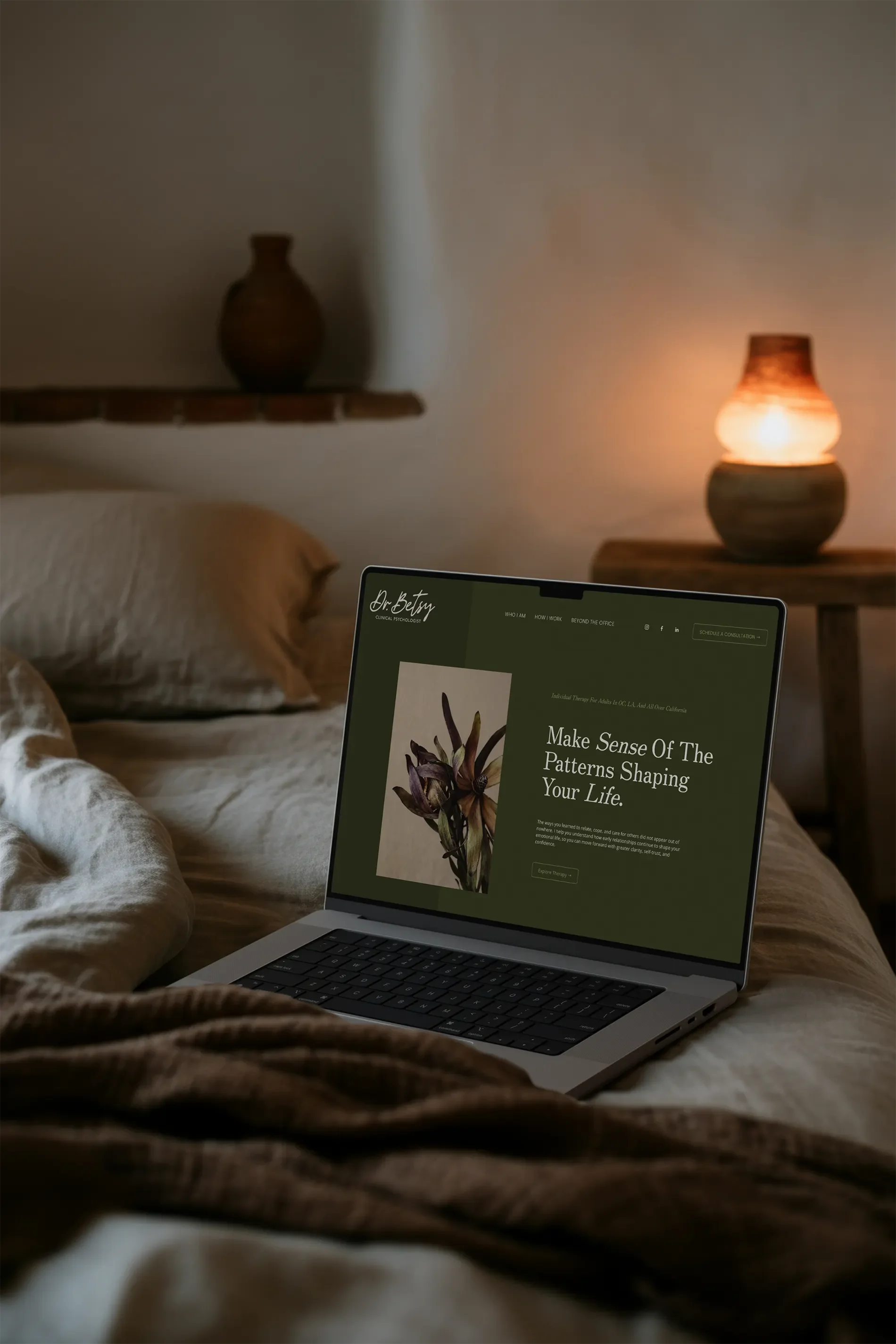
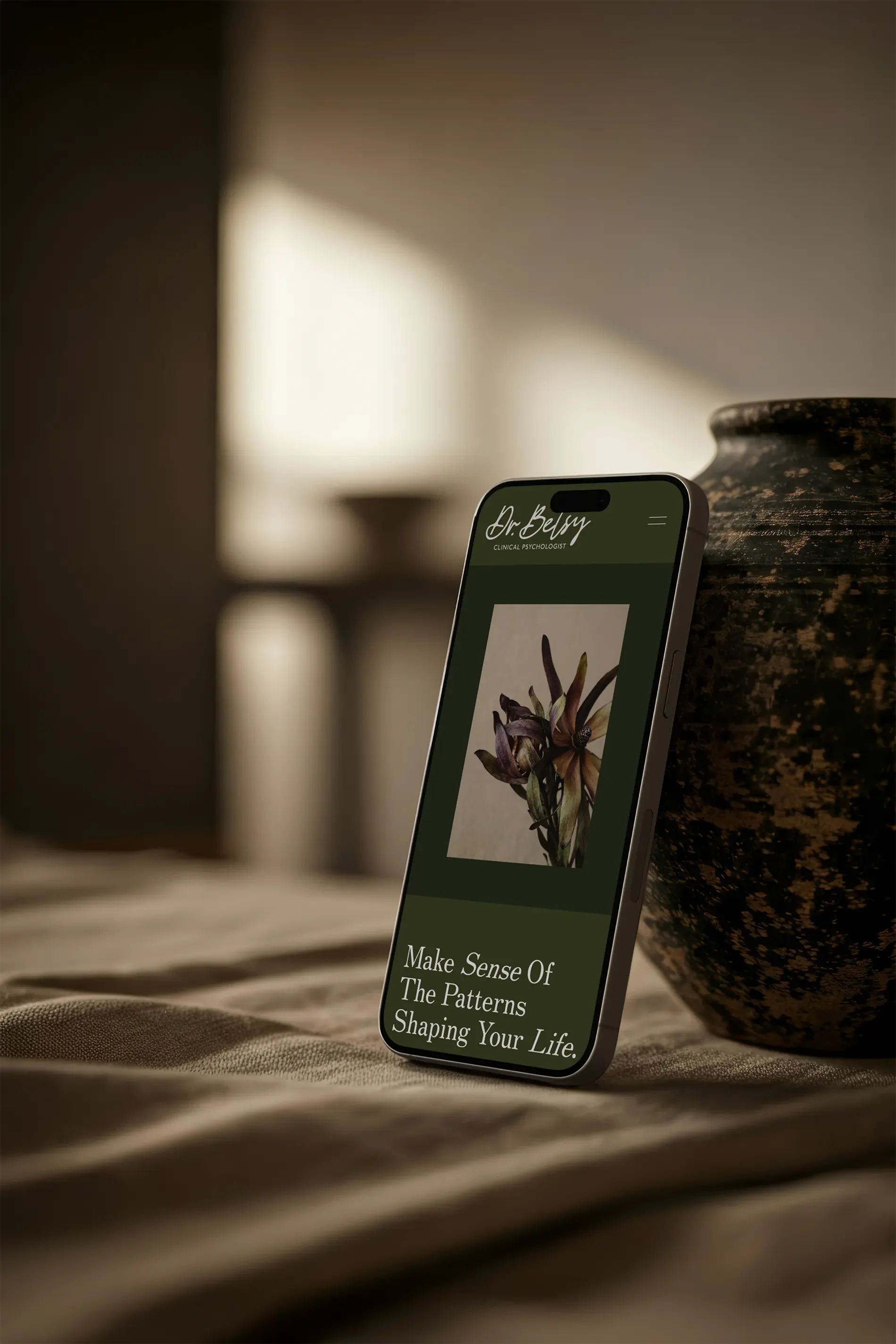
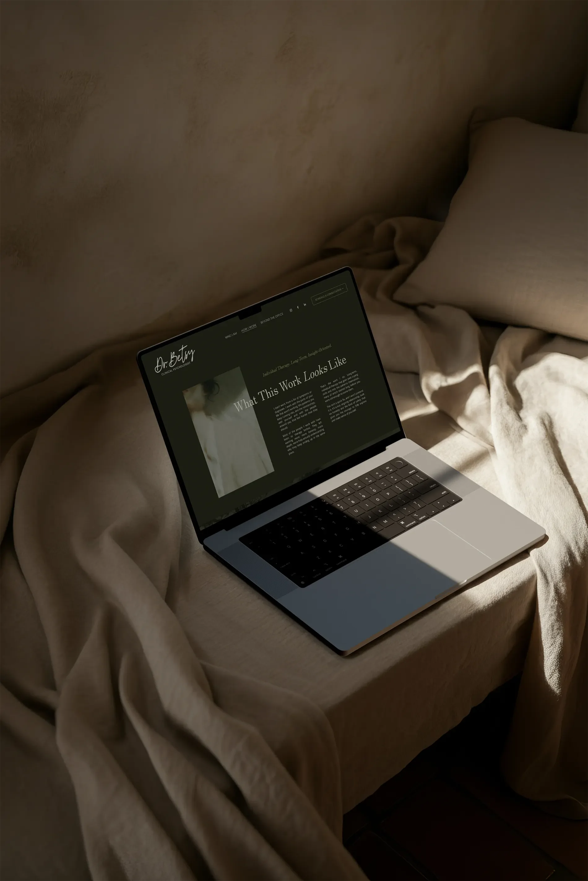
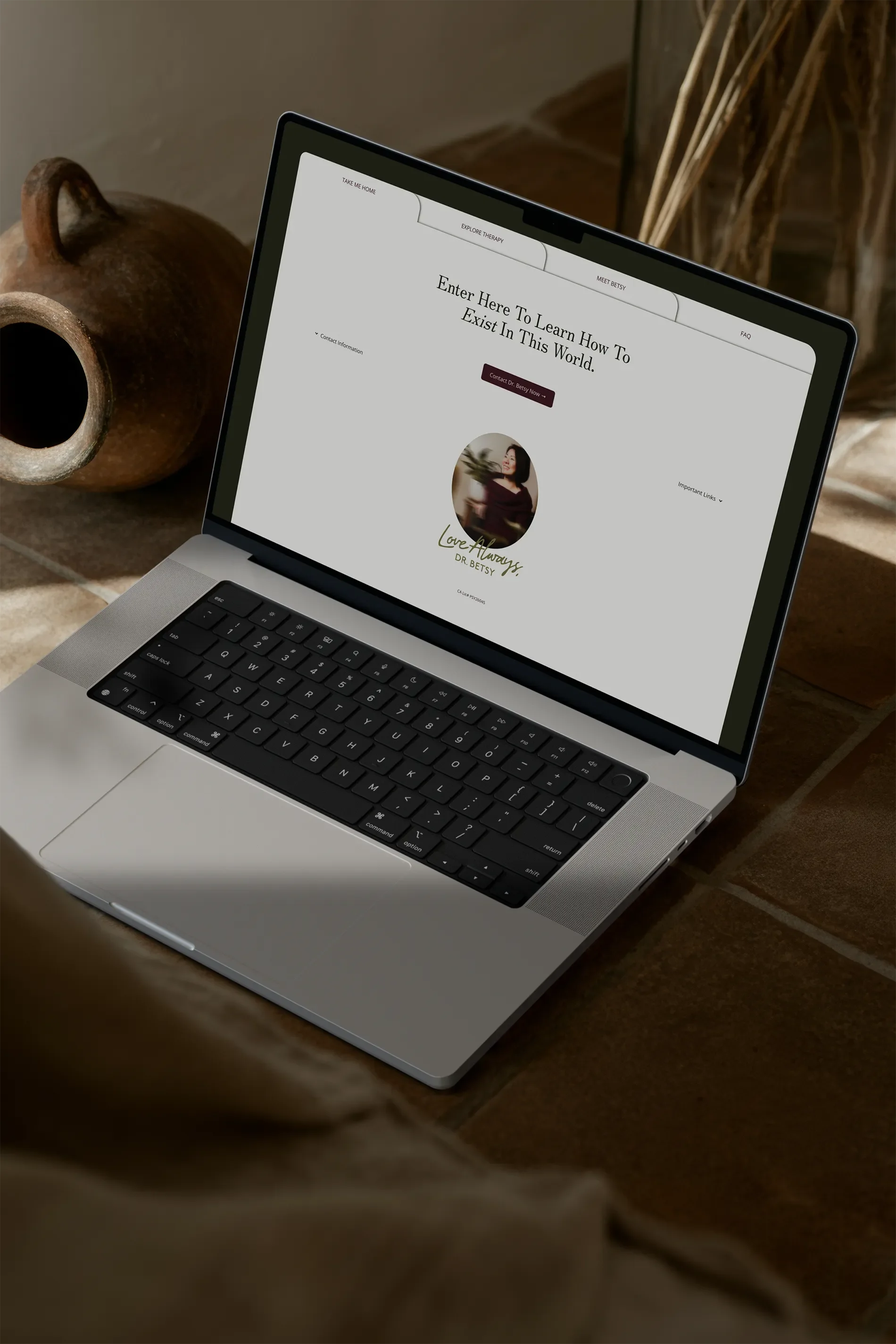
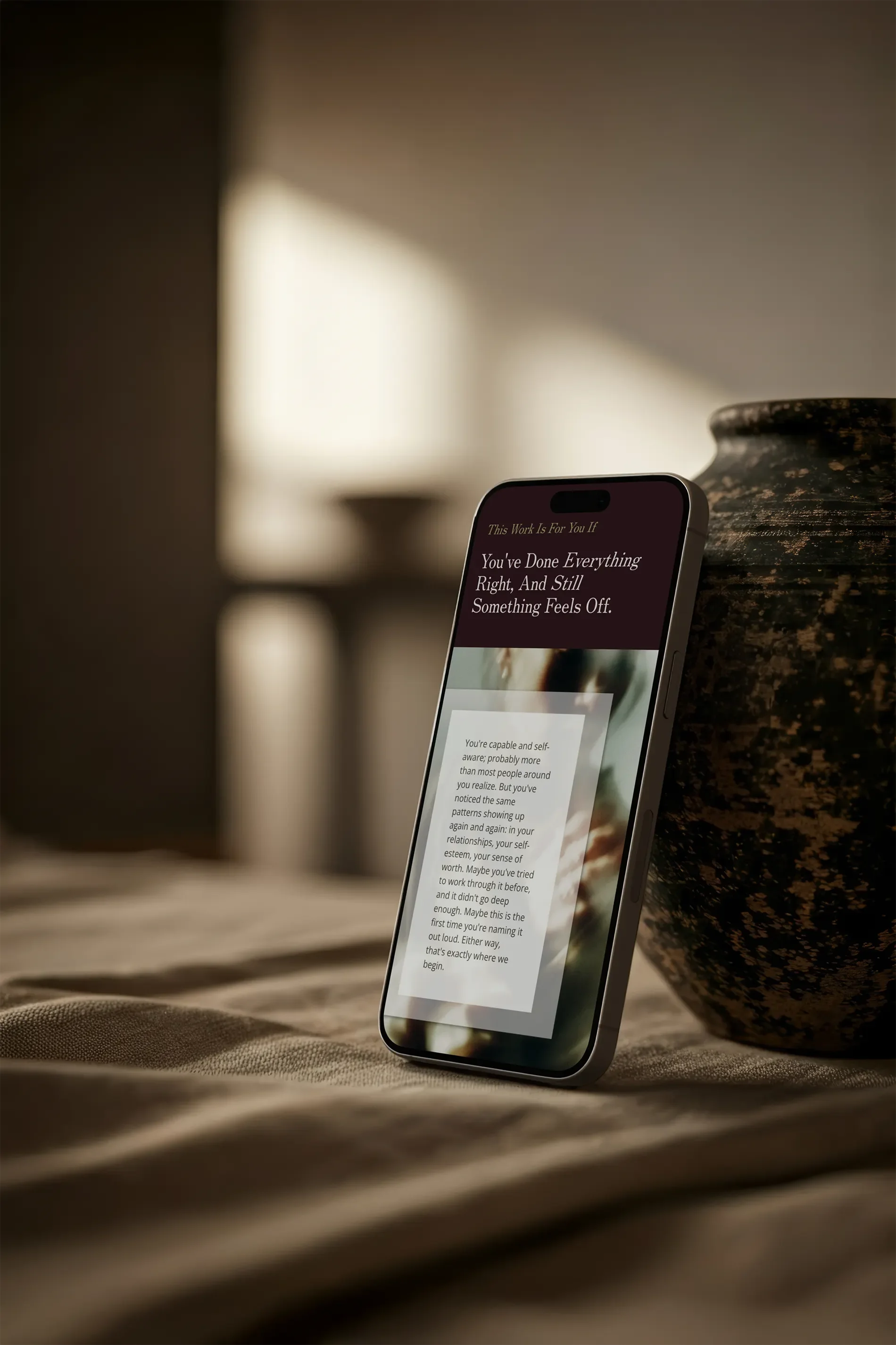
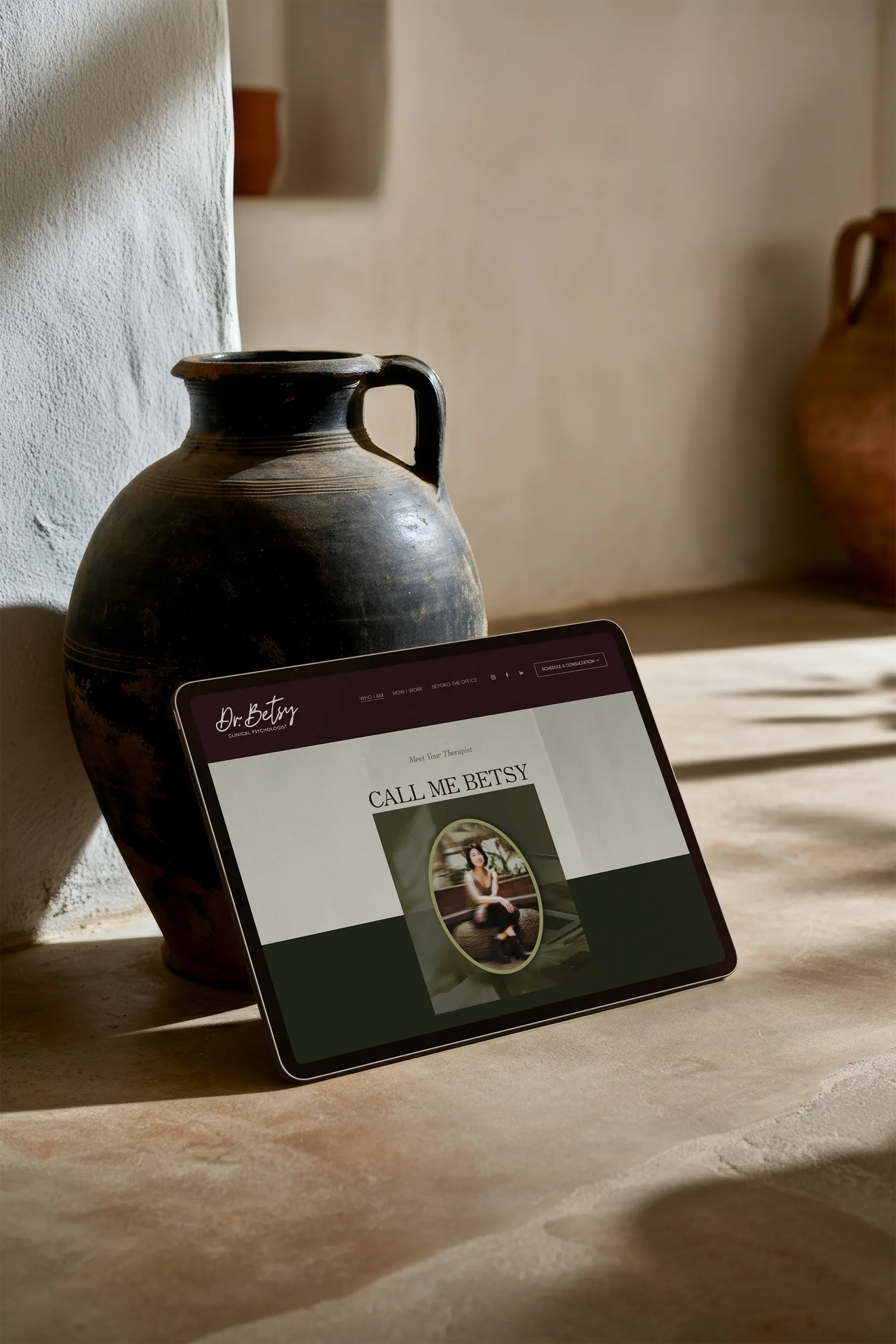
Once the identity was established, I migrated Betsy’s website from Wix to Squarespace and rebuilt the experience around the new brand.
The old site had useful information, but visually there was a lot competing for attention: multiple colors, styles, content blocks, and design treatments living together without a strong system.
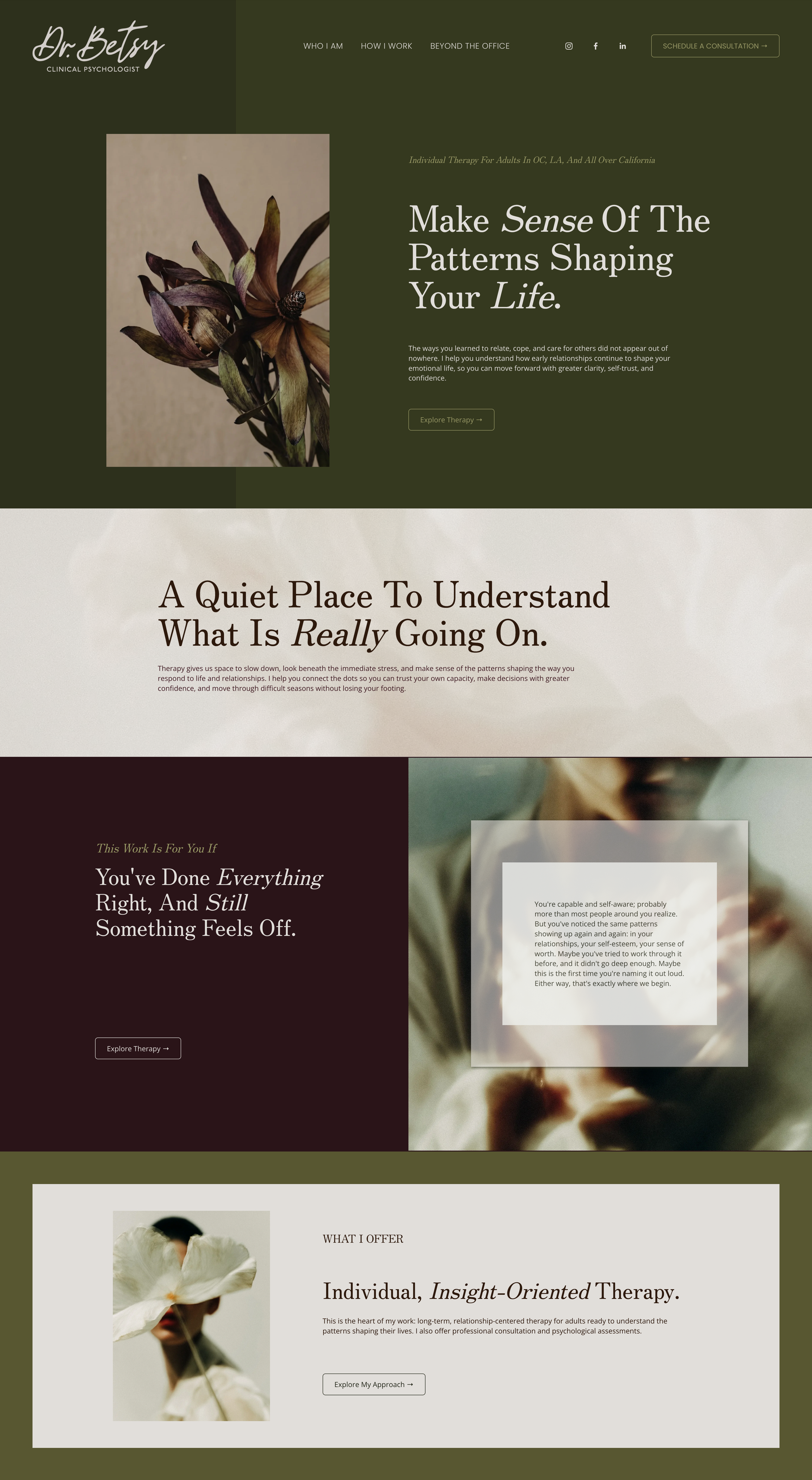
The new site needed to feel quieter, more deliberate, and more confident.
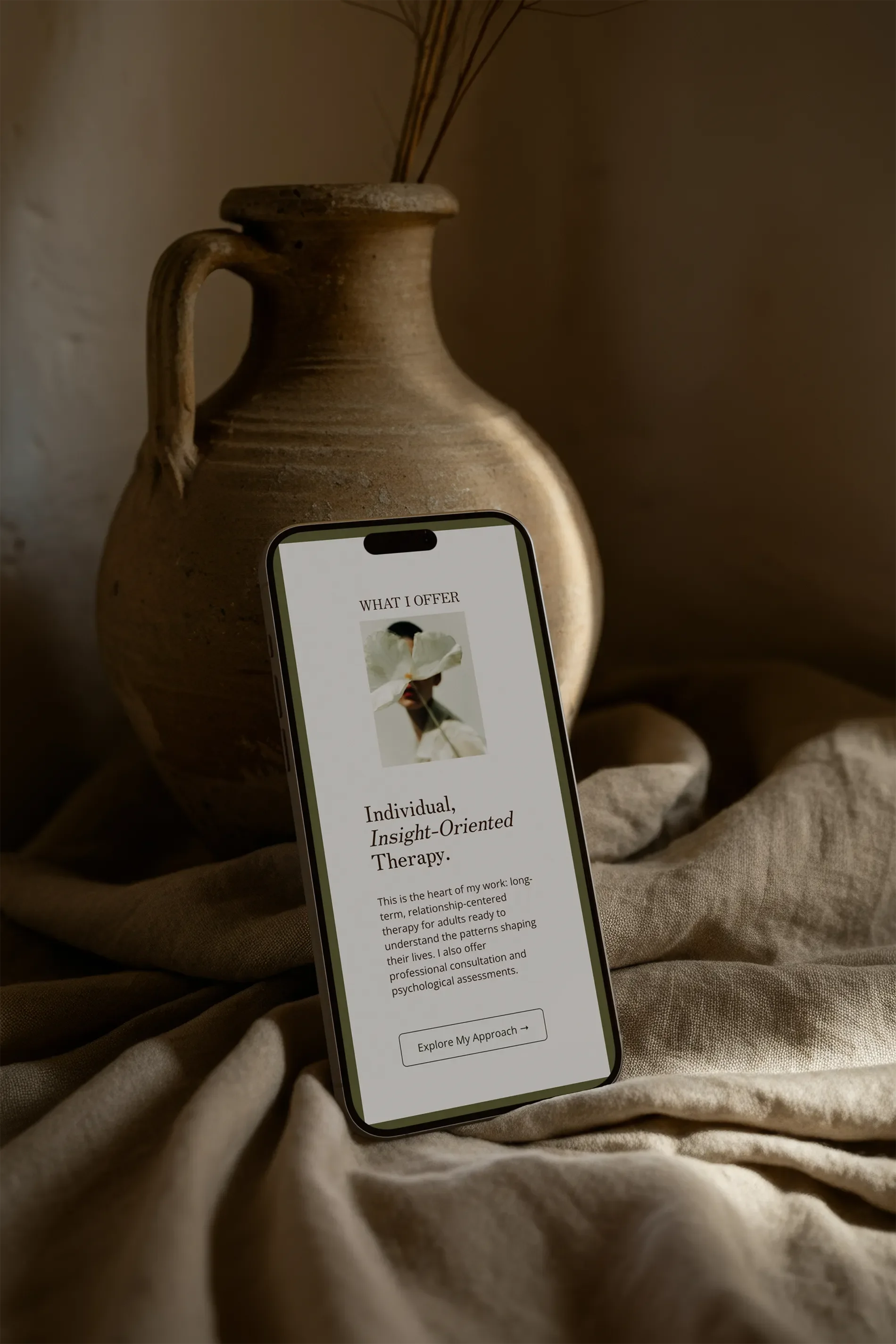
We used dark, warm backgrounds, generous breathing room, editorial typography, intimate imagery, and clear hierarchy so visitors could actually slow down and understand how Betsy works. The direction was intentionally closer to stepping into a private, thoughtfully considered space than browsing a therapist directory.
And because a beautiful website is only useful if people can figure out what the hell they’re supposed to do on it, the design also needed to make her approach, experience, and paths to working together much easier to understand.
Check out the before and after slider!
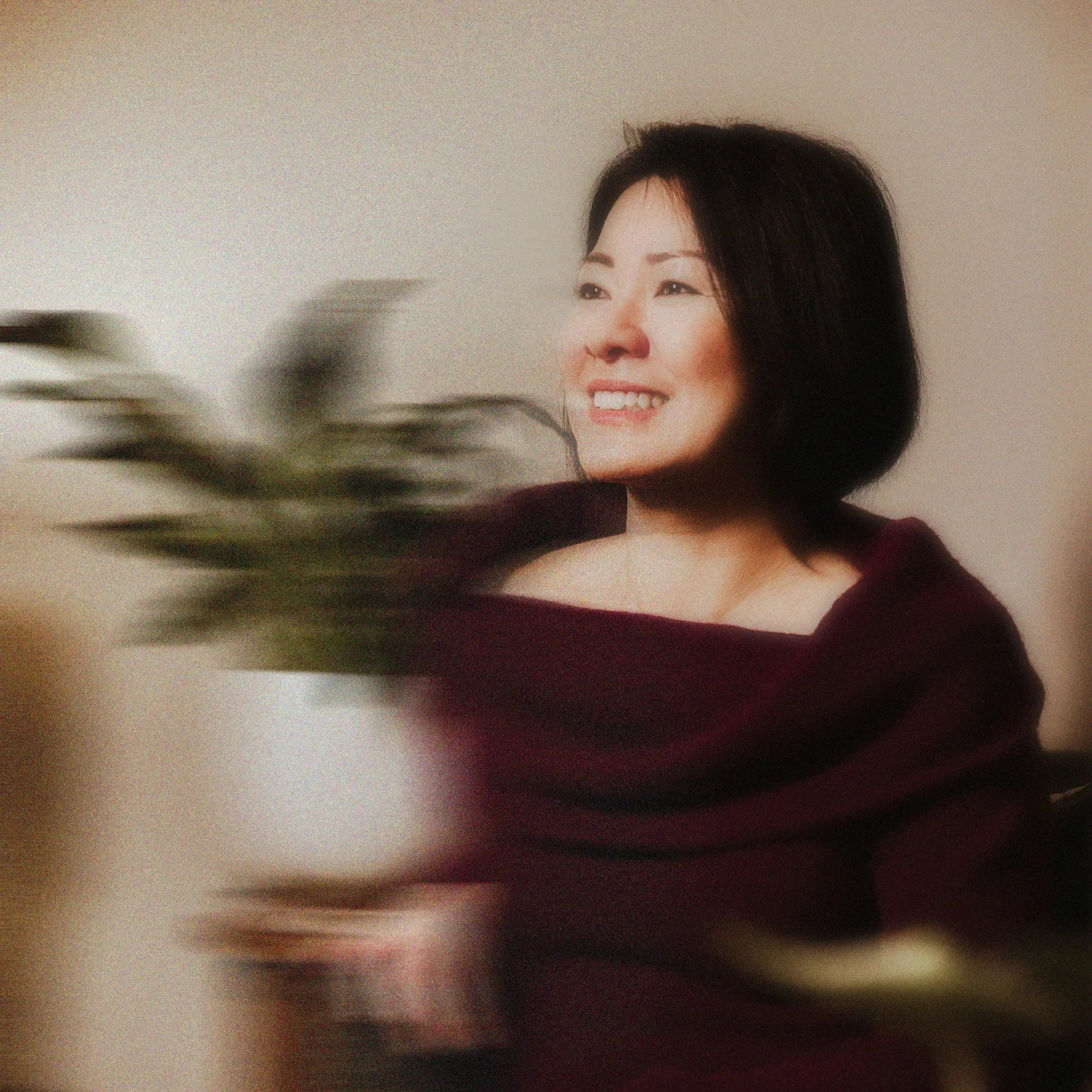
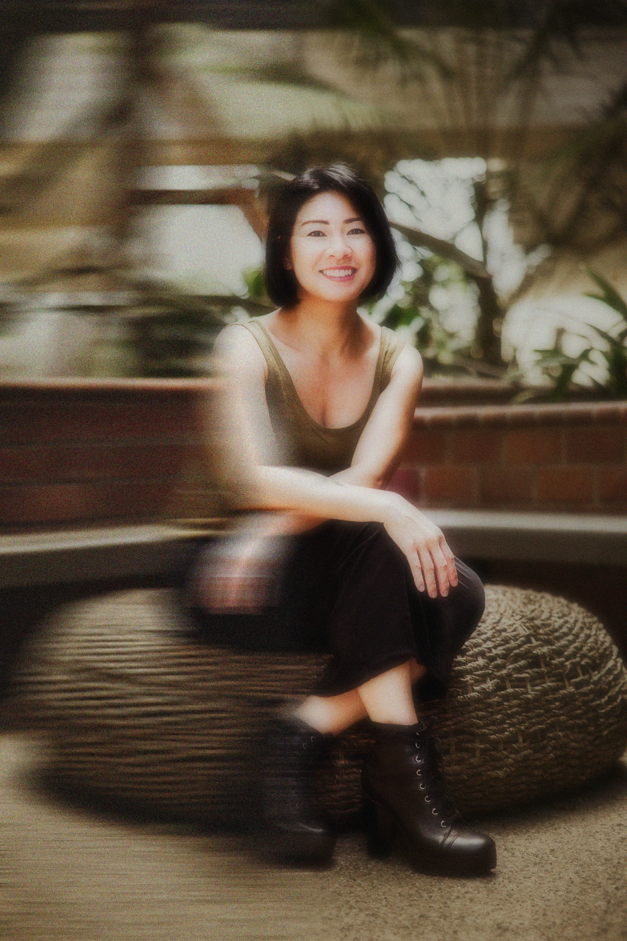
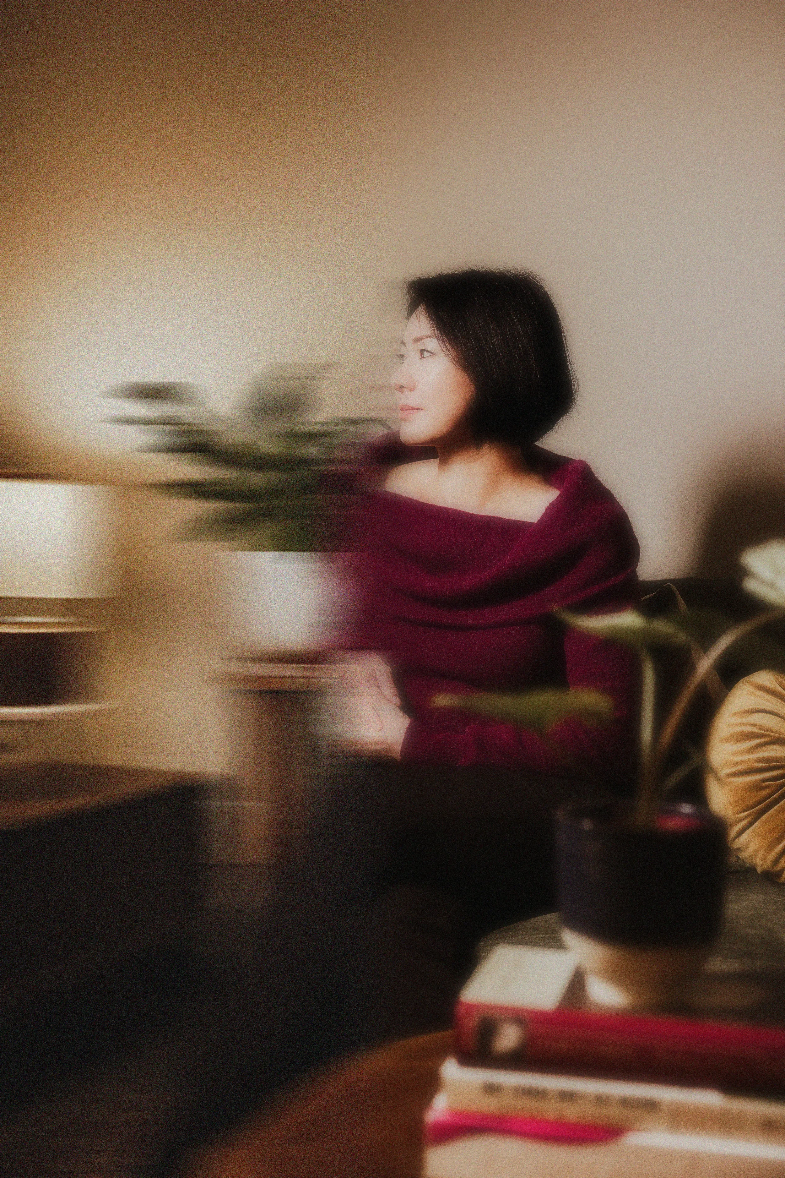
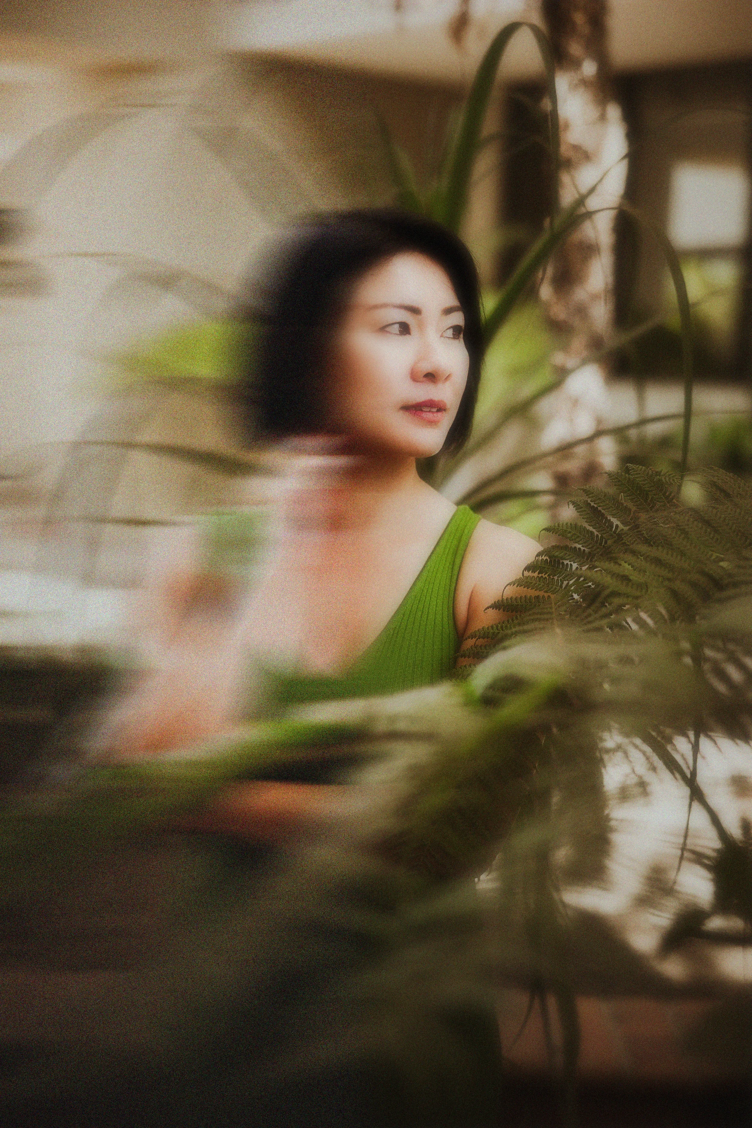
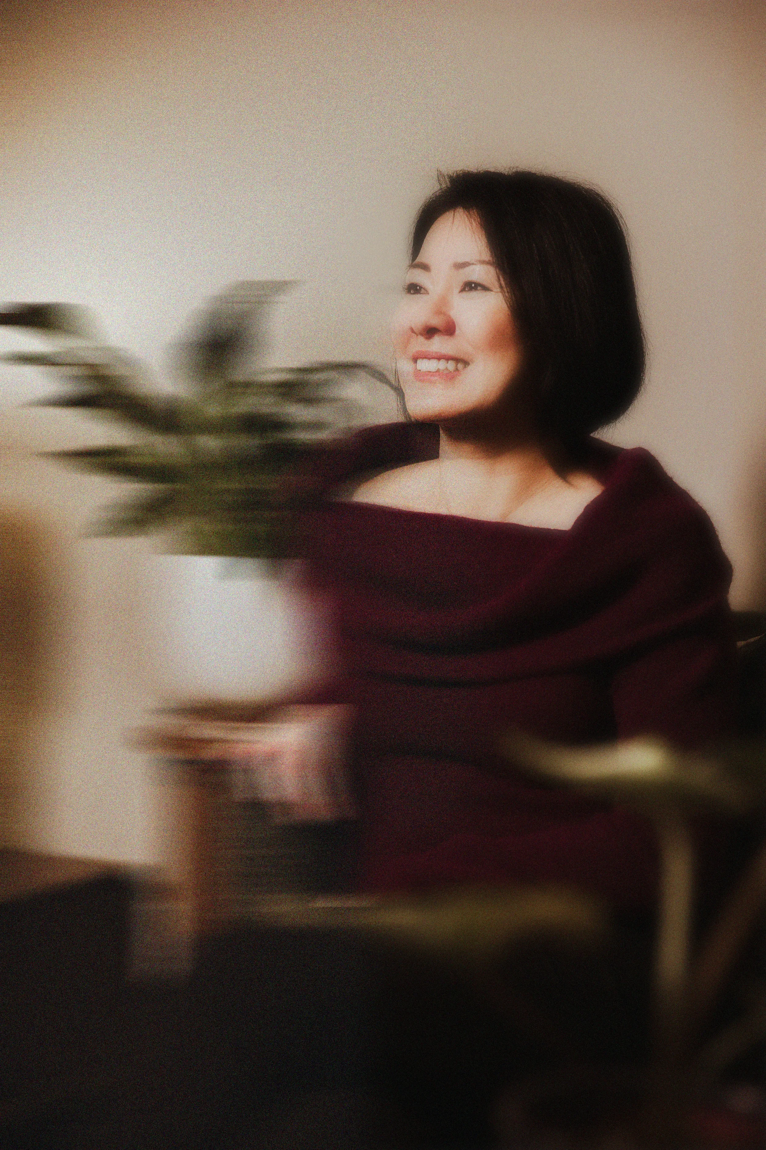
A little photography helped tie the whole thing together.
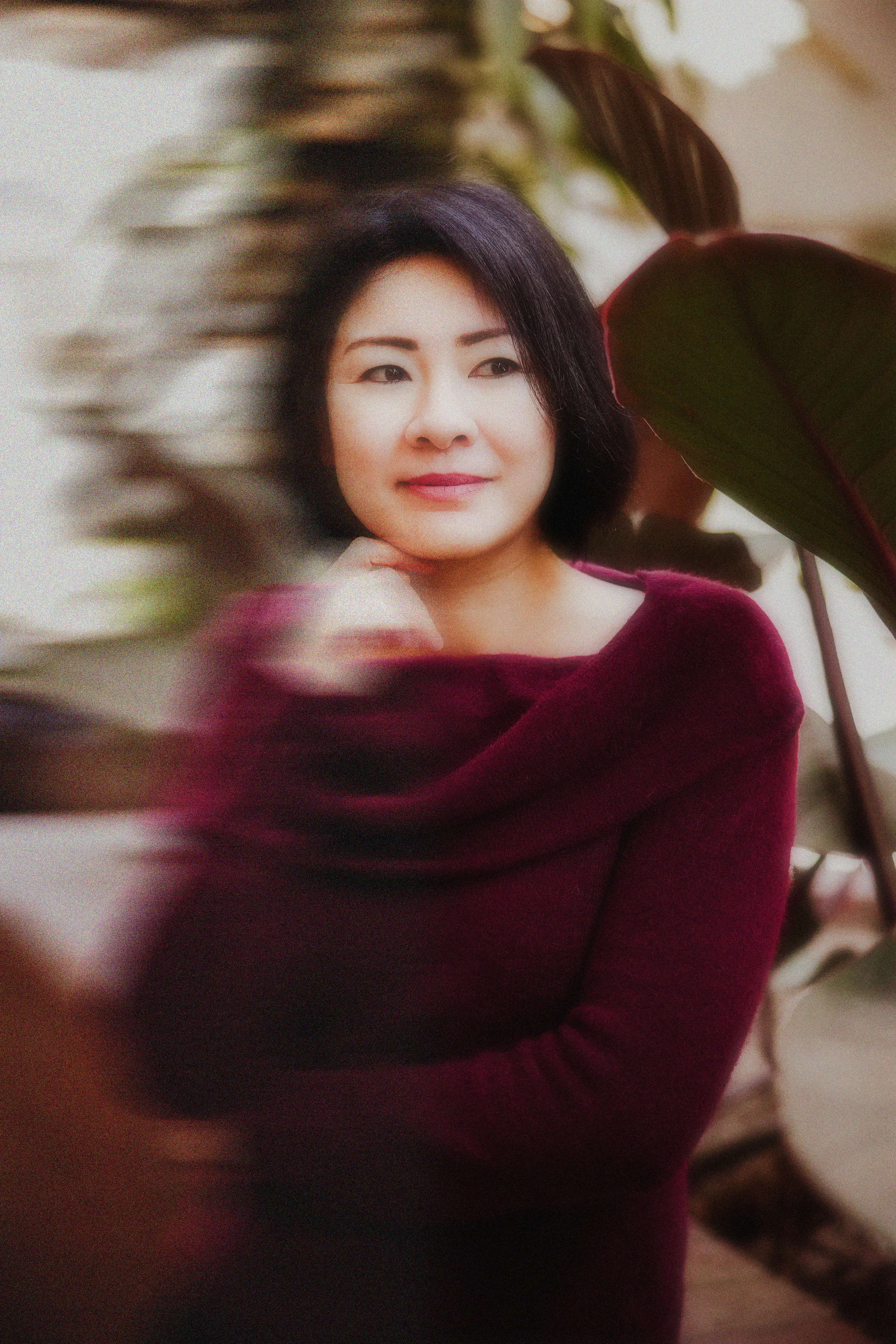
Because photography is part of my background, I was also able to photograph Betsy’s new headshots as part of the project.
That meant we weren’t designing an entire visual world and then trying to shove an unrelated corporate headshot into it afterward.
The imagery could belong to the brand from the beginning: personal, a little edgy, warm, and human.
It’s one of those supporting pieces that seems small until you see the entire ecosystem together, and then suddenly everything feels intentional.

And yes, there is a SYSTEM behind all of this.
One of the things I care about almost as much as the work itself is making sure clients don’t spend the entire project wondering what happens next.
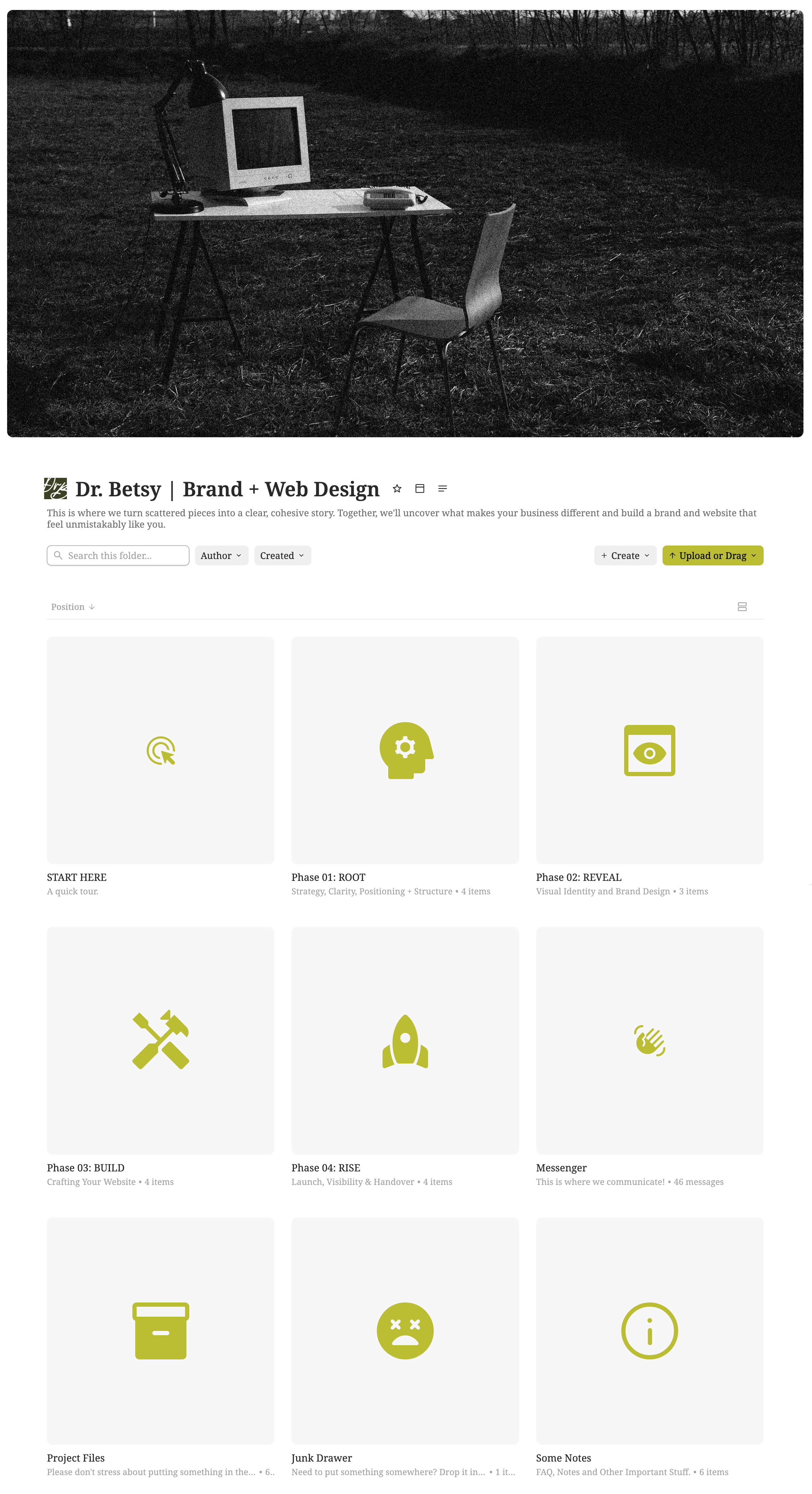
Every AFOTIK project lives inside a private client portal where questionnaires, timelines, files, feedback, approvals, links, and project updates stay in one place.
Betsy didn’t need to remember which email had the logo proof or hunt through a twelve-message thread to find the next step. She could log in, see exactly where we were, what I needed from her, and what was coming next.
Because creative work can feel exciting without also feeling chaotic.
And especially for clients who don’t consider themselves “creative,” that structure gives them room to participate in the process without feeling like they’re suddenly supposed to know how to be a designer.
The part I care about MOST
There’s a sentence from Betsy’s feedback that pretty perfectly describes what I want the AFOTIK process to feel like:
“You just kept giving me what I wanted before I even knew it was what I wanted.”
That doesn’t happen because I’m secretly psychic. Unfortunately.
It happens because I spend a lot of time at the beginning listening.
I want to understand how someone talks about their work, what they care about, what makes them different, what they’re afraid of getting wrong, and what they’re trying to communicate underneath all the logistical stuff.
By the time I’m choosing typefaces or building a homepage, I’m not designing for some vague demographic called women 35–55 seeking therapy.
I’m designing for Betsy.
And for the person who needs to land on that website and think:
Oh. I think she might get me.
The RESULT: A Cohesive Brand She Was Excited to Use
Betsy came into the project feeling like her brand no longer represented the level of experience and care she brought to her work.
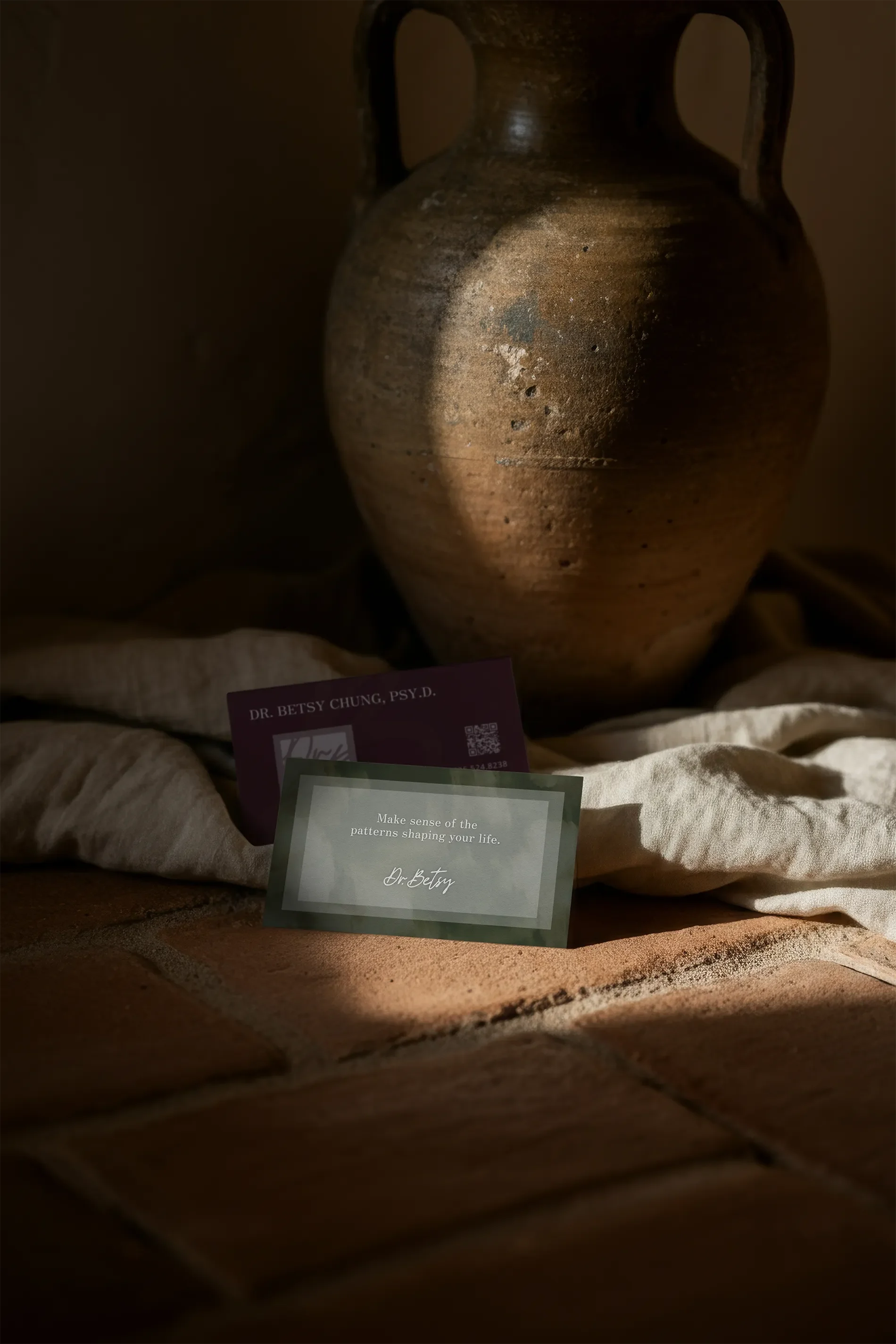
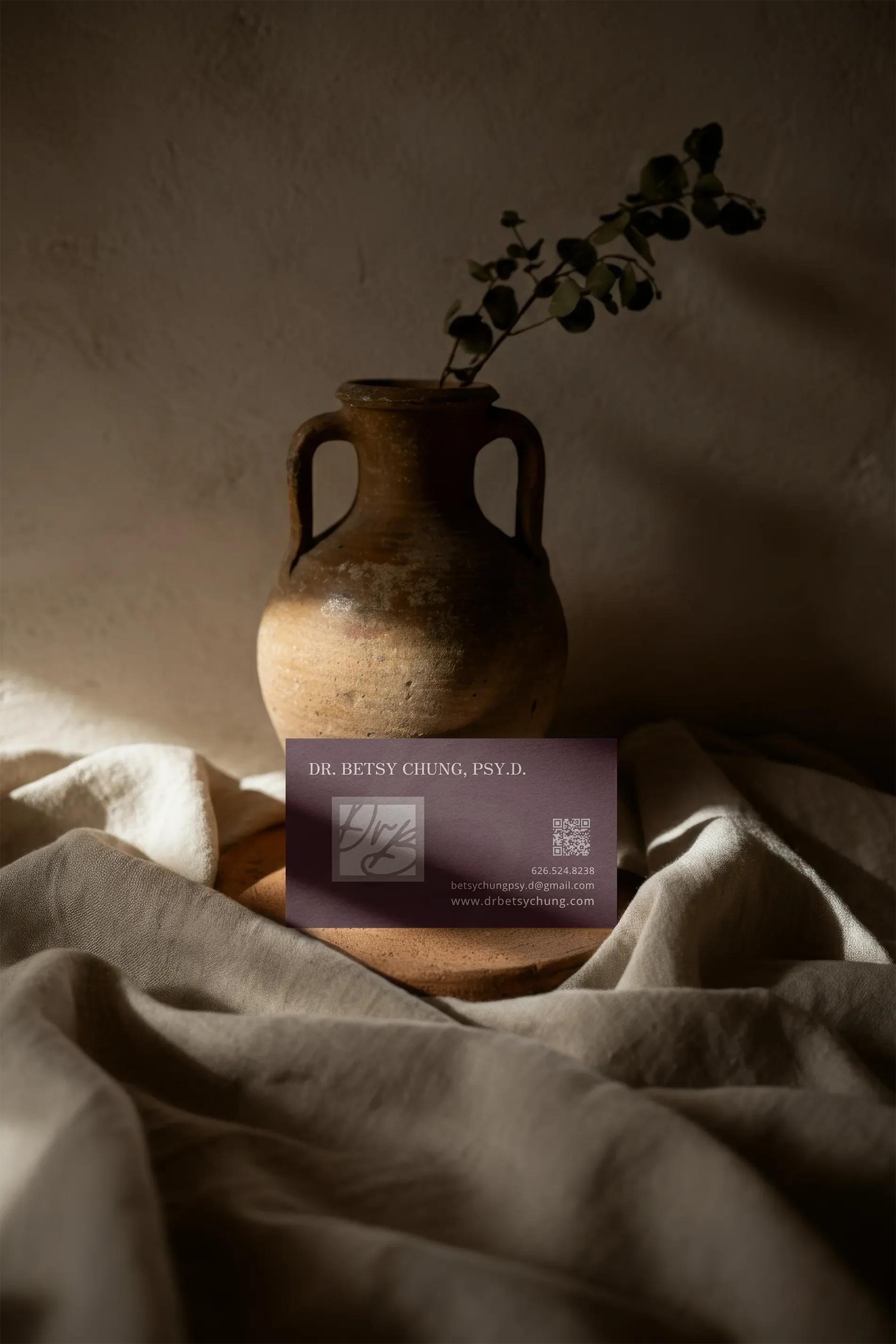
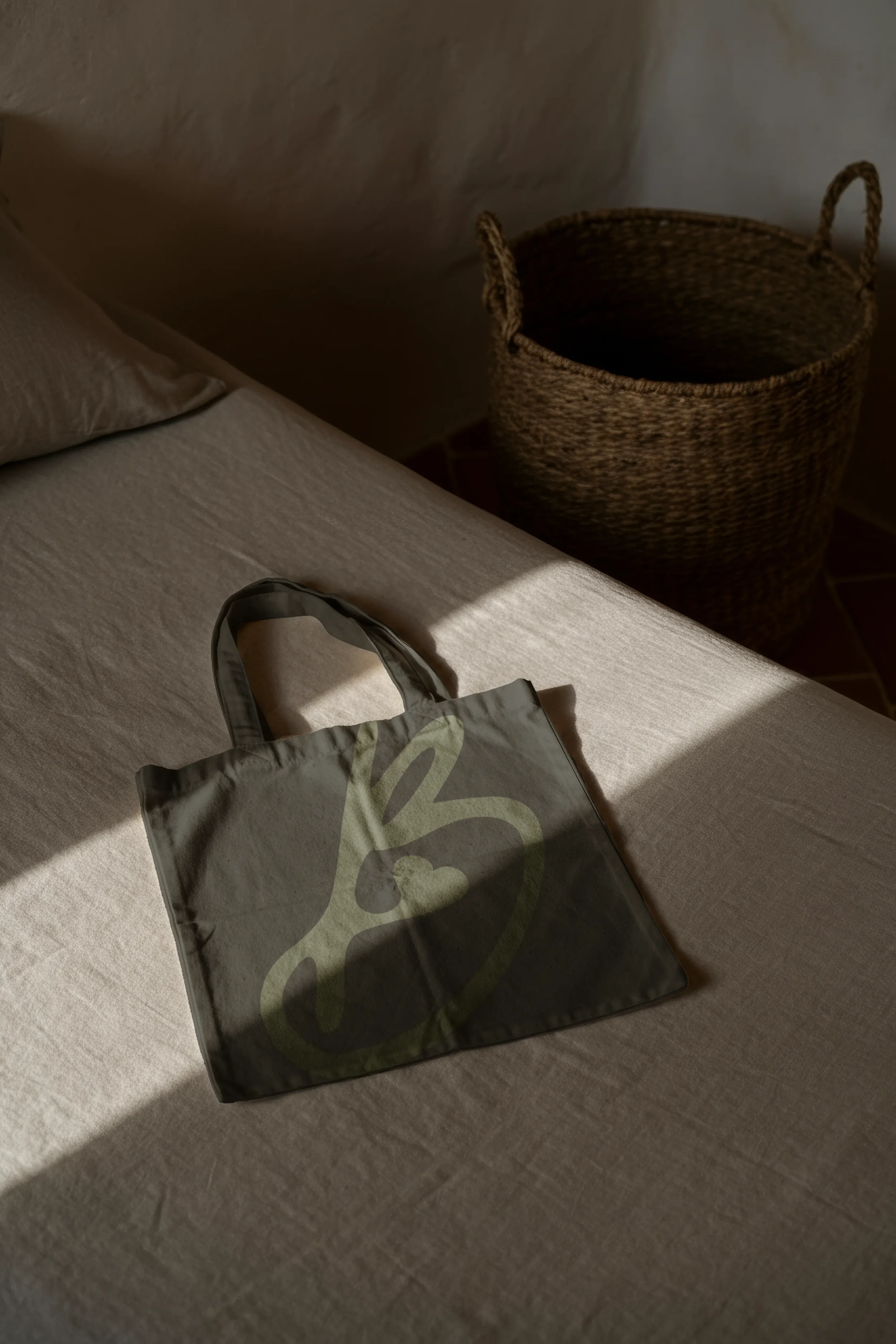
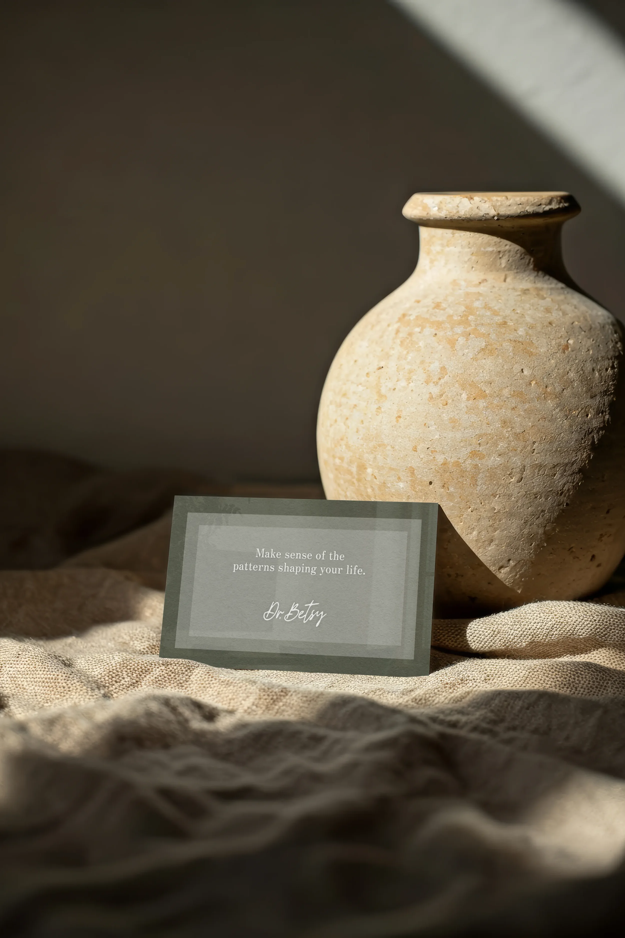
She left with a complete visual system, messaging, new photography, a custom Squarespace website, and a business card, all built to feel like parts of the same story rather than unrelated pieces.
More importantly, she told me the new brand had actually made her excited to start showing up again.
She wanted to share the website.
She wanted to start posting.
She wanted to see the brand out in the world.
That, to me, is the best version of a rebrand. Not something you unveil once and then carefully preserve in a folder. Something that makes you want to use it.