

Orange County Web + Brand Design
Project Name
01. Behind the Brand

02. Behind the Design
-
Before AFOTIK’s redesign, Balænce lacked a cohesive digital identity. The existing visuals and web presence didn’t reflect the band’s cinematic sound or conceptual depth. There was no consistent brand system to carry across streaming platforms, videos, and social channels, and no true home for fans to explore beyond Spotify or YouTube.
-
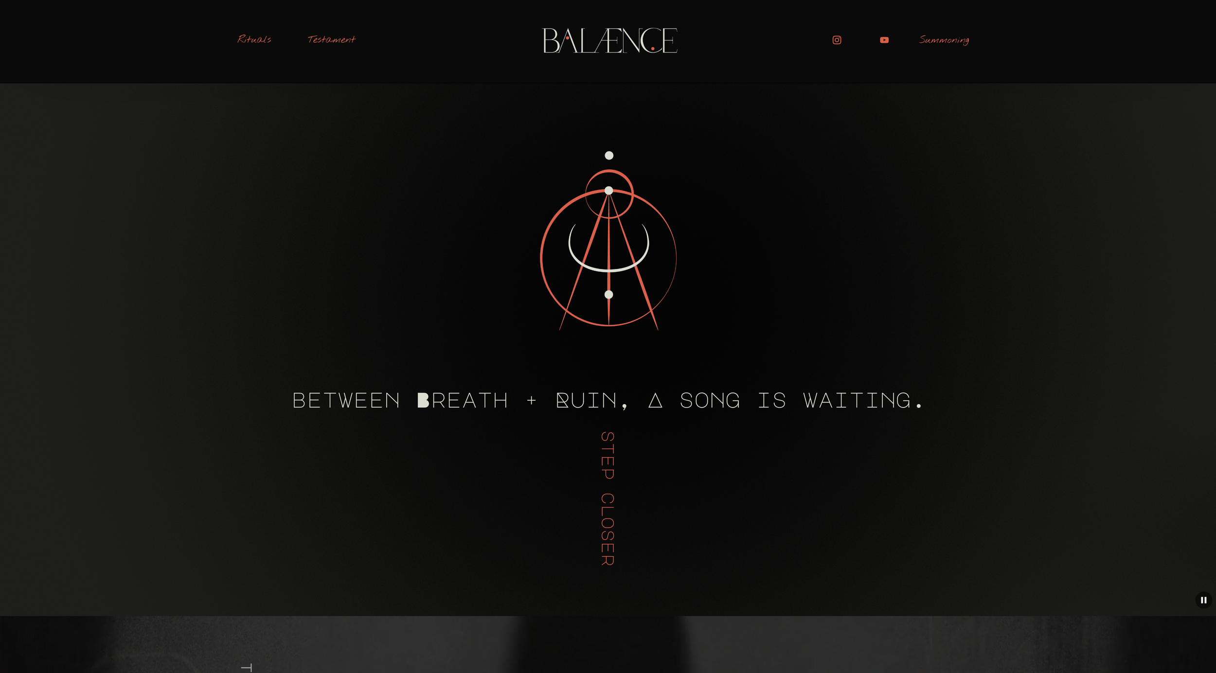
I began by crafting a complete brand identity system [logo, typography, and color palette] designed to translate emotion into form. The site was developed on Squarespace for its flexibility and fluid motion options, integrating Spotify, Apple Music, and YouTube so listeners could move seamlessly between visual storytelling and sound.
The design approach balanced stark black-and-white photography with rich atmospheric tones, custom textures, and organic typography. Each page was treated as a chapter [part ritual, part narrative], inviting the audience into the world of Balænce rather than simply presenting information.
-
Visually, the project drew from early 20th-century photography, occult symbolism, and the haunting simplicity of analog design. The site’s rhythm mirrors a song’s arc, building tension, offering release, and leaving space for resonance.
-
Item description
03. the Color Palette
04. the Logos


05. the Typography

06. the Website


Ready to start your project?
Whether you’re building a brand-new practice or reimagining your business, I’d love to help.
Want to read some cool articles?
Check out the blog, The Art of Being Seen, to discover some tips, tricks, and other cool stuff.