
OPEN ROOM: A Therapy Rebrand With Room to Be Yourself
TL;DR: Alexandra Rosenberg had been running her therapy practice for years, but her online presence wasn't doing much to help it grow. What started as a request for branding and a website turned into a complete reinvention of Rosenberg Therapy. I helped her find a new name, Open Room Therapy, and built a warm, slightly unconventional brand and website around the way she actually practices: with curiosity, compassion, humor, and plenty of room for people to be themselves.
An Orange County Therapist Who Didn't Want to Look Like Every Other Therapist
Brand Naming + Strategy · Visual Identity · Voice + Messaging · Brand Photography · Therapist Website DesignWhen Alexandra Rosenberg reached out, she'd already spent years building her private practice and becoming the kind of therapist she wanted to be.
She worked with individuals and couples throughout California, with a particular passion for creating safe, affirming spaces for LGBTQIA+ clients. Her approach was collaborative, trauma-informed, and grounded in genuine human connection.
What she didn't have was much of an online presence. No website. No real brand identity. Just a couple of online profiles and some headshots her wife had taken in the park. (Which is a pretty relatable starting point for a small business.) And while the practice was established, it wasn't growing the way she wanted. People would ask for her website or how to refer someone, and she didn't have much to send them. She'd see other therapists with beautiful websites and think about what having something like that could mean for her own business.
But there was one thing she knew she absolutely did not want: Another generic therapist website.
You know the ones. Soft colors, calming stock photography, vague promises about finding your best self, and enough visual similarities that you could swap the therapist's name and barely notice. Alexandra wanted warmth and comfort, absolutely. But she also wanted personality. Humor. A little weirdness. Something that felt like her.
Turns out, that’s where I do my best work.
"I wanted to figure out branding that felt authentic and unique to me, but I wasn't totally sure how to translate that into a website and into a way that could grab a potential client's attention."
From Rosenberg Therapy to OPEN ROOM: Finding the Name That Fit
One of my favorite questions to ask during the branding process is what someone's business would feel like if it were an actual place.
Alexandra's answer?
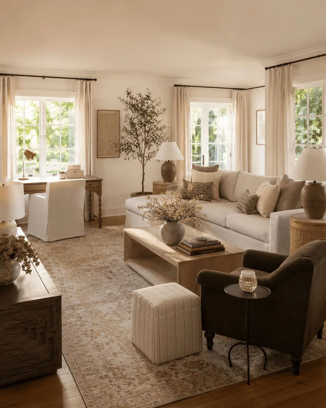
A Nancy Meyers set, but slightly weirder.
Which might be one of my favorite creative briefs of all time. She wanted that cozy, lived-in feeling. Warm light. Natural textures. A room where you'd immediately want to curl up on the couch and stay awhile. But the perfectly polished, impossibly expensive version where everyone looks like they own a second home in the Hamptons? We needed a little more personality than that.
More like Nancy Meyers meets a queer bookstore. I could work with that.
So naturally, I went looking at Nancy Meyers interiors. And something kept standing out to me: the openness of those spaces. The big rooms, the natural light, the feeling that there's space to settle in and just be. At the same time, I kept thinking about what Alexandra had told me about her work.
She wanted to create a safe, queer-affirming space where people didn't have to fit a particular mold. Where they could be curious about themselves, explore difficult things, and feel accepted without having to explain or justify every part of who they are.
Put those two ideas together, and you get an open room. A place where there's room for all of it.
OPEN ROOM THERAPY.
Her original practice name, Rosenberg Therapy, had served its purpose, but Alexandra had already mentioned she wasn't particularly attached to it. She was open to exploring something with a little more meaning. Open Room gave us that. It felt welcoming, inclusive, and easy to remember. It spoke directly to the experience Alexandra wanted people to have when working with her.
And once we had the name, it gave us a whole world to build around.
Building a Brand That Feels Like a Place You'd Actually Want to Be
Once we had the name, the visual direction started coming together.
I wanted Open Room Therapy to feel warm and grounded, with the kind of personality and imperfection that makes a space feel genuinely lived in.
Basically, the design equivalent of a really good room with comfortable furniture, interesting books, and absolutely no inspirational wall decals telling you to Live, Laugh, Love.
Golden Hour, Olive Greens, and a Little Bit of Nostalgia
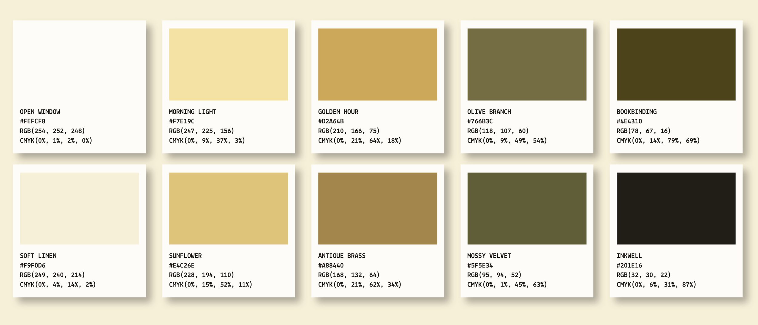
The color palette grew out of Alexandra's love of natural textures, warm greens, and golden yellow.
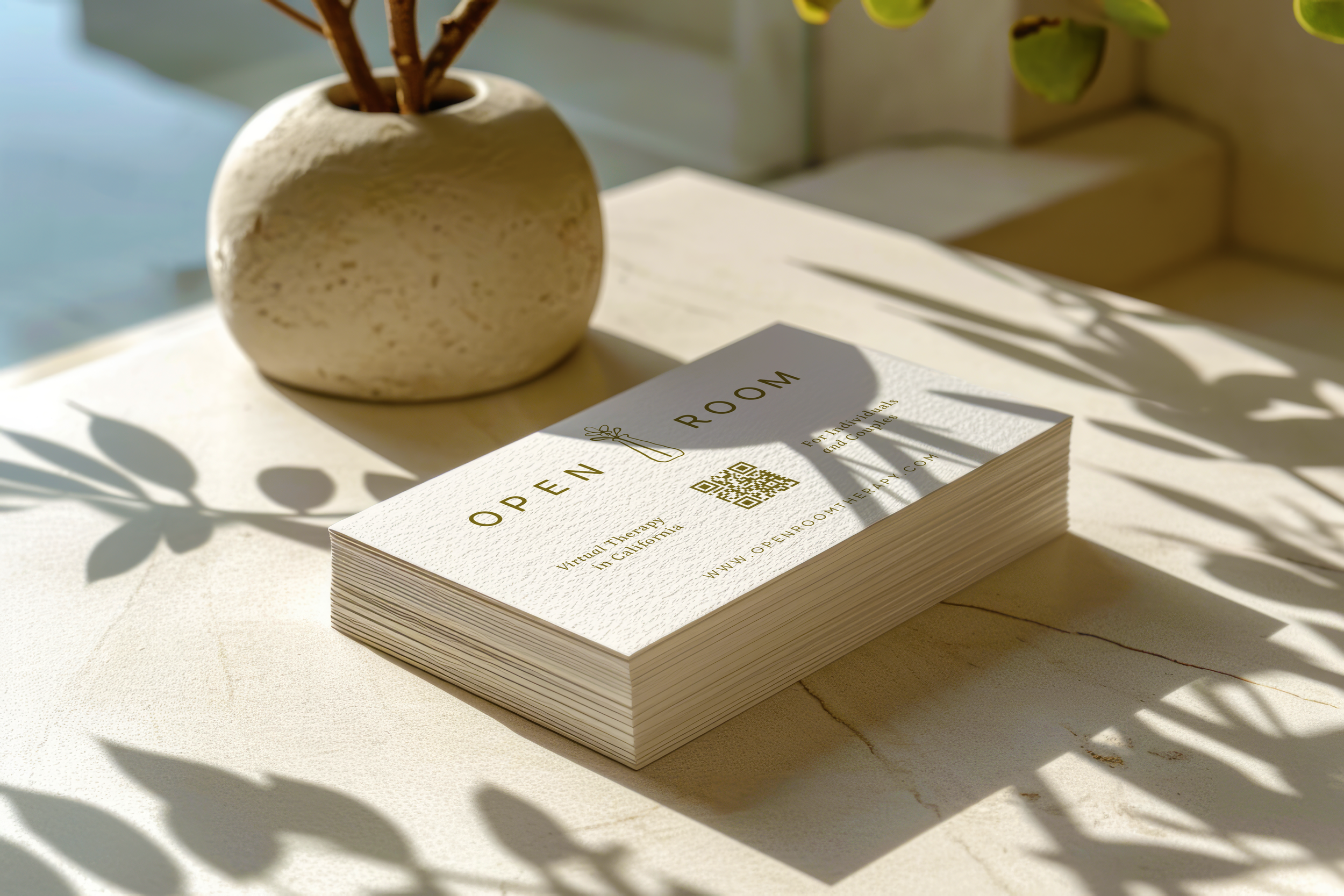
I leaned into deep olive, antique brass, sunflower gold, and soft creamy whites. Colors that feel a little nostalgic, like afternoon sunlight coming through an old window or a favorite book you've read so many times the cover is starting to wear.
The typography follows that same balance. I paired a clean, approachable sans serif with a warmer, slightly bookish serif, then added a handwritten accent for the moments that needed a little extra personality.
Nothing too formal. Nothing overly whimsical. Just enough character to feel human.
A Little Flower With a Bigger Story
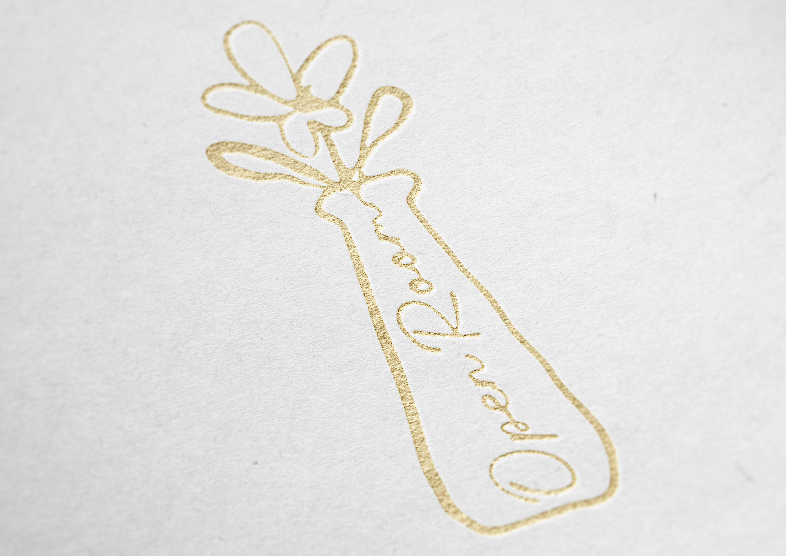
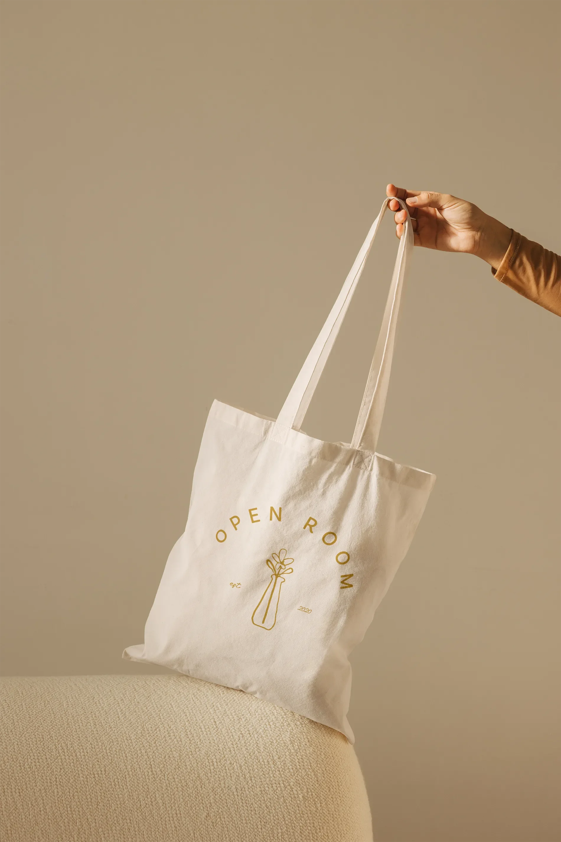
The logo centers around a simple, hand-drawn vase holding a flower, inspired by an illustration I came across during my research. I loved how delicate and a little imperfect it felt, almost like something you'd find sketched in the margins of an old book. It fit right into the world we were creating for Open Room.
For the primary logo, I kept the vase illustration simple, paired with the Open Room wordmark. But I also wanted Alexandra to have something she could use on its own, especially in smaller spaces where the full logo might feel like too much.
So I created a standalone version of the vase with a little hidden surprise: the words open room tucked into the stem. It's one of those tiny details you might not notice right away, which is part of why I love it.
And the flowers had a story of their own.
Early in the process, Alexandra mentioned being drawn to sunflowers and yellow flowers. She wasn't even sure she wanted to use them in the brand, but she brought them up anyway. What I didn't know at the time was that her grandmother had recently passed away, and sunflowers were her favorite. Alexandra hadn't set out to make the website a tribute to her grandmother. She wasn't even sure that connection belonged in her business branding.
As the identity came together, the flowers found their place.
And I think that's one of the loveliest things about this project. Sometimes the smallest details turn out to be the most meaningful. And sometimes they come from those little things people mention almost in passing, without realizing how much of themselves they're sharing. Which is exactly why I ask so many questions at the beginning of a project. You never really know which detail is going to become the detail.
"The site feels like me, but there's this little nod to my grandmother that feels really sweet."
Bringing the Brand to Life in an Independent Bookstore
Remember that whole Nancy Meyers meets queer bookstore thing?
Well, I took that pretty literally when it came time for Alexandra's brand photography.
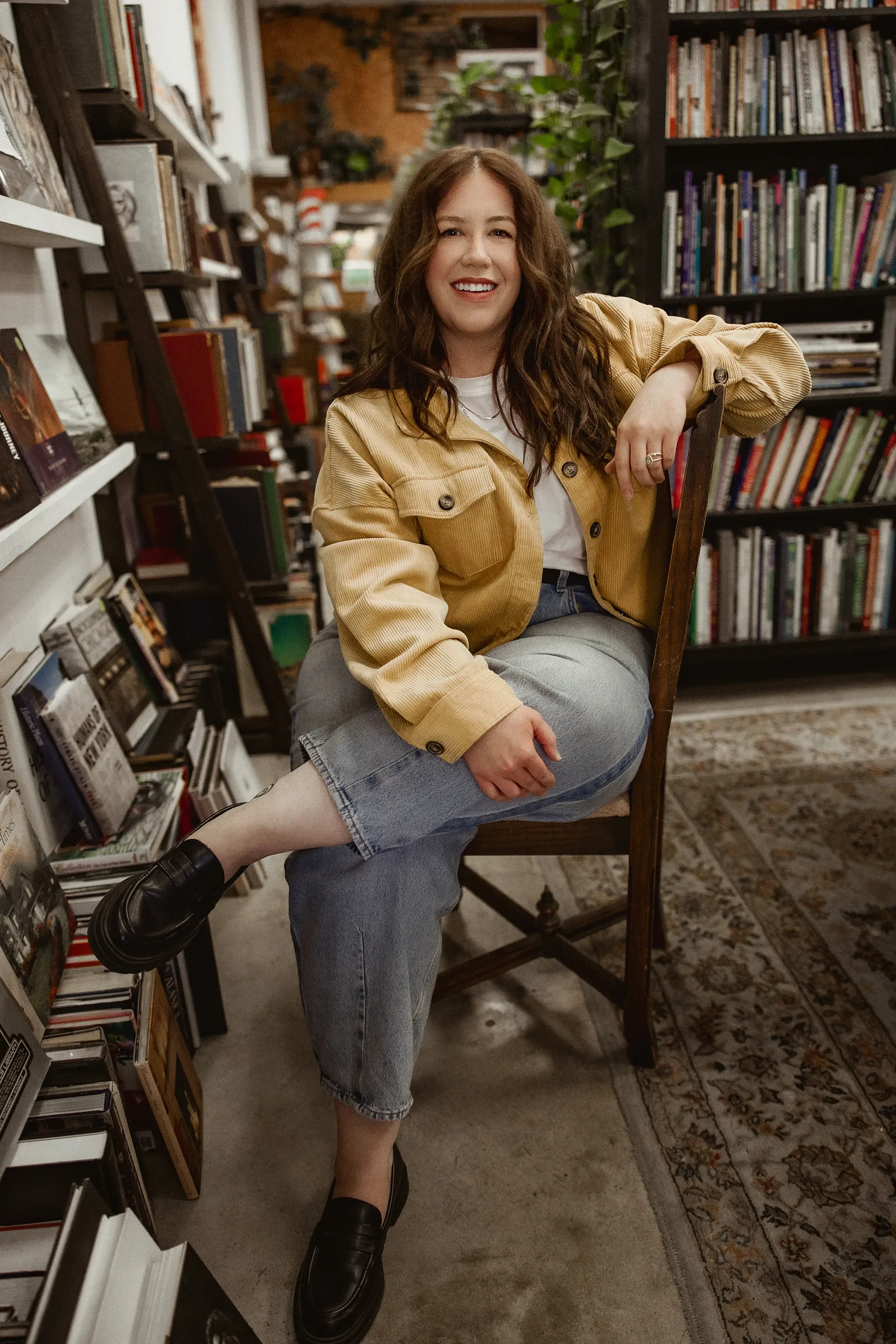
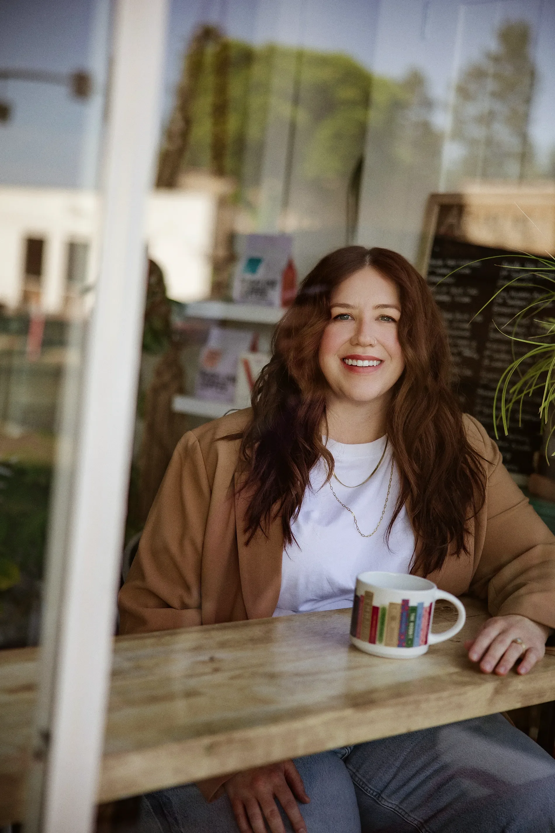
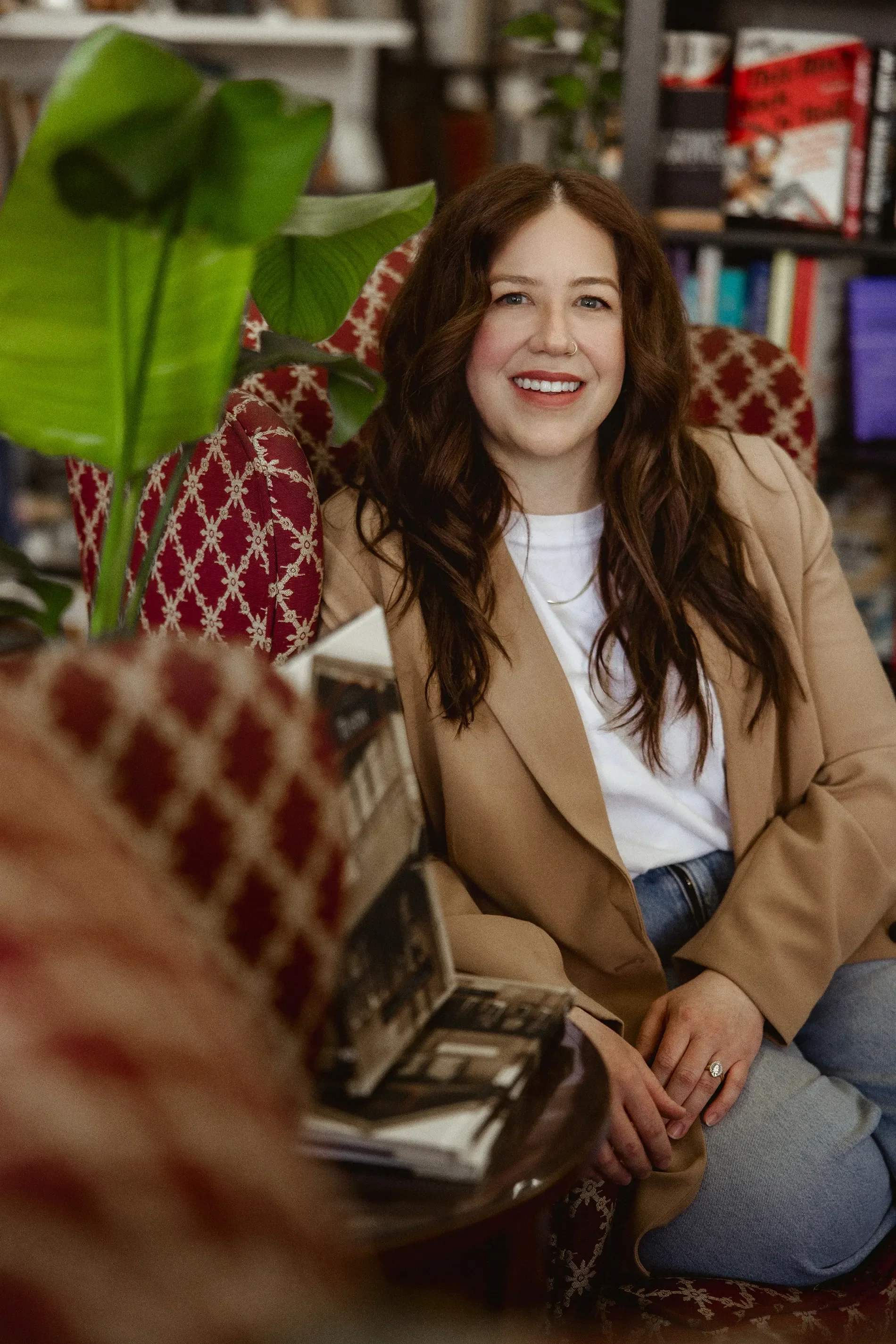
We did her headshot session in an independent bookstore, surrounded by bookshelves, plants, mismatched furniture, and all the cozy, slightly eclectic details that had inspired the brand in the first place.
It was kind of perfect.
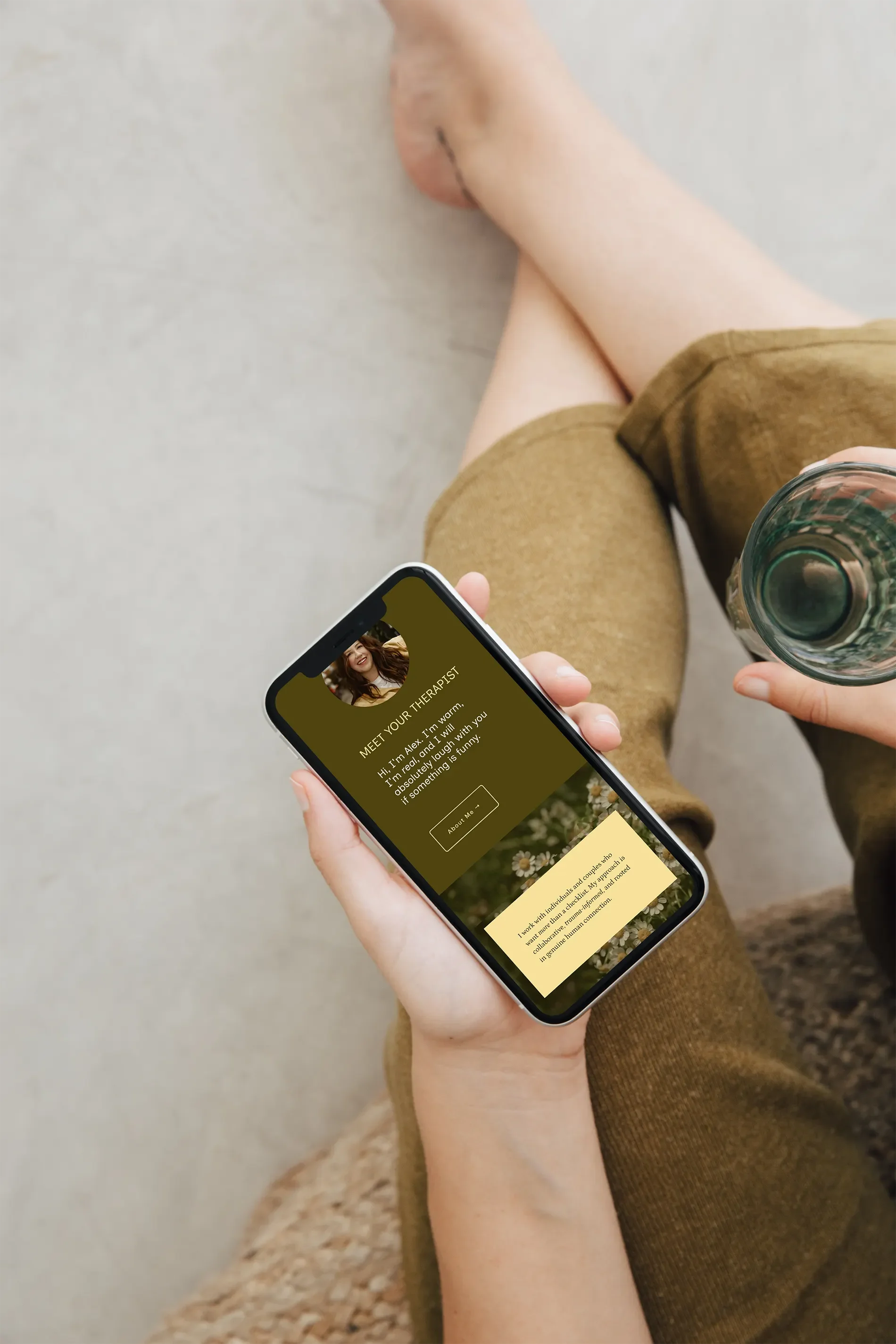
I wanted photos that showed Alexandra the way I was getting to know her: warm, approachable, genuinely friendly, and someone you could imagine sitting down and having a real conversation with. And because I was designing her website, too, I could approach the photography with the entire brand in mind. The warm tones, natural textures, and lived-in surroundings worked beautifully with the olive greens, soft creams, and golden yellows we'd already established. Even her wardrobe fit right into the story.
That continuity is one of my favorite parts of handling both branding and photography. I get to think about how everything will work together from the beginning, including how the photographs will look alongside the typography, colors, and website layouts.
We also snuck in a few photos with her wife and dog, because while we were there, why not get a head start on the family holiday cards? 😉
The whole session felt relaxed, personal, and very Alexandra. And the resulting images give potential clients a chance to see the real person behind Open Room Therapy before they ever meet her.
A Squarespace Website With Room to Grow
By this point, we had a new name, an entire visual identity, messaging that sounded like Alexandra, and a collection of bookstore photos that felt like they belonged to the same world.
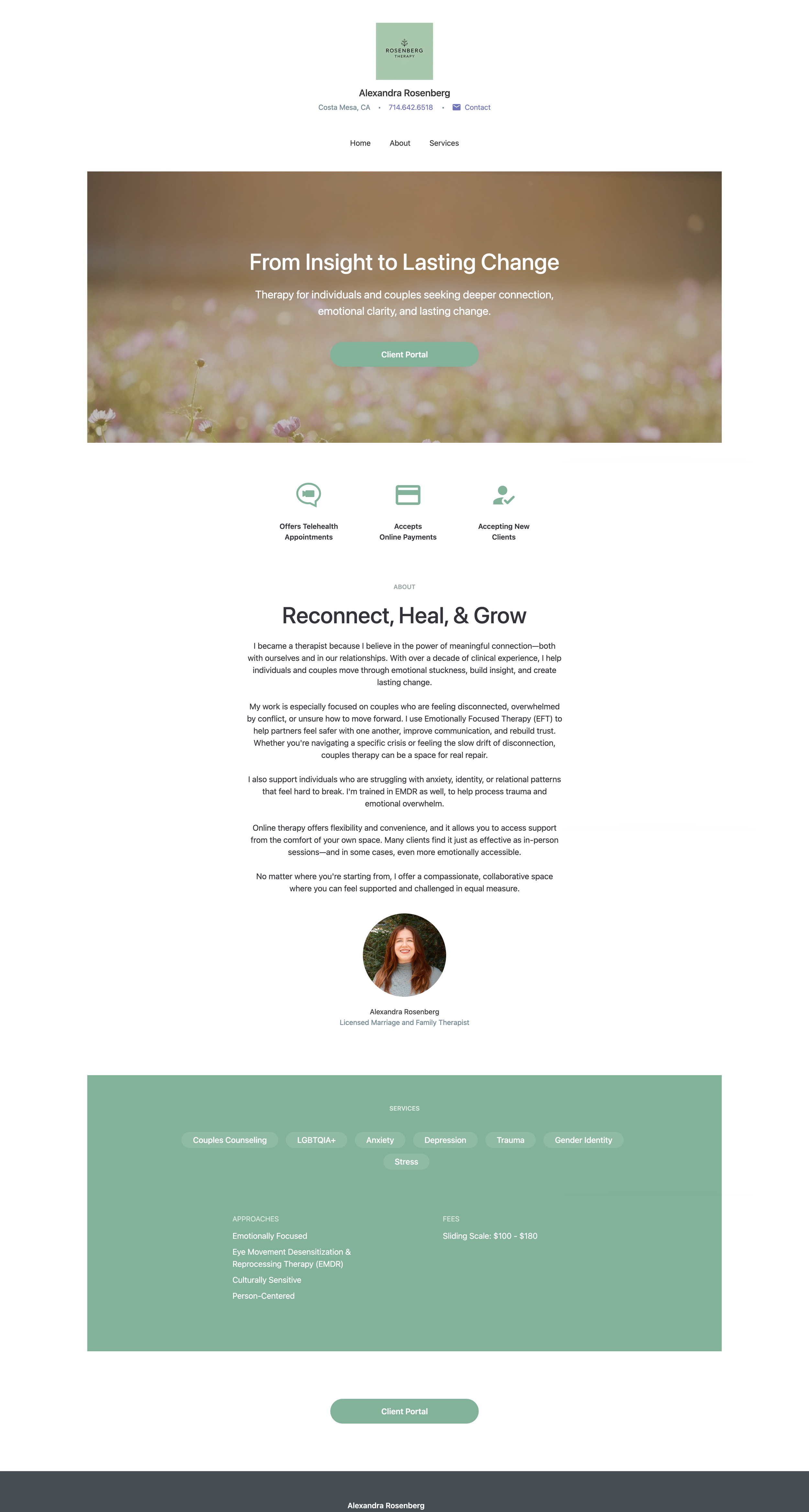
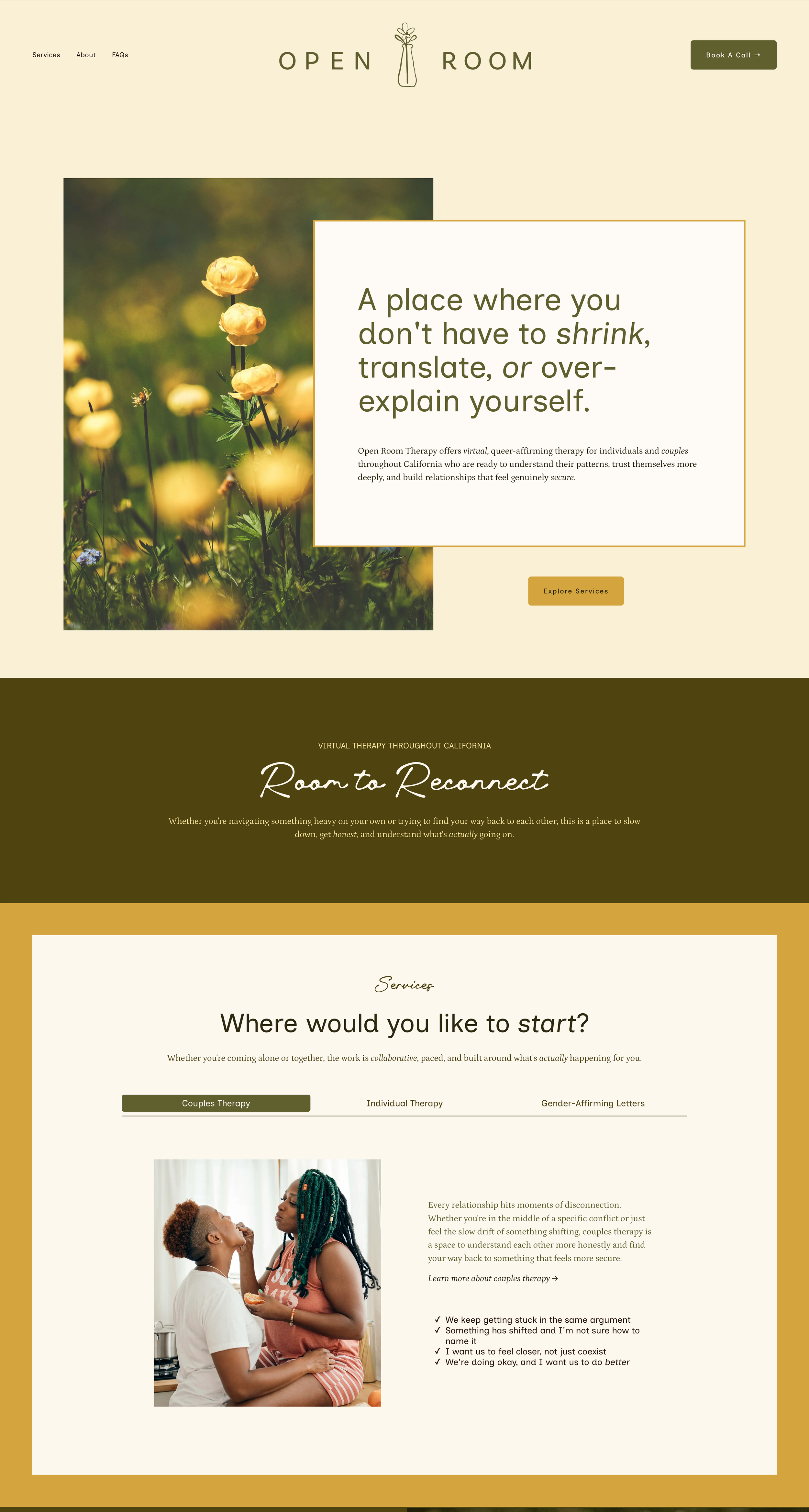
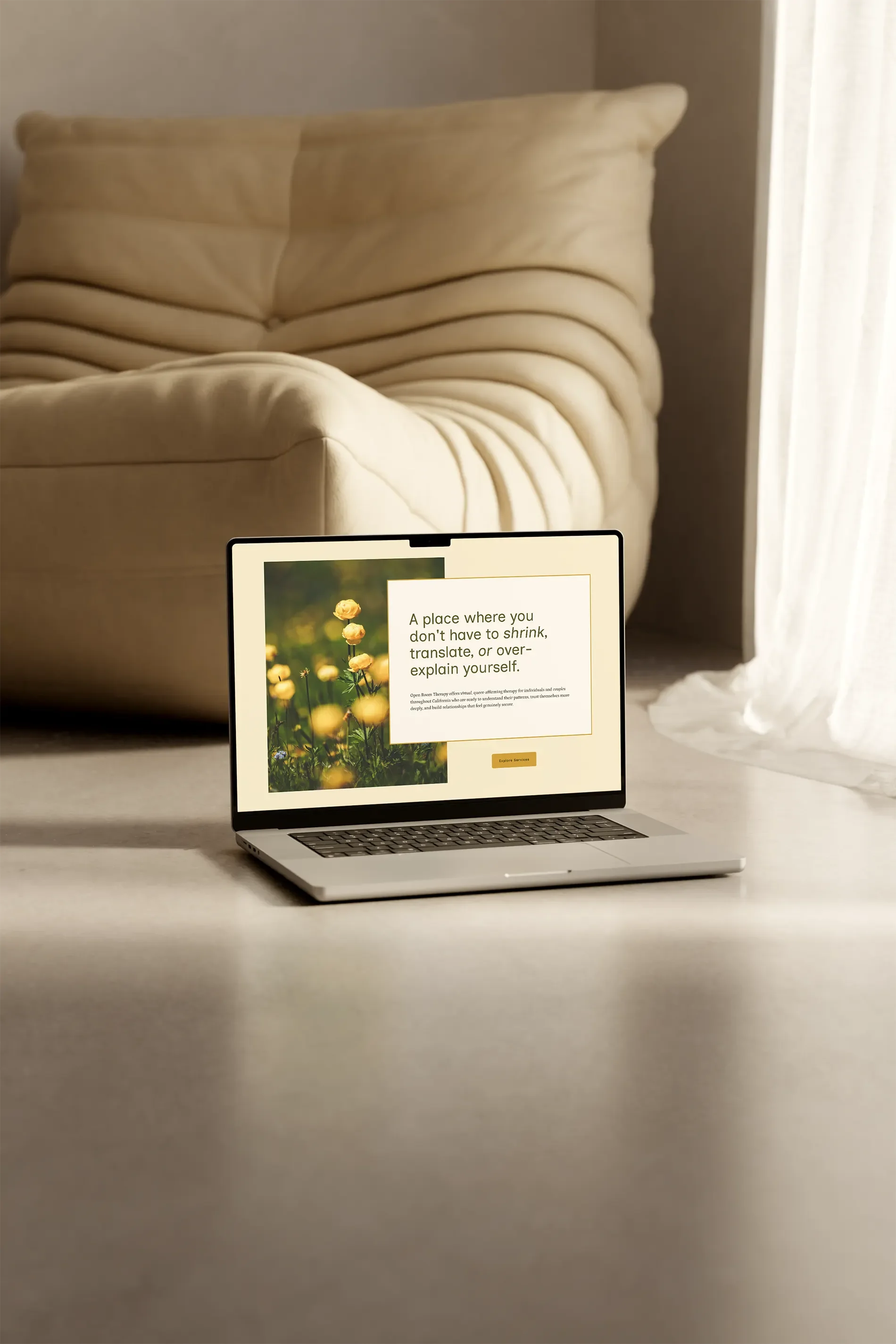
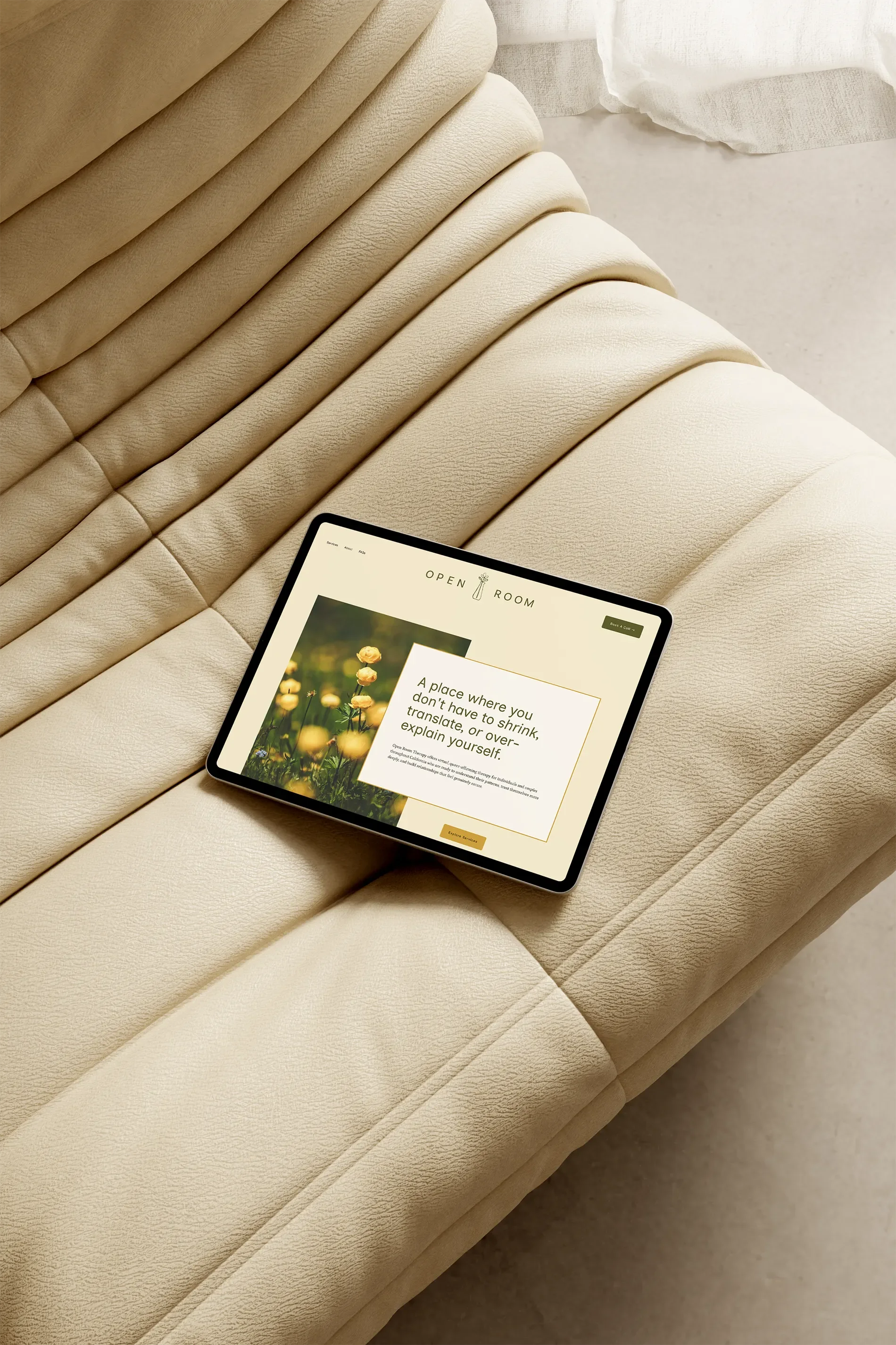
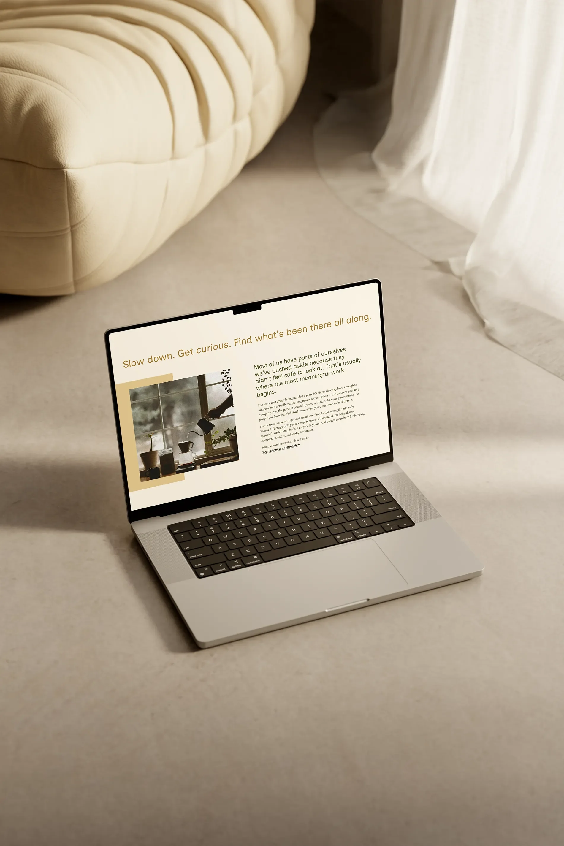
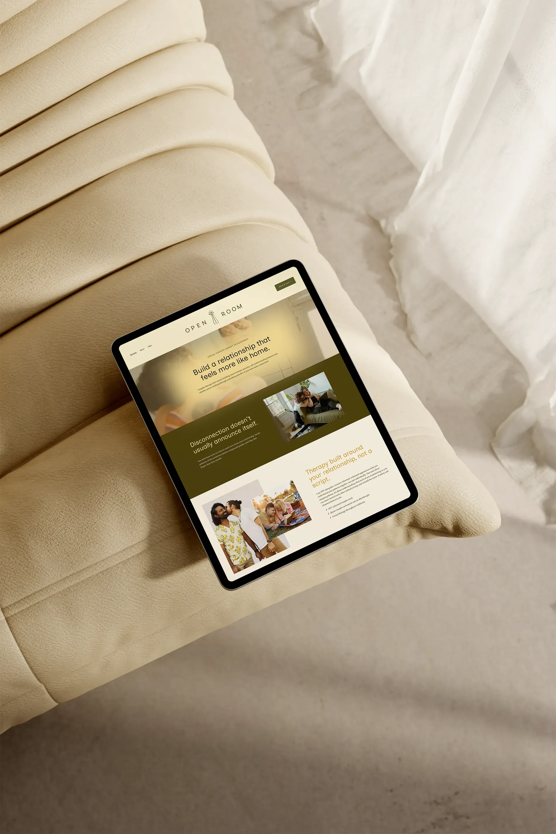
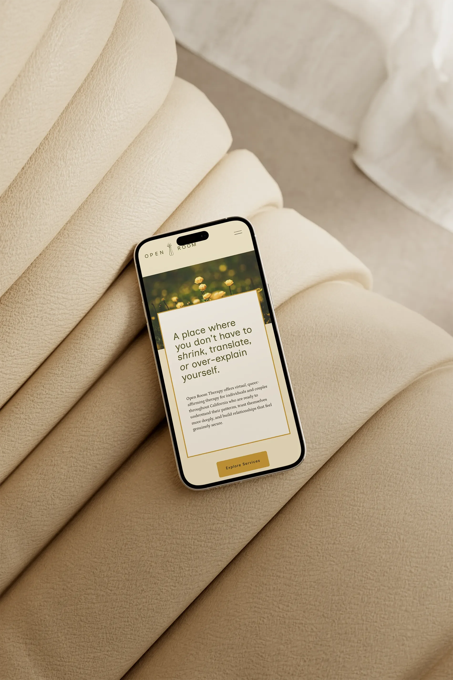
Now we needed somewhere to put it all. Since Alexandra had never had a dedicated website for her practice, I got to build her Squarespace site from the ground up.
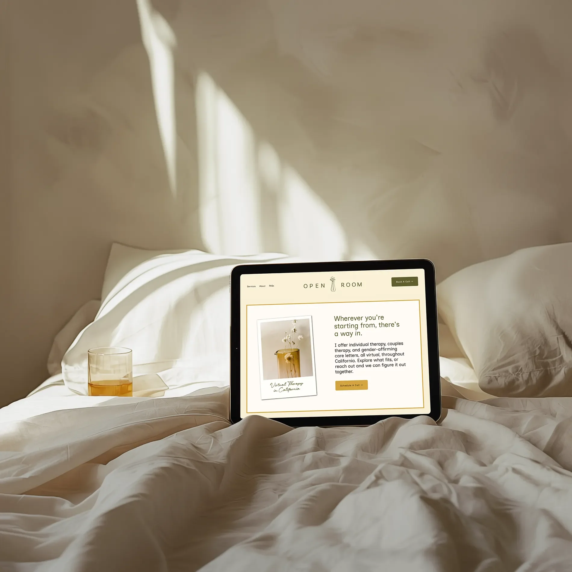
I wanted the website to feel like an extension of the space we'd imagined together: warm, open, comfortable, and full of personality.
I built the visual experience around generous breathing room, warm photography, soft golden accents, and typography that felt inviting and easy to read. Throughout the site, I brought in sunlit interiors, natural materials, flowers, and the kind of everyday details that make a room feel welcoming. Alexandra's new bookstore portraits fit right into that world, giving the whole website a consistent feel. Of course, it also needed to be easy to use. (A beautiful website isn't much help if nobody can figure out where to click.) I wanted someone landing on the site to quickly understand who Alexandra is, who she works with, and what makes her approach different. Clear navigation and thoughtful calls to action help visitors move through the information and find the next step when they're ready.
And because Alexandra provides virtual therapy throughout California, I made sure the messaging clearly communicated who she serves and where she practices. I incorporated foundational SEO throughout the site, optimizing each page to help search engines understand her services, specialties, and location. After years of relying almost entirely on a Psychology Today profile, Alexandra finally had her own corner of the internet that people could discover, explore, and share.
All those decisions came back to the same question I'd been asking since the beginning: what would it feel like to step into Alexandra's therapy room?
“Open Room feels like the space I try to create in my work. I take my work seriously, but I am not a deeply serious person all the time. I think that's a strength in my work, which is how I bring myself into it, and that feels like it's captured in what you put together.”
The RESULT: A Practice She's Excited to Put Out Into the World
One of the things I loved most about Alexandra's feedback wasn't that she thought the website was beautiful.
(Although, yes, I'll happily take that compliment.)
It was how differently she felt about her business afterward.
Before the project, Alexandra had been focusing on strengthening her clinical skills and doing the work she loved. But the business side of her practice hadn't received that same attention. She didn't have a website she was excited to send people to. She didn't have a brand that made networking feel especially motivating.
Now? She wants everyone to see it. She's excited to update her Psychology Today profile and LinkedIn. She's motivated to network, share her work, and start growing the practice in a way she hadn't felt ready to before.
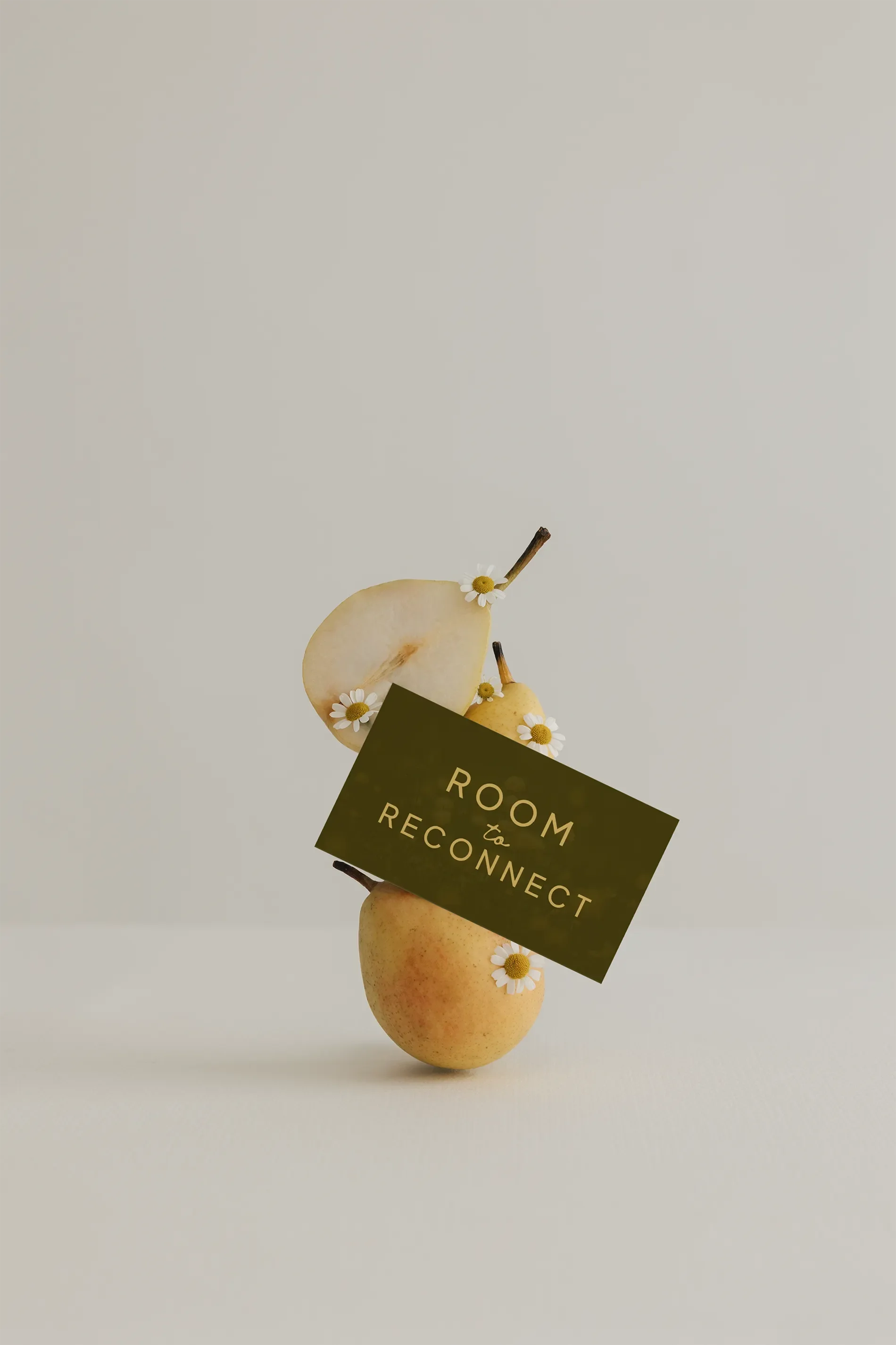
A brand should be something you actually want to use. Something you're excited to share, put on your business cards, add to your email signature, and send to someone who asks what you do.
"I can't get over how excited I feel about my business. I have really focused on strengthening my clinical skills over the past few years, but now I feel like I can turn my attention to the business side of things."
More Than a New Name and a Pretty Website
What started as Rosenberg Therapy, a practice with no dedicated website and a name Alexandra wasn't particularly attached to, became Open Room Therapy.
A brand with a story.
A visual identity with personality.
Photography that feels like her.
And a website that finally gives her practice a proper home.
She has the pieces she needs to start putting herself out there: a clear identity, a consistent message, and a website she genuinely loves sharing. And for me, that's seriously one of the best parts of doing this work. Getting to know someone, listening to all the things they tell me about their business, noticing the little details they might not realize are important, and figuring out how to bring it all together.
Until one day they see everything and say, Oh. That's me. And sometimes, if we're lucky, there's a really good bookstore involved.
There's Room for You Here.
Curious about Open Room Therapy? Visit Alexandra's website to explore her approach to individual and couples therapy, and see the full brand in action.
Explore Open Room Therapy →
Your Business Deserves a Little Room to Grow, Too.
Maybe you've been running your business for years without a proper website.
Maybe you've outgrown the name you started with.
Maybe you know exactly how you want people to feel about your business, but you have absolutely no idea how to make that happen visually.
That's where I come in.
You don't need to show up with a perfectly organized vision, a Pinterest board full of answers, or even a business name you're completely sold on. We can figure that part out together.
Let's Make Some Room for Your Next Chapter →