
Sage Psychiatry: Branding a Mental Health Practice That Wasn't Afraid to Stand Out

TL;DR: Tiffany Futrell had built a specialized perinatal psychiatry practice, but her DIY website wasn't communicating what made her different. I created a colorful, personality-filled brand and redesigned her Squarespace website to balance her clinical expertise with her warmth, humor, and refreshingly human approach to mental health care. We carried that same vision into her brand photography (including a handmade floral blouse that deserves its own moment) and social media templates. Shortly after launch, Tiffany reported more website engagement, a record number of intakes over a two-week period, and an investment that had already paid for itself.
When Your Website Looks Like Everybody Else's
Brand Strategy + Visual Identity · Messaging · Brand Photography · Squarespace Website Redesign · Social Media Templates · Brand GuidelinesWhen Tiffany Futrell started building her website for Sage Psychiatry, she did what a lot of small business owners do when they're figuring things out on their own:
She looked at other websites in her industry and used them as a guide.
Which seems perfectly reasonable…until you realize that everyone else might be doing exactly the same thing.
Tiffany is a psychiatric nurse practitioner specializing in perinatal mental health, providing care for people navigating pregnancy, postpartum, and all the complicated changes that can come with them. She has a specific approach to her work, specialized expertise, and a personality that doesn't exactly scream generic healthcare website. But you wouldn't have known much of that from her original branding.
The copy played it safe, her personality was missing, and her specialization wasn't immediately obvious. She was also having trouble getting found online unless someone was already searching for her specifically.
As Tiffany put it:
"Even when you did find it, there was nothing to distinguish it from the hundreds of other private practices that looked just like it."
She knew she wanted something different. Something that felt more like her. The problem was that she wasn't entirely sure how far she could push things without compromising her professional credibility. And I could understand the hesitation. Mental health branding has some pretty established visual conventions. Soft colors, soothing language, delicate illustrations, the occasional strategically placed houseplant. There's a reason those things are popular, but they weren't particularly representative of Tiffany.
So we had an interesting challenge: create a brand that could communicate specialized psychiatric expertise while making room for the funny, candid, colorful person providing that care.
And maybe retire a few of those stock photos of plants while we were at it. 😉
Serious About Mental Health. Less Serious About Everything Else.
One of the things I liked about Tiffany right away was how clearly her personality came through when we talked. She's knowledgeable, direct, warm, and funny. She takes her work seriously, but she doesn't seem particularly interested in making the experience of psychiatric care feel more intimidating than it already can. That distinction became an important part of the brand strategy.
Sage Perinatal Psychiatry provides specialized, evidence-based mental health care. Its audience includes people navigating experiences that can be exhausting, confusing, frightening, joyful, and sometimes all of those things before breakfast.
The brand needed to make room for that complexity.
I wanted someone visiting the website to feel like they could bring their whole experience into the conversation, including the messy, uncomfortable, less-than-Instagram-worthy parts.
We built the brand around three guiding values:
Take It Seriously.
Talk Like a Human.
Make Room for Hope.
They gave us a useful filter for everything that followed. We could use humor, but it had to feel appropriate. We could be optimistic without minimizing someone's experience. And we could communicate clinical expertise in language that sounded like it came from an actual person.
One of the brand statements we developed sums it up pretty well:
Care that takes you seriously without making everything feel so damn serious.
That became the spirit of Sage.

Goodbye, Pastel Therapy Website.
Once we established the brand's personality, we could have some fun with the visual identity. Tiffany was ready to move beyond the usual mental health aesthetic, although she was understandably nervous about how something bolder might be perceived.
I wanted to give her a visual identity that felt modern, expressive, and a little unexpected, while still being appropriate for a specialized psychiatric practice.
We landed on a palette of burnt orange, periwinkle, pink, golden yellow, warm neutrals, and deep plum. Some of the colors have names like Vitamin C, Not Barbie, Daydream Blue, and 3 A.M. Which feels pretty appropriate for a brand centered around pregnancy and postpartum life, if you ask me.
The brighter colors bring energy and optimism, while the deeper shades keep everything grounded. Used together, they give Sage plenty of personality without overwhelming the information or making the brand feel childish.

The logo is another favorite detail.
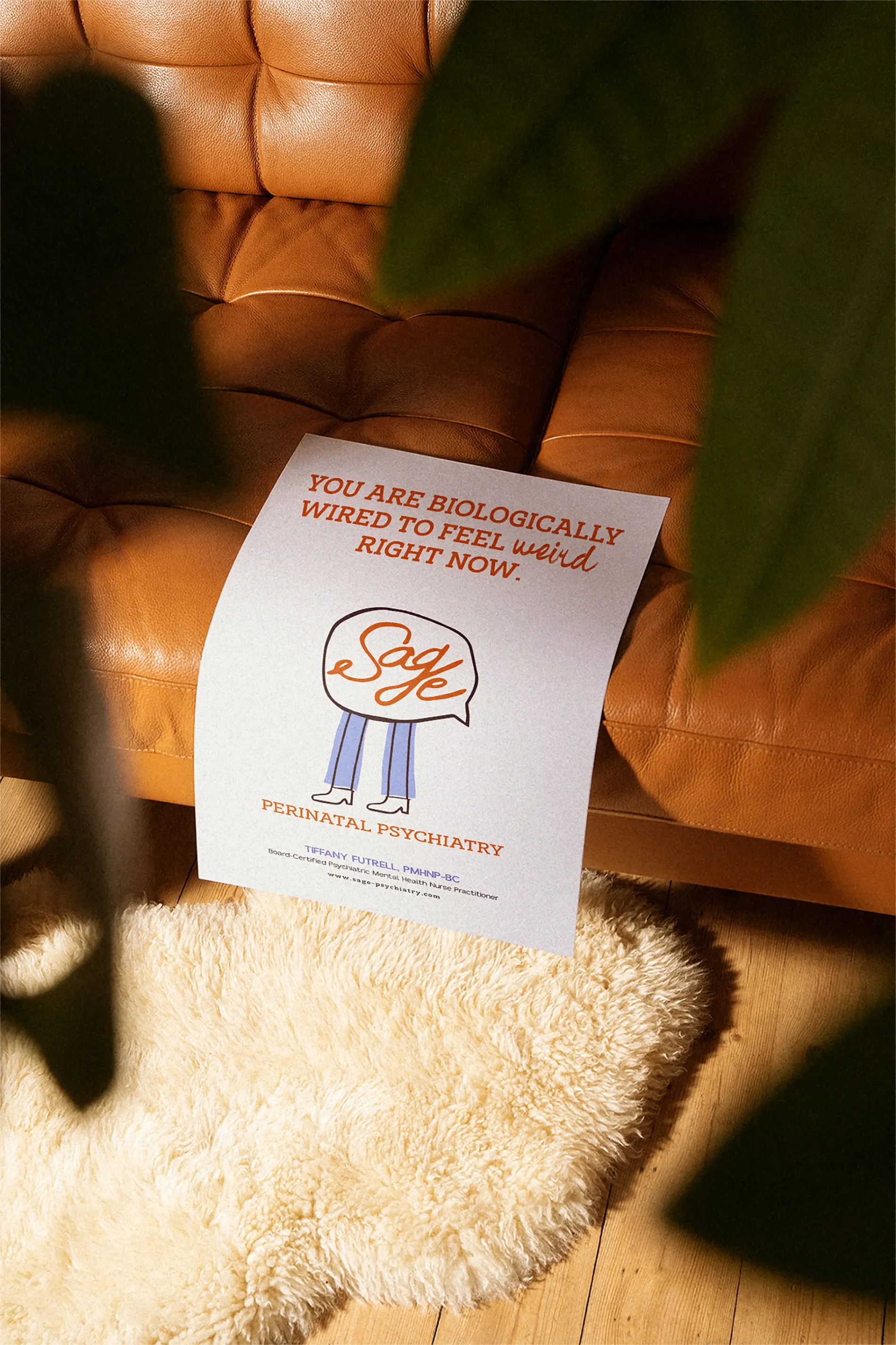
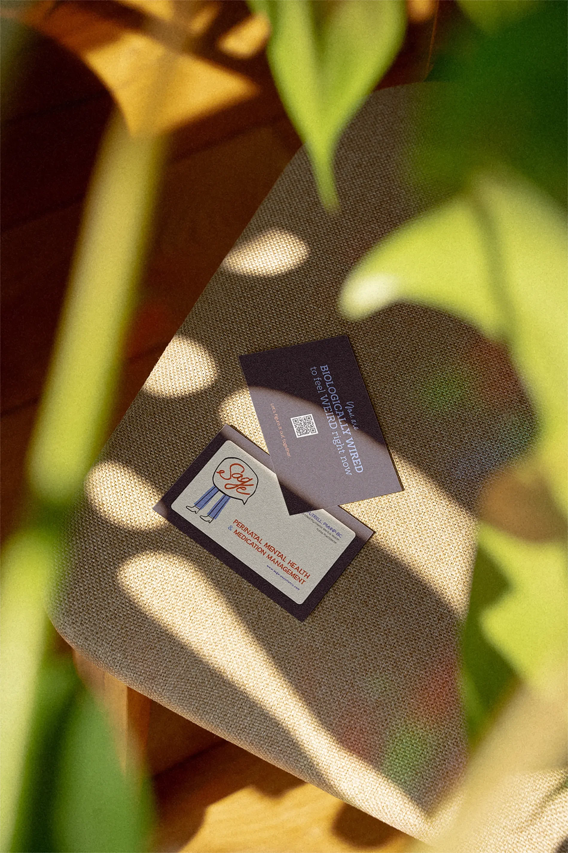
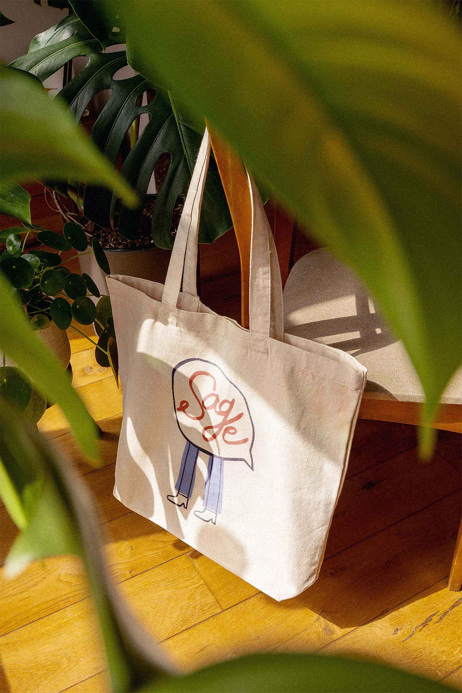
Its expressive lettering sits inside an imperfect speech-bubble shape, a nod to the conversations and human connections at the heart of Tiffany's work.
It feels playful, personal, and recognizable, with supporting logo variations that give her flexibility across different applications.
And it looks nothing like the generic healthcare branding she was hoping to leave behind.
"They're bold and a little bit playful while not trivializing the important work that I do."
That was especially nice to hear because Tiffany had been so concerned about finding that balance in the beginning.
And Yes, We Had a Few Revisions.
Here's something I think is worth talking about:
I don't always nail the creative direction on the first try.
My initial brand presentation for Tiffany missed the mark. She gave me feedback, we talked through what wasn't feeling right, and I went back to work.
No hurt feelings. No awkwardness. No need to pretend she loved something she didn't.
I think clients sometimes worry that giving a designer negative feedback will be uncomfortable, especially when they've invested a lot of money in the process. But feedback is part of the job. I have plenty of ideas, but I'm also working with someone else's business, personality, and vision. I want them to feel comfortable telling me when something isn't clicking.
“Amber heard everything that I said and actually listened. When there was something I wanted to be changed, it was really minor, and Amber was really good at making sure she understood exactly what it was that I wanted to be different.”
By the time we arrived at the final identity, Tiffany felt that we'd found exactly the balance she'd been looking for. And perhaps more importantly, she knew she could speak up throughout the process and that I'd listen.
I promise I'll still like you if you don't love the first logo.
Probably even if you hate it. We're adults here.
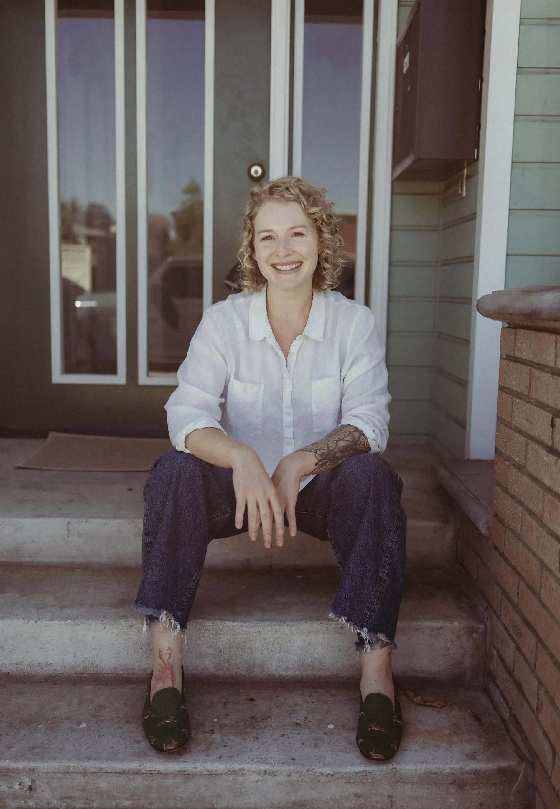
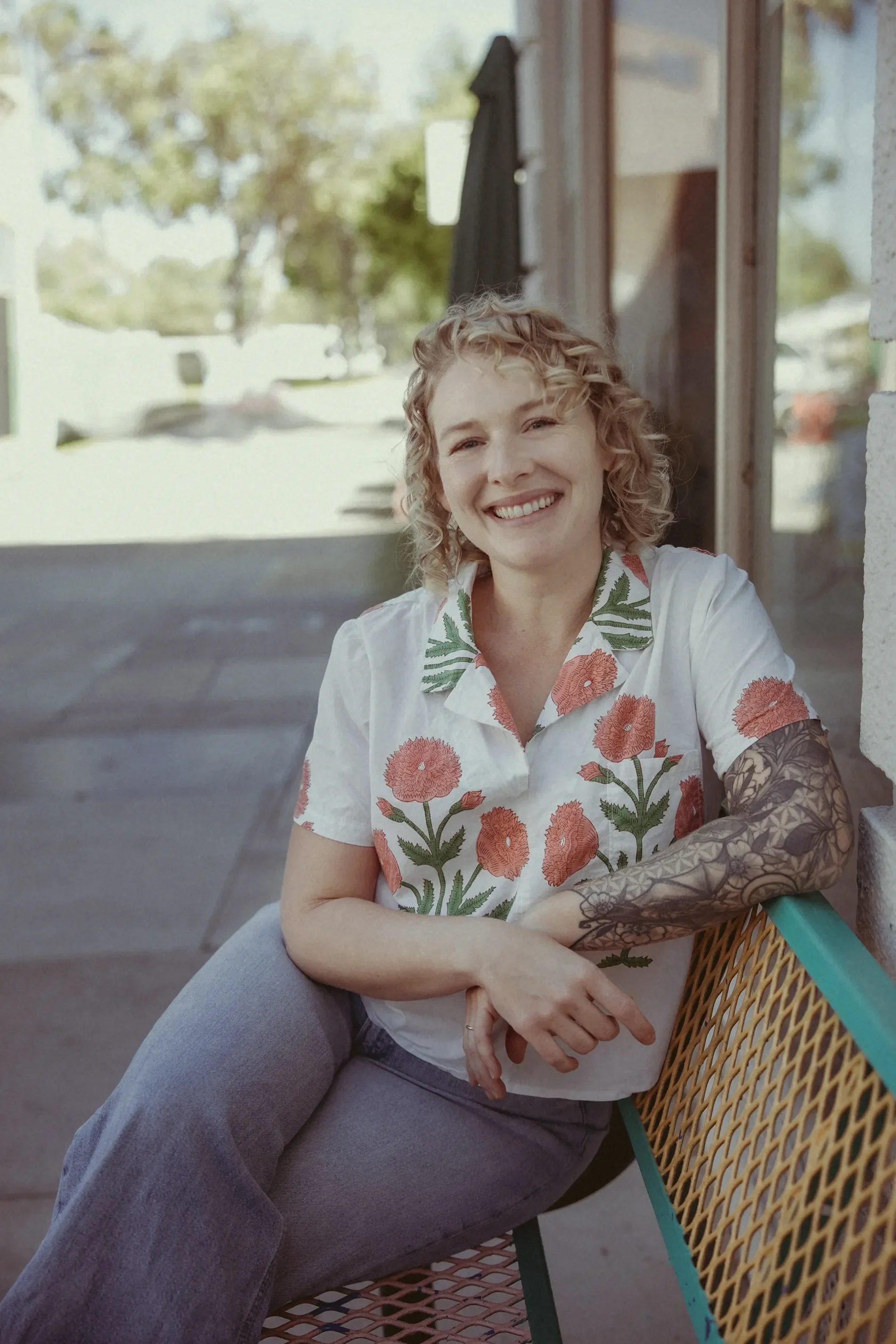
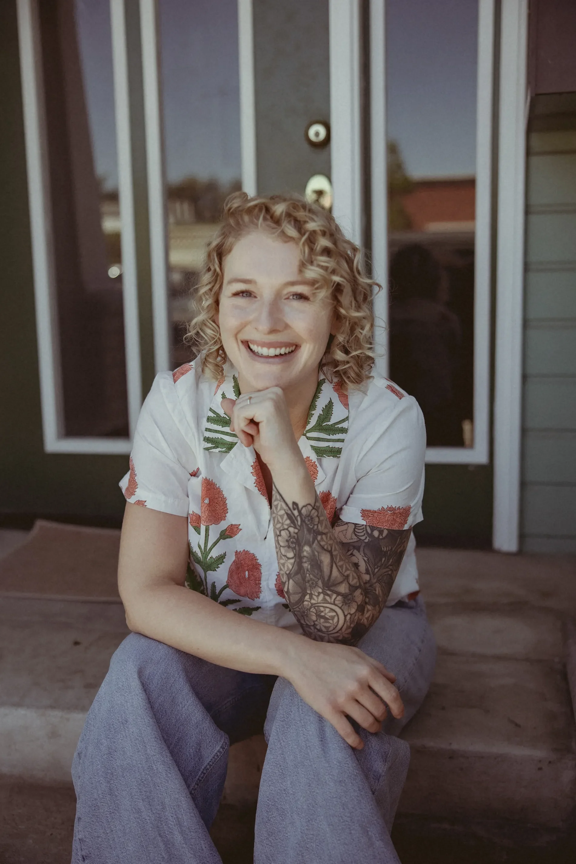
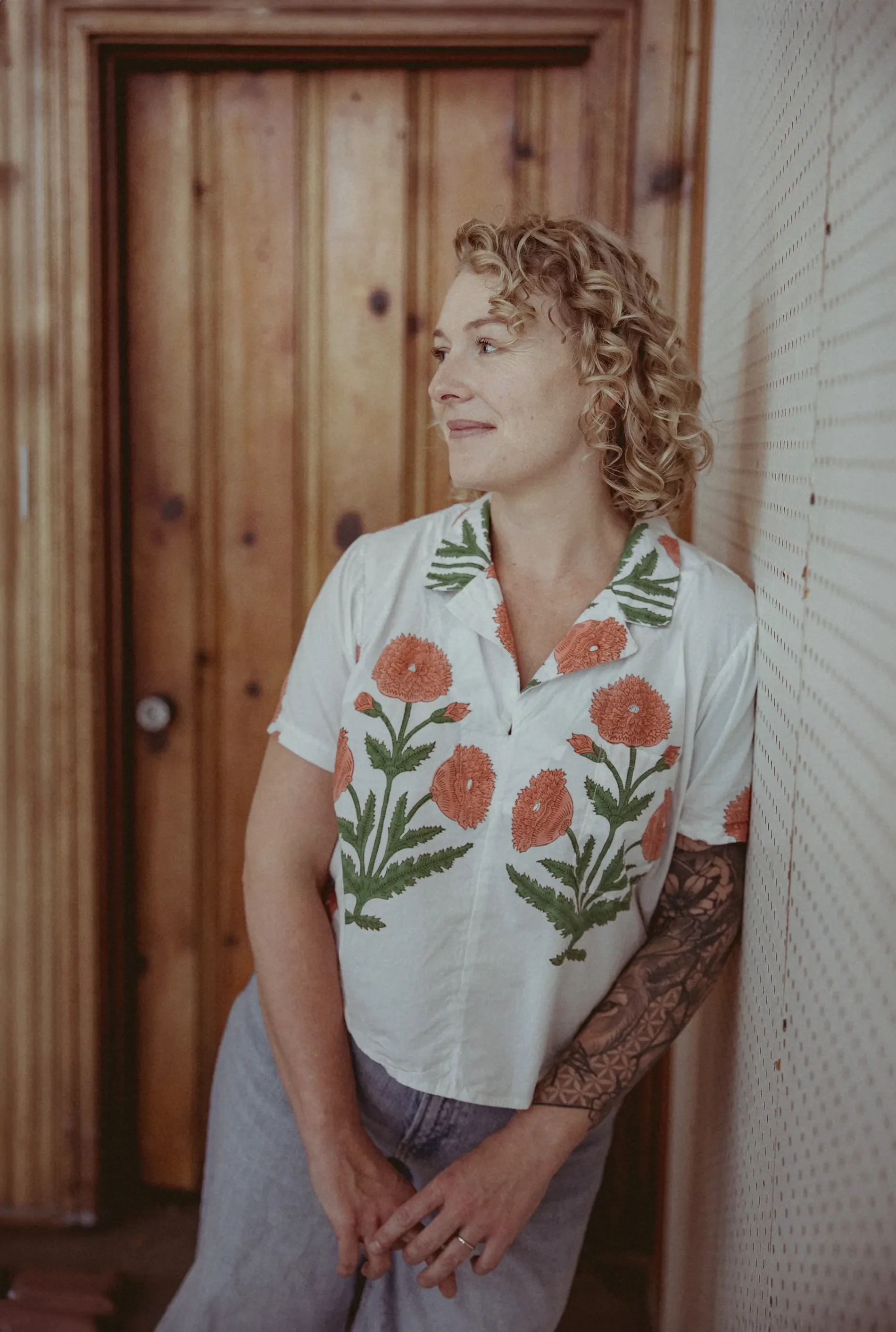
Turns Out, You Don't Have to Dress Like a Therapist, Either.
During our initial consultation, Tiffany told me something that stuck with me. When she'd taken her original headshot, she'd put on a gray zip-up sweater because that's what she thought she was supposed to wear.
And that sounded awfully familiar.
She'd approached her original website by looking at what other mental health professionals were doing. Apparently, she'd applied the same logic to her wardrobe.
For our brand photography session, I encouraged her to bring some personality into the mix: wear something you love. Something that feels like you. Have a little fun with it. Professional doesn't have to mean predictable.
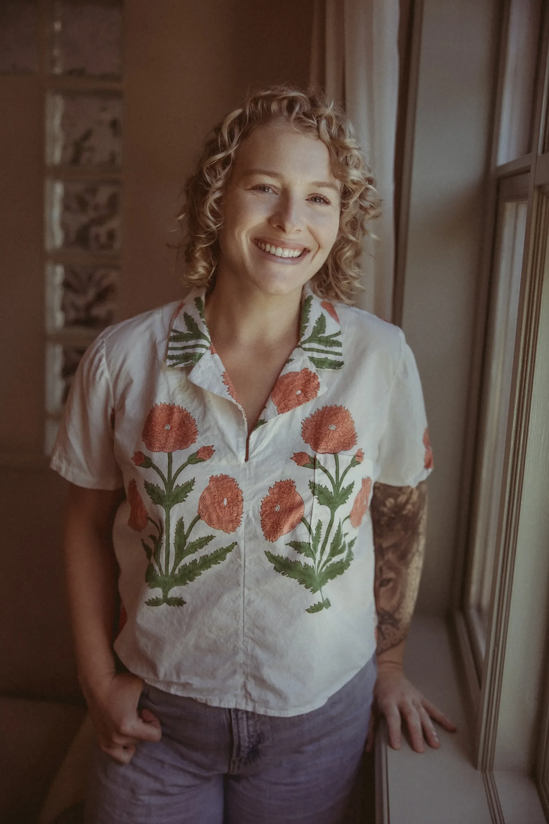
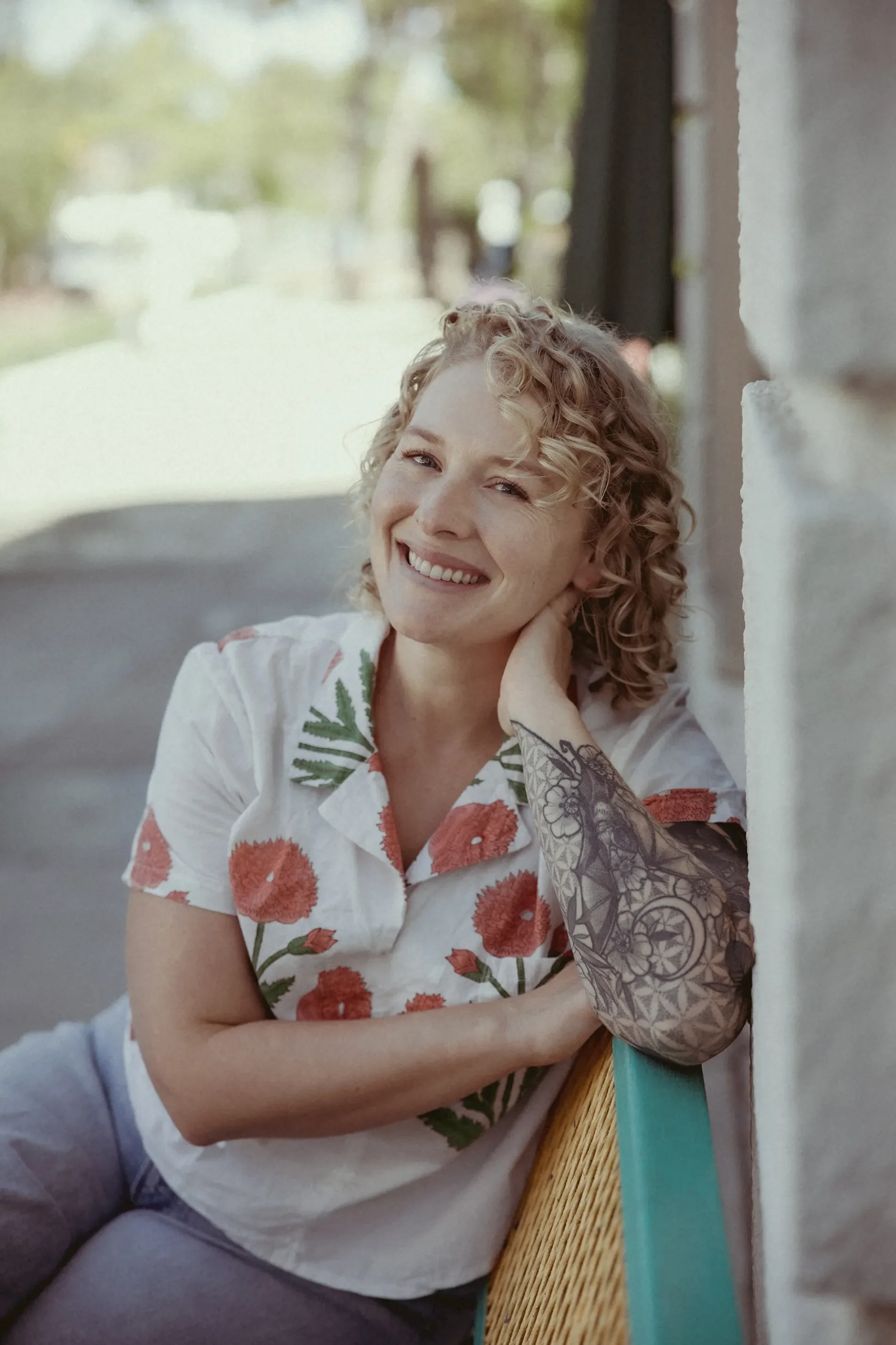
And then she showed up wearing a floral blouse she'd MADE HERSELF. I mean, COME ON.
Of course we were going to photograph that.
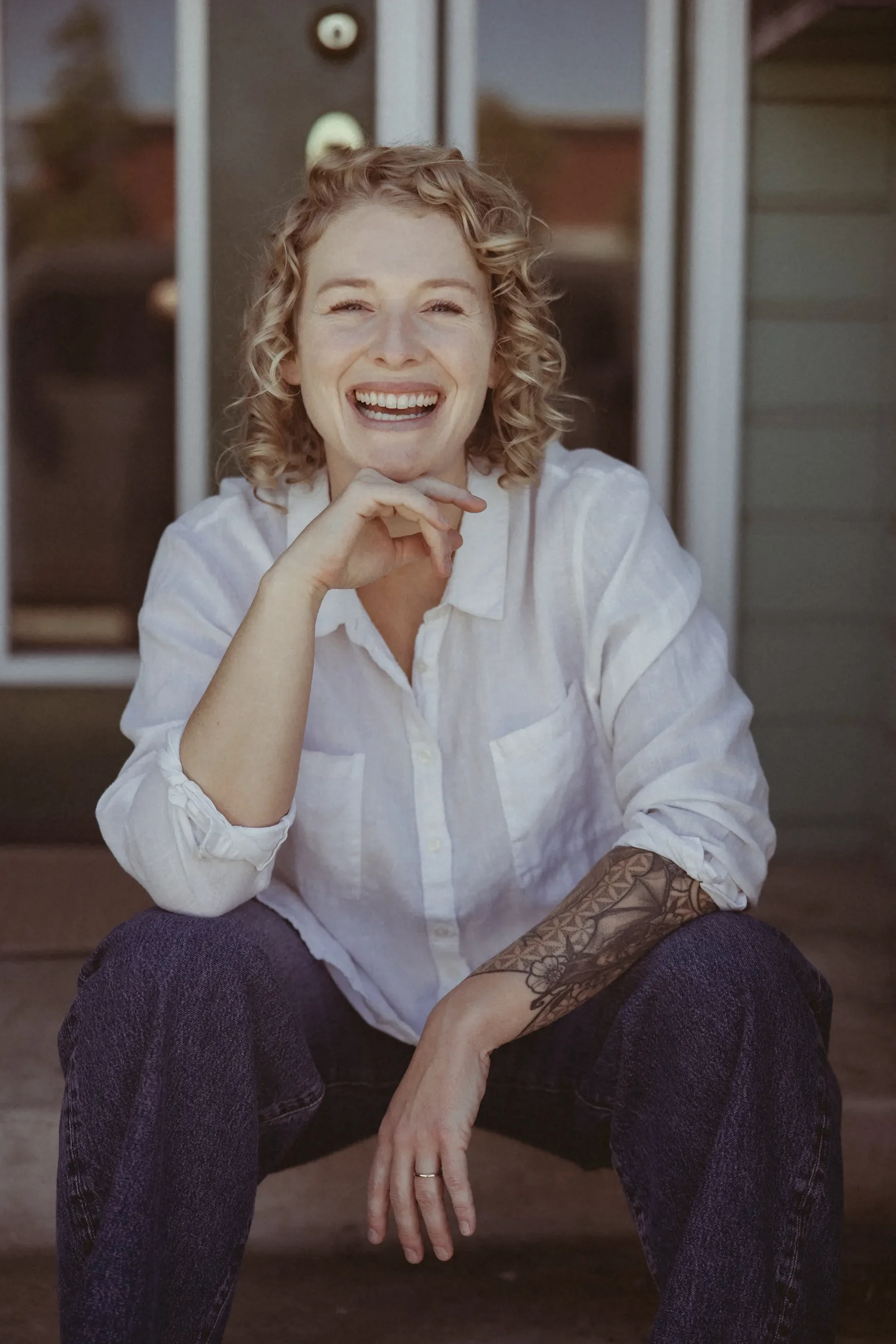
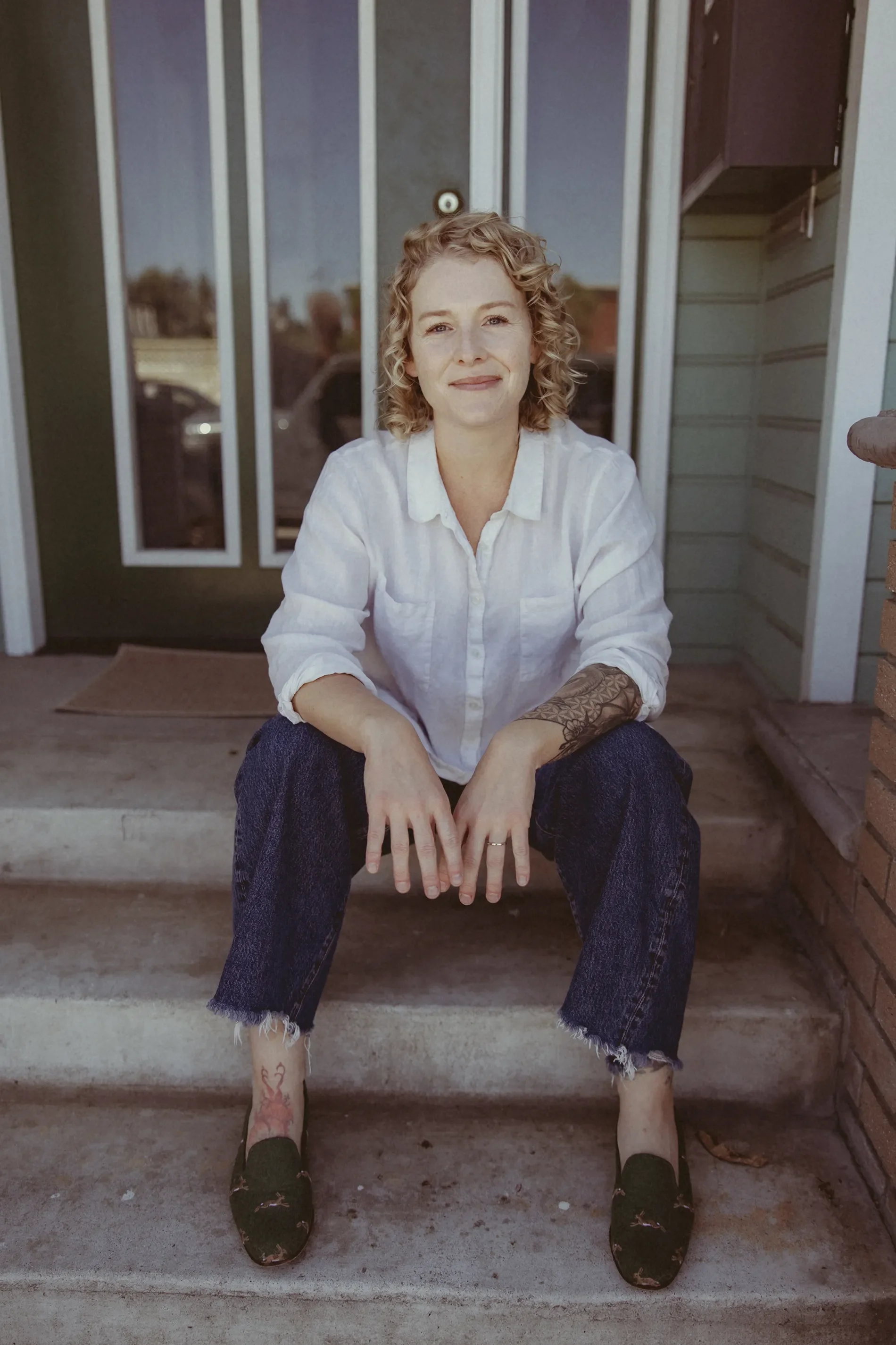
We created a collection of warm, natural portraits that felt relaxed and approachable. The handmade blouse brought in beautiful color and personality, while some of the more candid images captured Tiffany laughing and looking completely at ease. Those photographs feel right at home in the Sage brand.
And because I was handling the photography alongside the branding and website design, I could approach the entire session with the finished experience in mind. I thought about the colors, the lighting, the mood, and how the images would work in different areas of the website. We could create wider compositions for banners, closer portraits for introductions, and supporting images that would feel cohesive wherever Tiffany used them.
This is one of my favorite parts of combining photography with brand and web design. Everything gets to belong to the same visual world from the beginning.
And that handmade blouse? I think it's a perfect little reminder that the things that make us different are often the things worth showing.
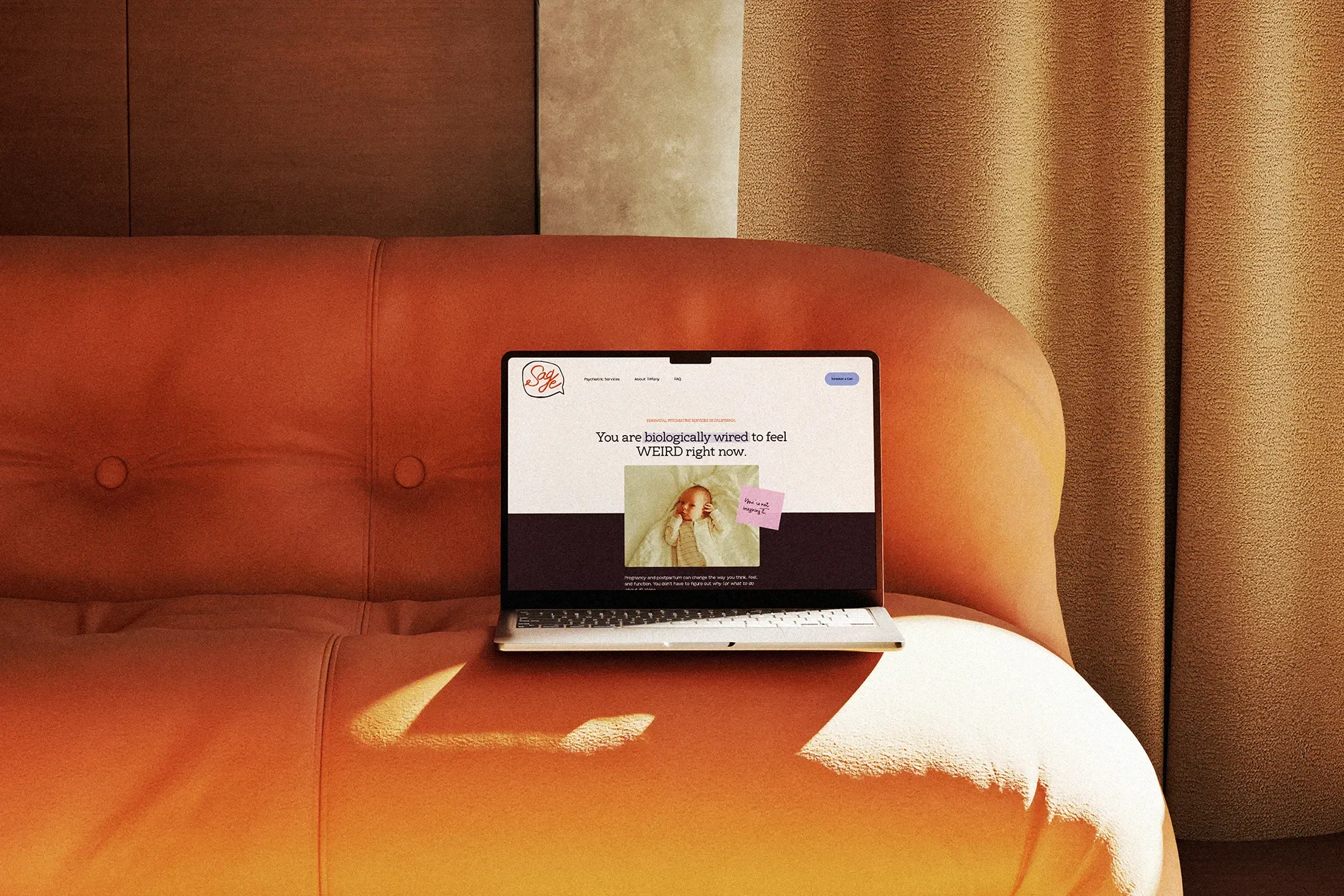
A Squarespace Website With a Little More Personality
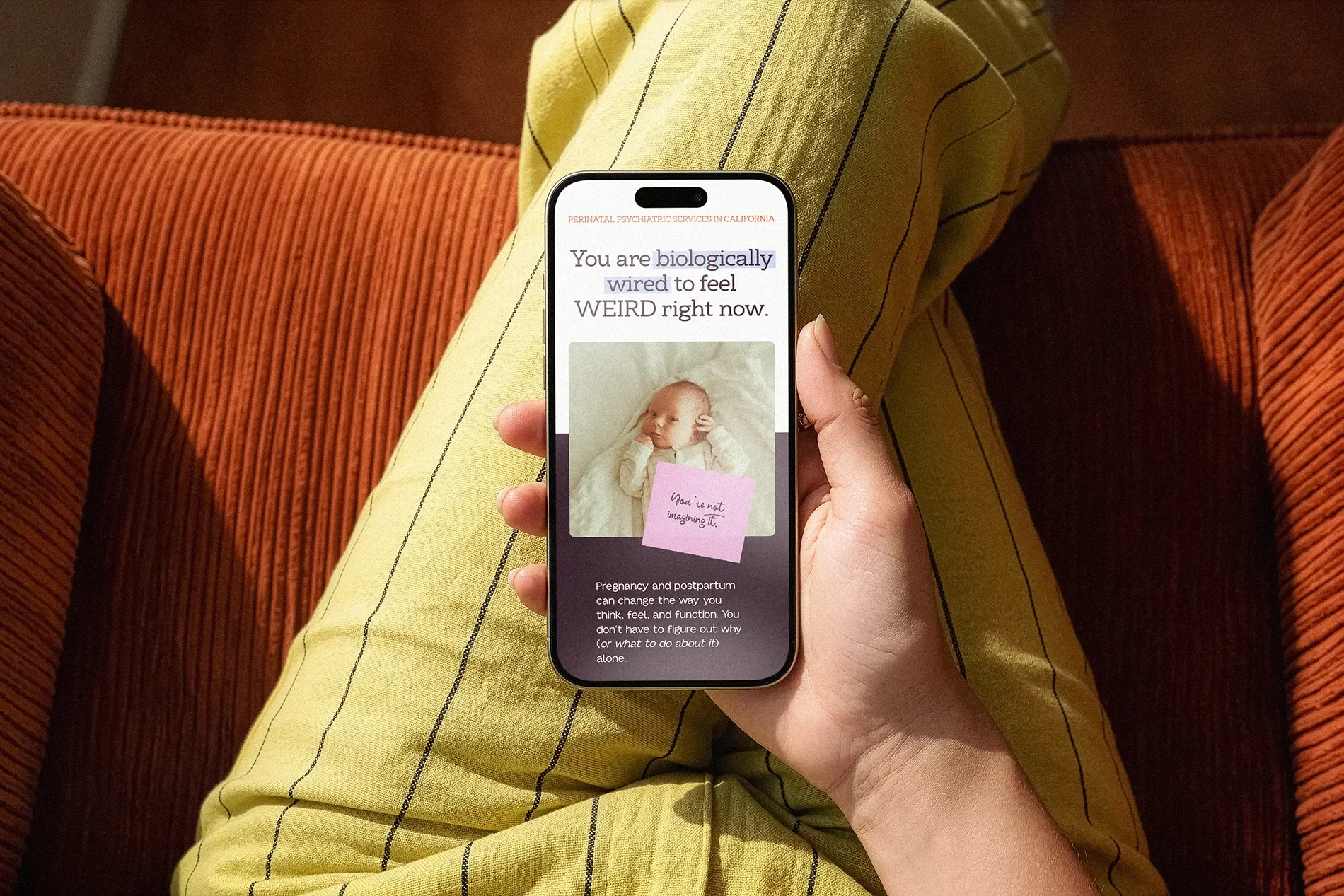
With the brand identity and photography established, it was time to bring everything together online.
Tiffany was already using Squarespace, so we could focus on redesigning the experience rather than moving her to a new platform.
The new website needed to accomplish a few things:
Make Tiffany's specialization immediately clear
Explain her approach to care
Help visitors navigate the services she offers
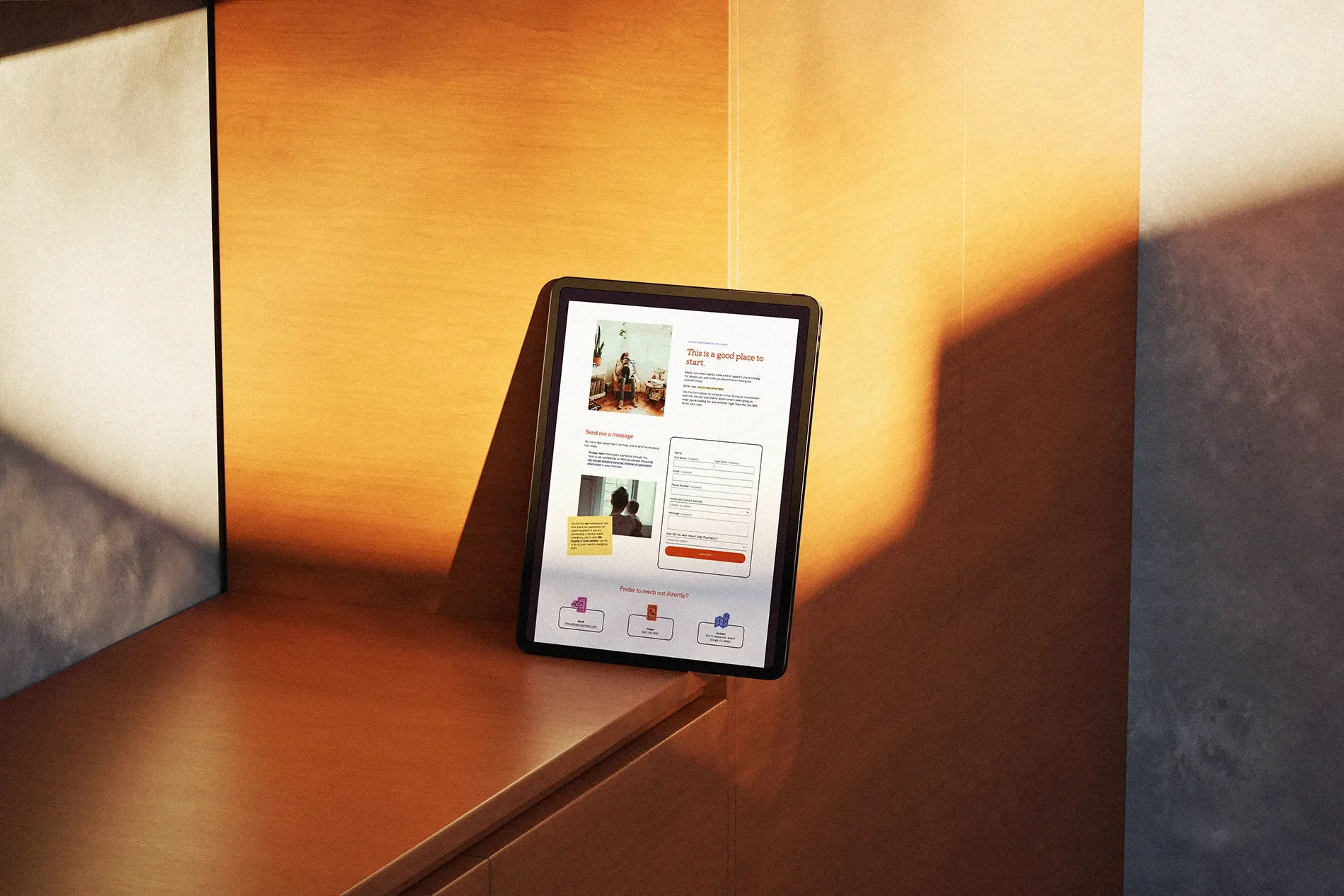
Give prospective patients a straightforward way to take the next step
It also needed to sound like Tiffany
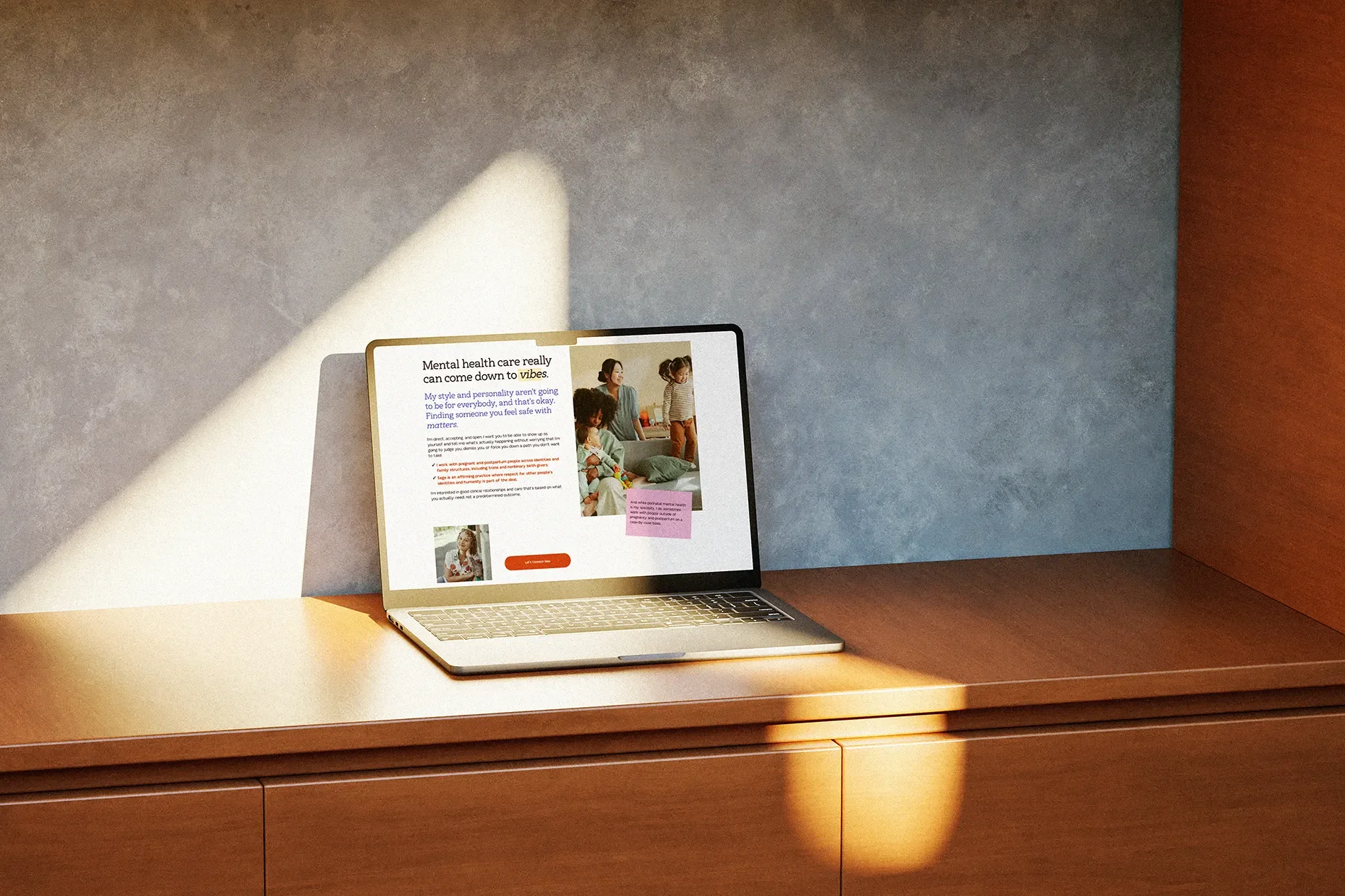
Mental health care can involve complicated, sometimes intimidating information. I wanted the website to make that information easier to understand without talking down to anyone or oversimplifying their experience.
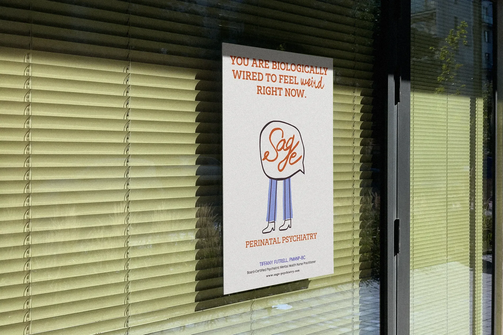
One of my favorite headlines from the site comes from what Tiffany actually says to her clients:
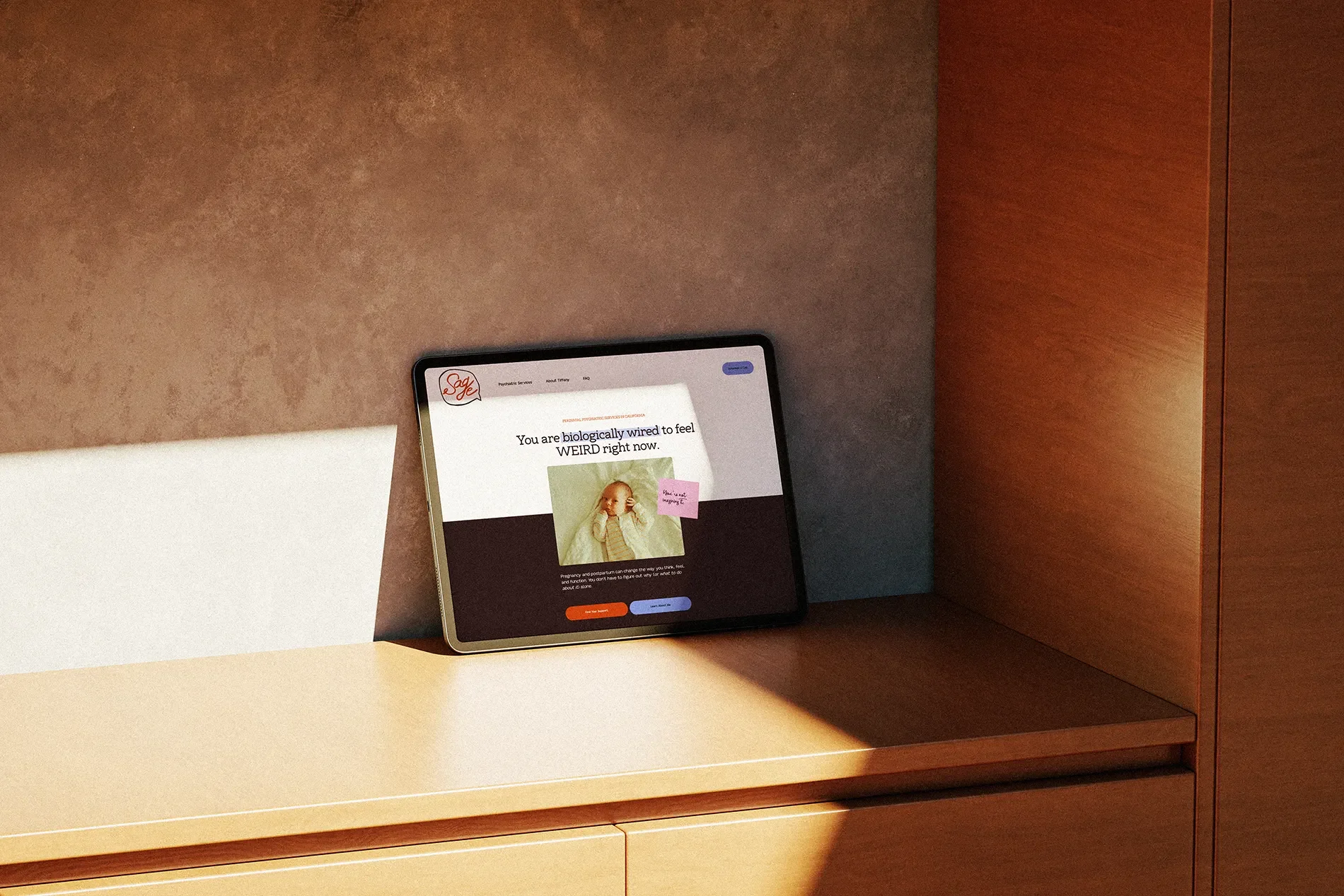
You are biologically wired to feel WEIRD right now.
It's a pretty good example of the voice we developed for Sage. It's conversational, slightly unexpected, and gives someone permission to recognize that what they're experiencing might be complicated.
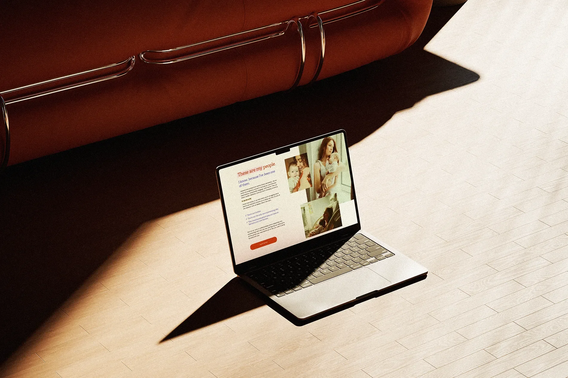
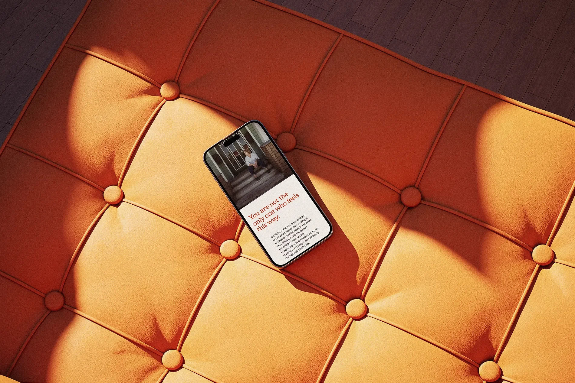
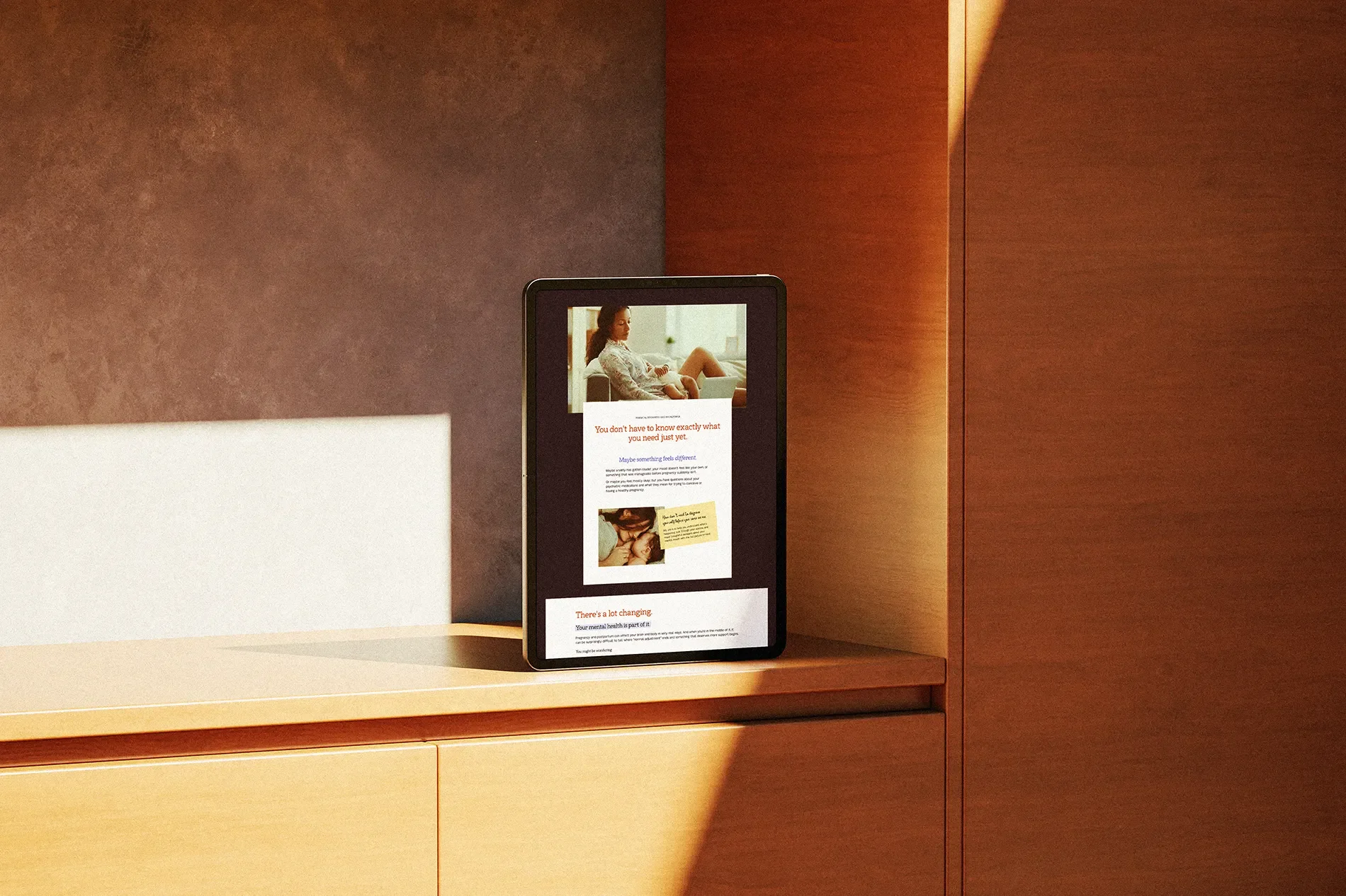
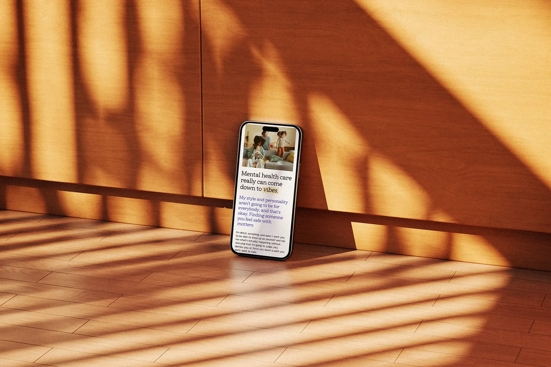
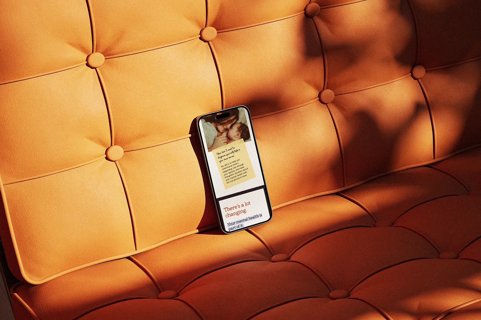
The website uses expressive typography, bold color, and candid imagery to create those moments of personality, while the supporting content stays clear and grounded in Tiffany's specialized expertise.
I also paid attention to how visitors would move through the site. Someone arriving on the homepage should be able to understand what Sage does, who Tiffany works with, and whether the practice might be a good fit without having to dig through several pages of generic information. Clear navigation, organized service content, readable layouts, and thoughtful calls to action help guide visitors toward the information they need.
The photography was especially important here.
Rather than relying on picture-perfect images of motherhood, the visual direction makes room for the full range of experiences that can accompany pregnancy and postpartum life. Joy, exhaustion, uncertainty, tenderness, connection. Real life, basically.
All of those choices contribute to a website that feels distinctive while remaining useful to the people who need it. And after spending so much time developing the brand's personality, it was especially satisfying to see everything finally working together.
And Because a Brand Has to Live Somewhere Besides a Website...
I also created a collection of branded social media templates so Tiffany could carry Sage's new identity into her Instagram presence.
The templates use the same expressive typography, bold colors, illustrations, and speech-bubble elements we developed for the brand, with layouts designed for educational content, service information, announcements, and the occasional reminder that pregnancy and postpartum can be a pretty wild ride.
I wanted Tiffany to have something she could actually use without needing to reinvent the design every time she wanted to post.
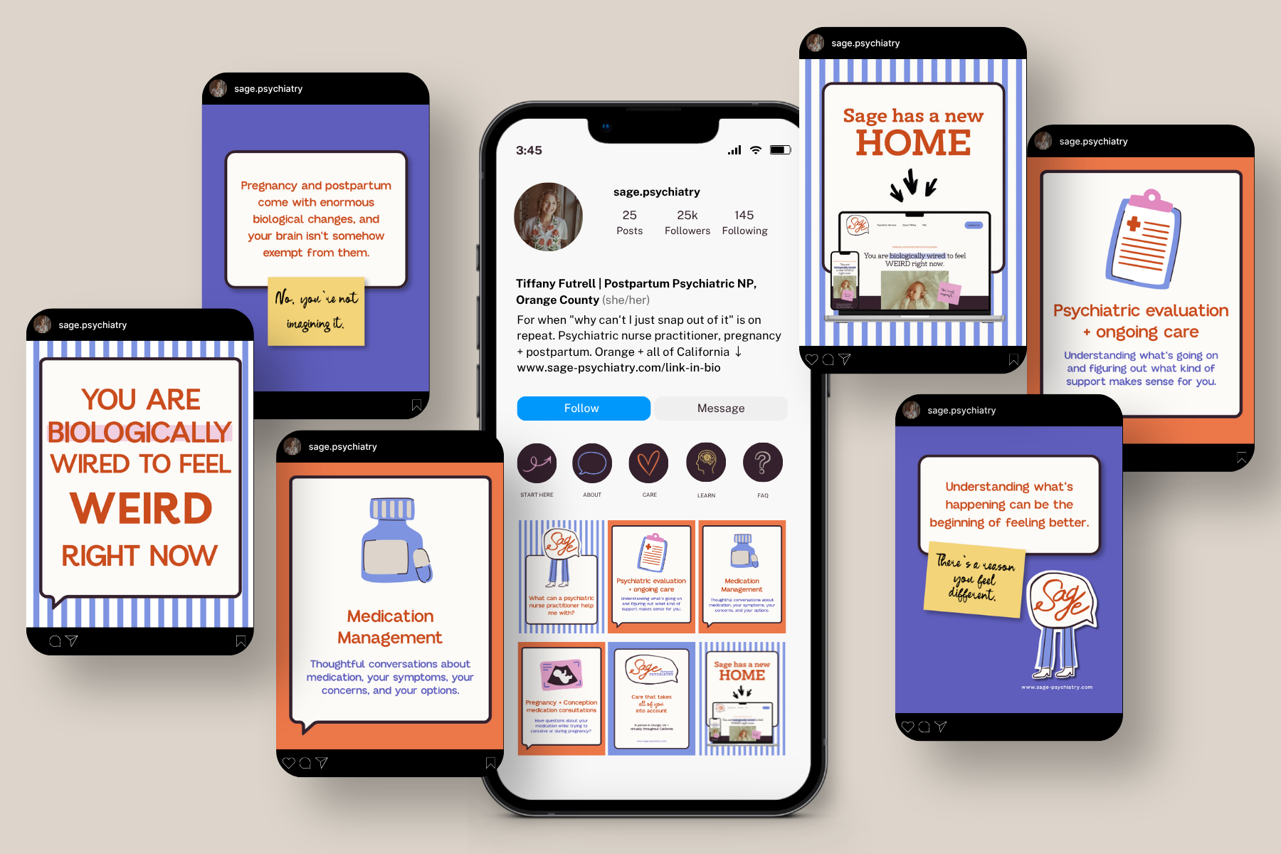
And that's an important part of creating a complete brand identity. It should work wherever your business shows up, whether that's a website, an Instagram post, or something we haven't even thought of yet.
Now, if I can just convince Tiffany to let me take over her social media accounts, we'll really be in business. (Tiffany, if you're reading this, consider this my formal application.)
Humble Brag: Apparently, I'm a Mind-Reading Witch.
One of my favorite things Tiffany said during our project came after our very first conversation:
"Maybe we’re psychically connected, or maybe you’re a witch? Idk"
She later went on to explain that I'd helped turn her half-formed thoughts and frustrations into something she could actually see and understand. Which is one of my favorite parts of this work.
Most of my clients aren't designers. They don't necessarily have the vocabulary to explain exactly what they're looking for, and I don't expect them to.
They know their businesses. They know what matters to them. They usually have a pretty good idea of what isn't working, even when they're struggling to articulate why. My job is to ask questions, listen carefully, and help connect those dots.
Of course, there's also a process behind all of this.
AFOTIK projects are organized through a private client portal where questionnaires, timelines, files, feedback, approvals, and updates live together. Clients can see where we are, what's coming next, and what I need from them. It's designed to make the creative process feel manageable, especially for people who have never worked with a designer before.
Tiffany had expected the experience to be stressful. She worried about communicating her ideas, navigating revisions, and feeling like she wasn't being heard.
Instead, she described the process as easy, collaborative, and genuinely fun.
"I thought this was going to be a nightmare before I met Amber. This was actually really fun."
And since we're sharing things Tiffany said about working together, I should probably disclose that she also officially declared me a mind-reading witch.
I’LL BE ADDING THAT TO MY RÉSUMÉ IMMEDIATELY.
A Website She's Proud Of. And Results Worth Celebrating.
One of Tiffany's biggest frustrations before we started was that her website didn't accurately represent her or make her specialized services easy to discover. So hearing how things were going after launch was particularly exciting.
She sent me this message:
"I have gotten more intakes in the last two weeks than ever before, so what you did is already working <333"
EXCUSE ME?! That's the kind of message that makes my entire week.
In her final questionnaire, Tiffany also reported that website engagement and intake inquiries had increased significantly. She was receiving compliments on the new website from other professionals and felt that her investment in the branding and website had already paid for itself. Those are meaningful results, especially for a small, specialized practice.
And there was another change that I loved hearing about:
Tiffany was proud of her website.
She felt like it accurately represented her personality, her approach, her values, and the specialized care she provides. She no longer felt like her practice was getting lost among hundreds of similar-looking websites.
"I feel really proud of my website now. I feel like it's something that accurately represents me, my brand, my practice, my values."
That's a pretty wonderful place to end up. We created a complete visual identity, brand messaging, custom photography, social media templates, and a Squarespace website that all work together to communicate what makes Sage different.
And Tiffany now has a brand that she's excited to put out into the world. Handmade floral blouse and all.
A Little Different. A Lot of Heart.
Sage Perinatal Psychiatry is bringing a more colorful, human approach to specialized mental health care.
Want to see how it all came together?
Explore Sage Psychiatry →

Your Business Was Never Meant to Blend In.
Maybe you built your website by looking at what everyone else in your industry was doing.
Maybe you've outgrown the brand you started with.
Or maybe you have a head full of ideas and absolutely no clue how to turn them into something cohesive.
Whether you need a full brand identity, a custom Squarespace website, photography that actually feels like you, or a little bit of everything, I'd love to hear what you're working on.
And if the first round of logos doesn't make your heart sing, I promise we'll work through it.