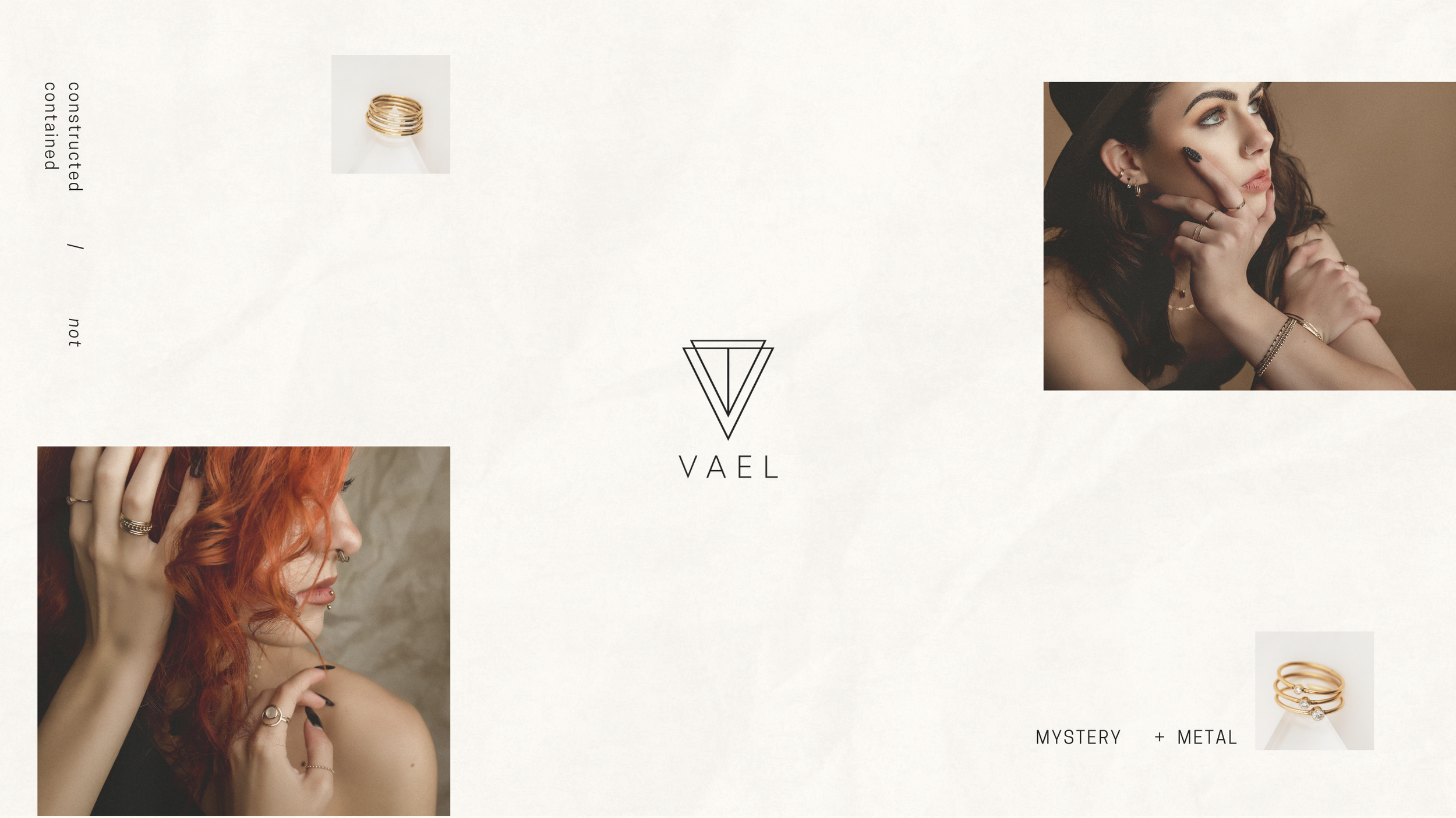
brand identity + photography for jewelry company // VAEL
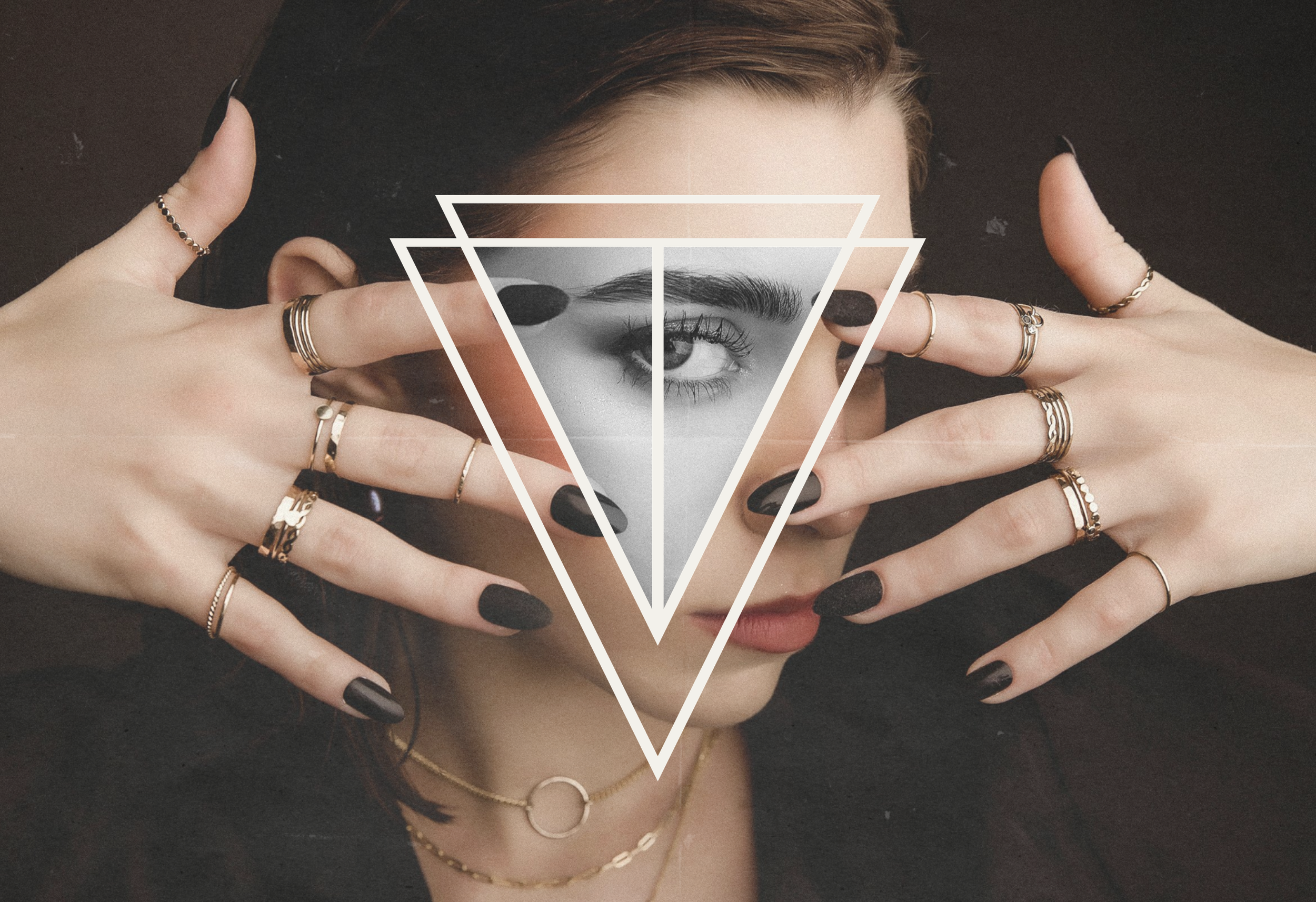
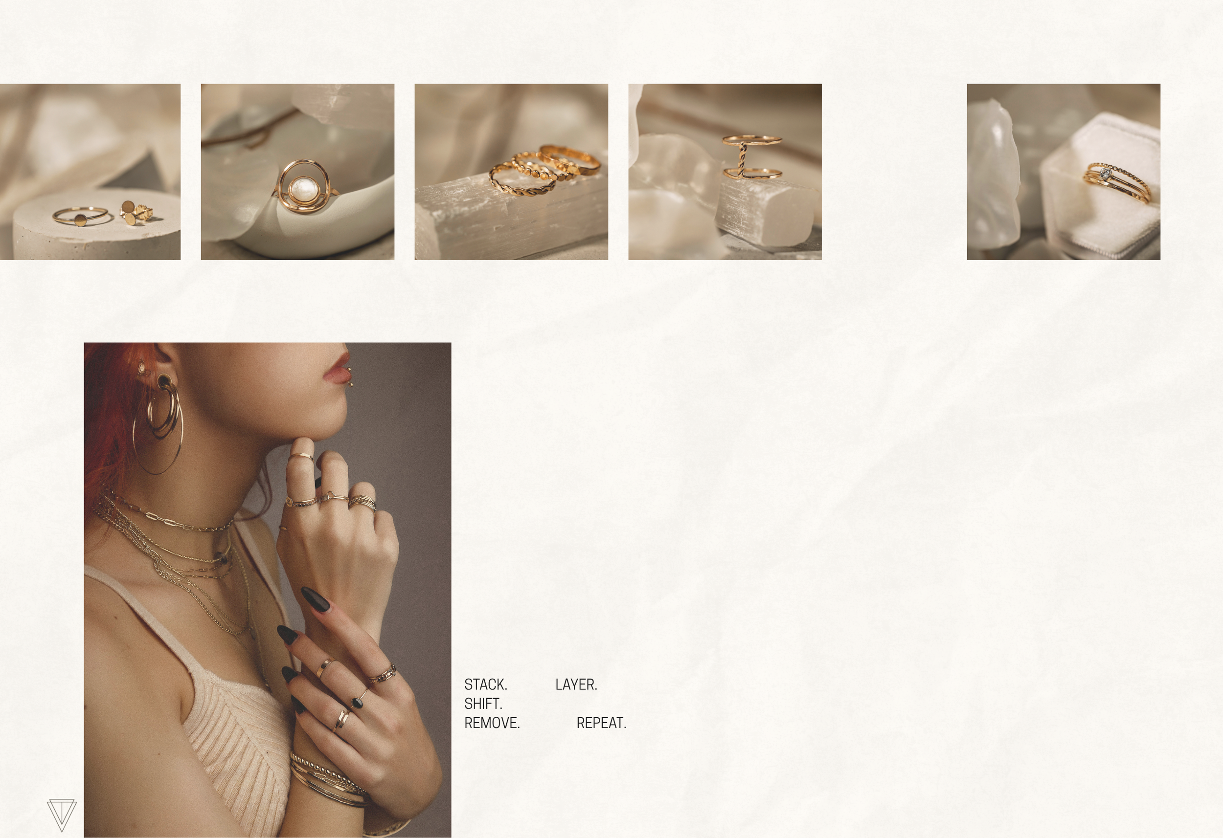
VAEL is a study in sacred balance, the meeting of mysticism and minimalism, light and shadow. Rooted in craftsmanship and intuition, the brand creates gold-filled jewelry that feels both celestial and grounded; pieces meant to be layered, lived in, and loved like ritual. Each curve and facet carries intention: a whisper of geometry, a hum of harmony. From Southern California, VAEL designs adornment for those who see jewelry not as decoration, but as devotion.
When VAEL arrived, their artistry was undeniable, but their identity lacked the cohesive visual language to match its spirit.
They needed a logo that captured sacred geometry without falling into cliché, a color palette that felt neutral yet alive, and imagery that translated their mysticism into something tangible.
Their existing product photography lacked the warmth, shadow, and story that define the brand’s ethereal tone.
We built VAEL’s brand identity around the idea of “sacred elegance.”
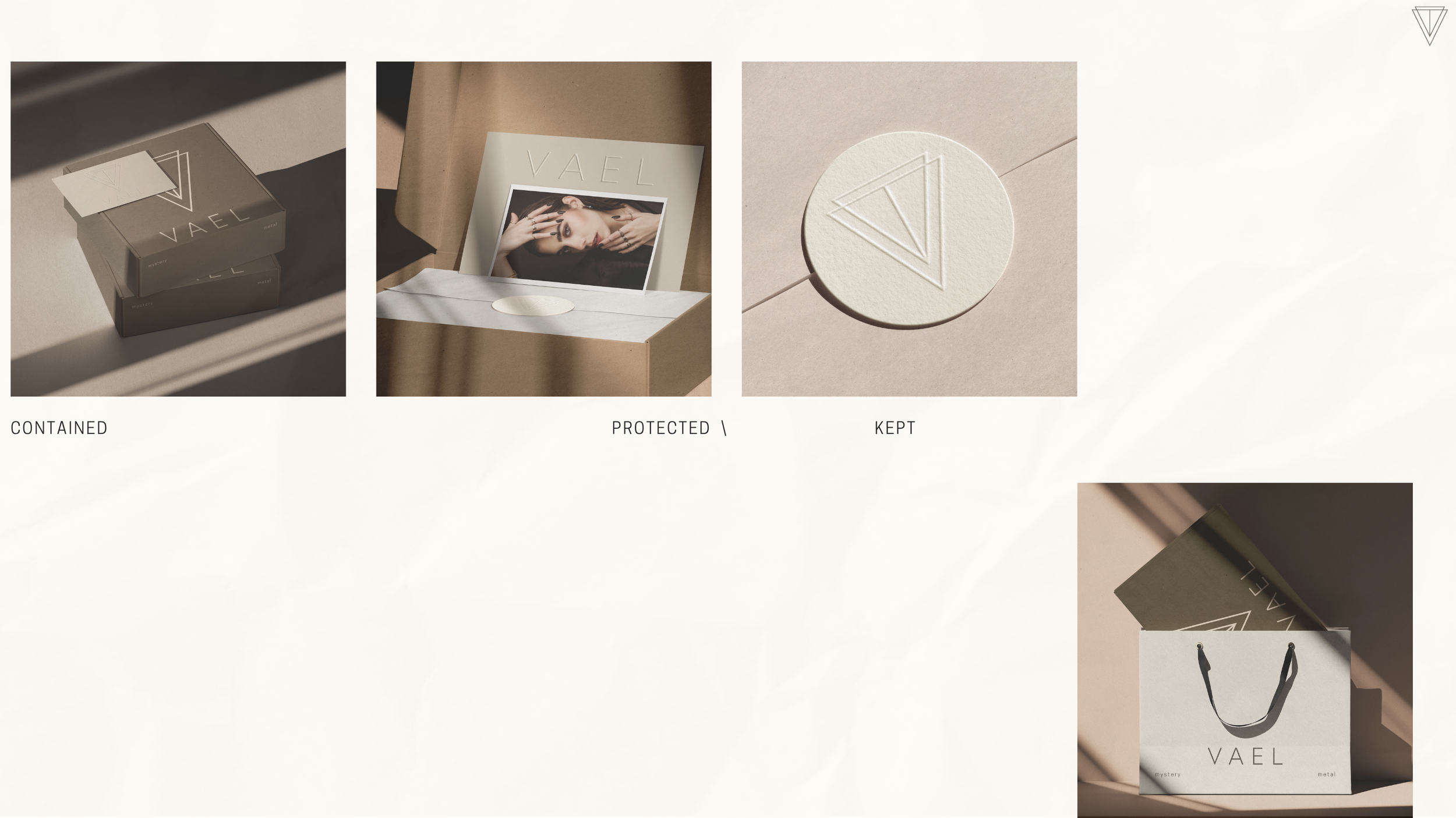
The logo draws from sacred geometry, refined into a mark that feels timeless and modern; a visual mantra in gold and shadow.
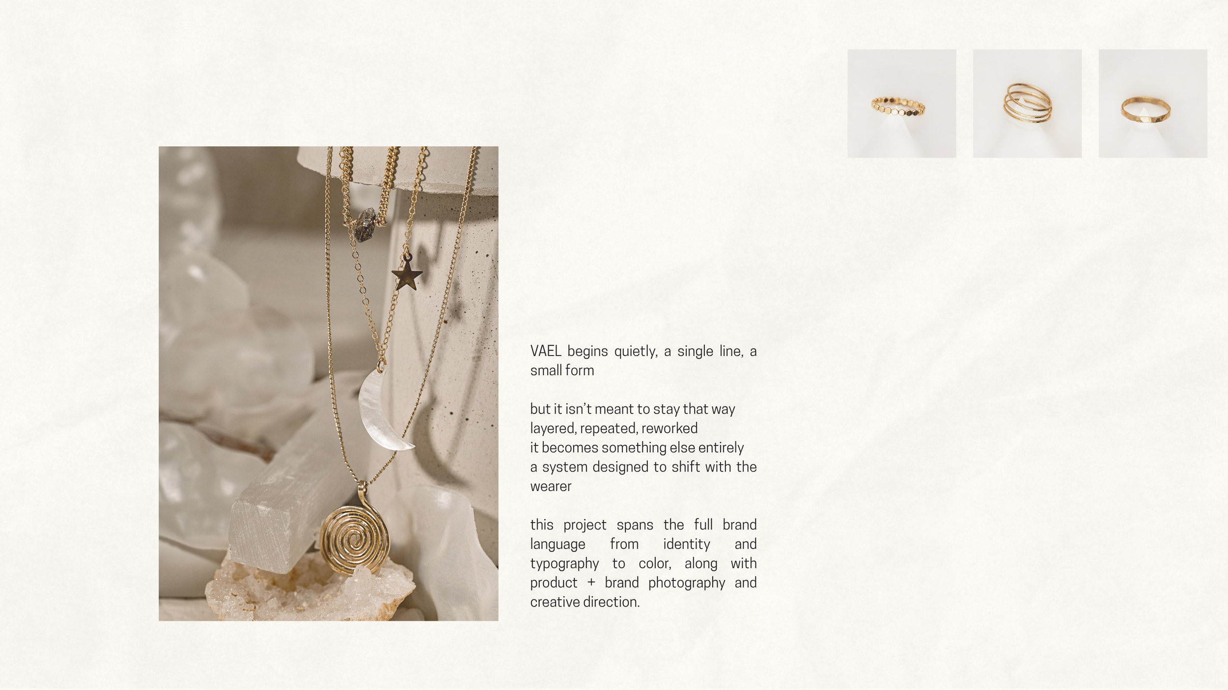
A soft-neutral color palette balances luxury with restraint, creating room for the jewelry to breathe.
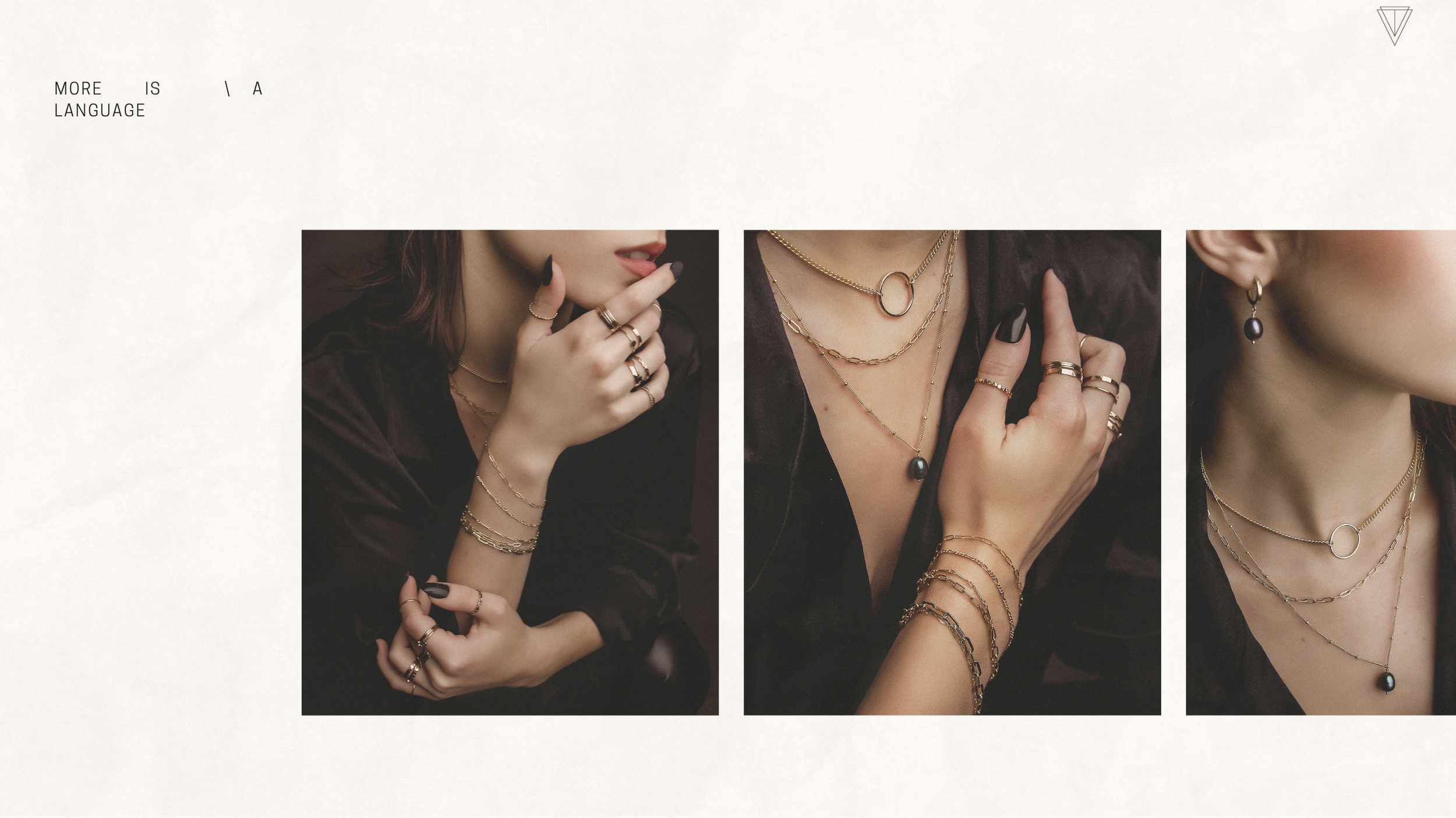
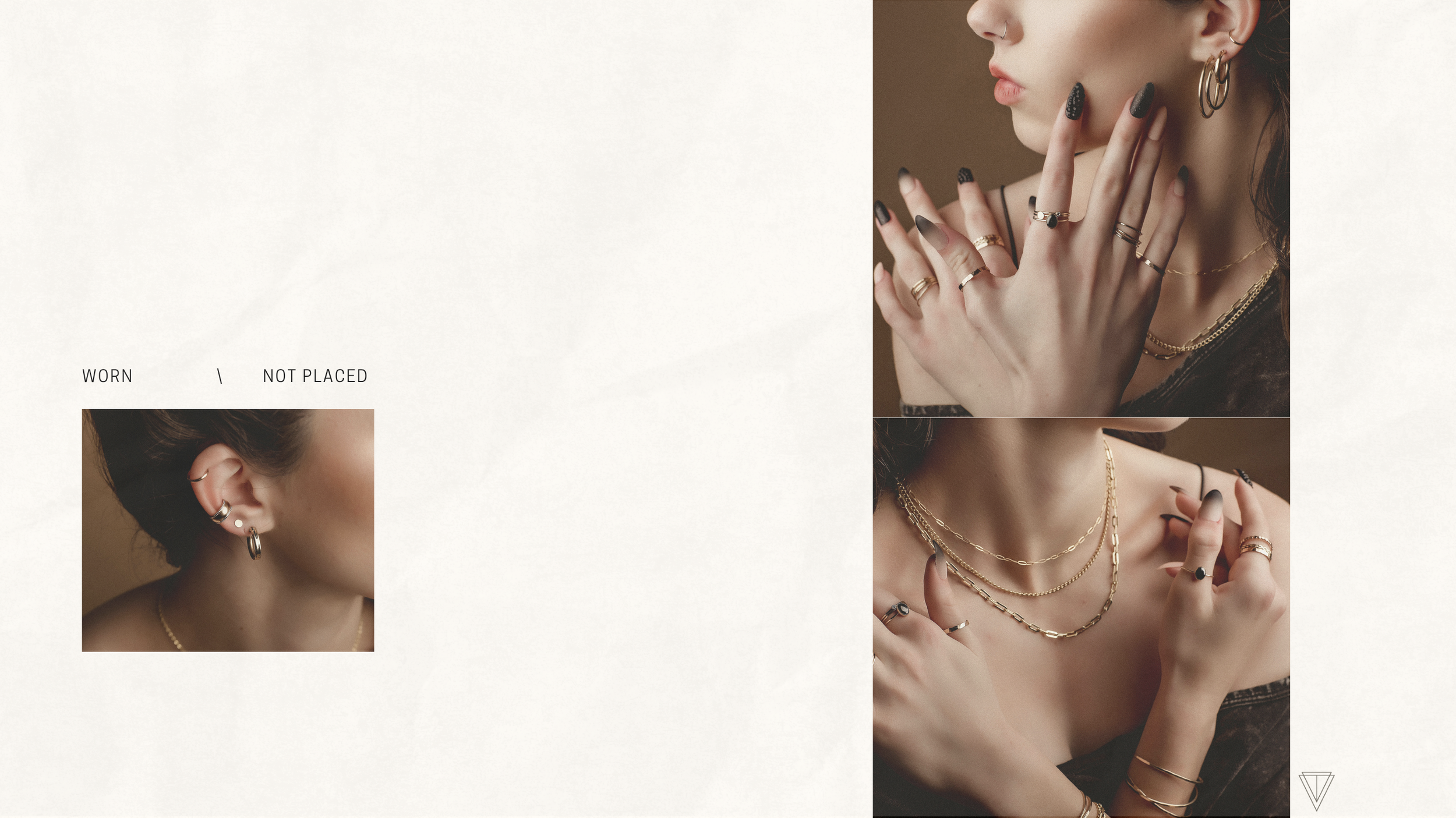
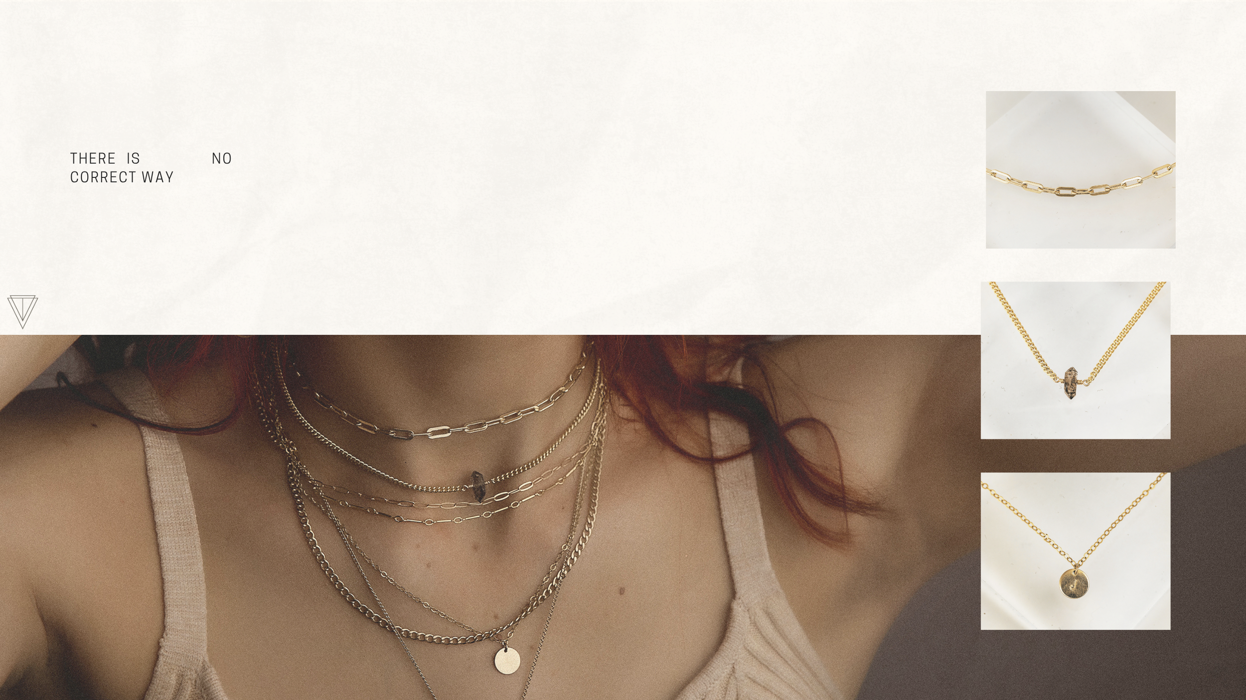
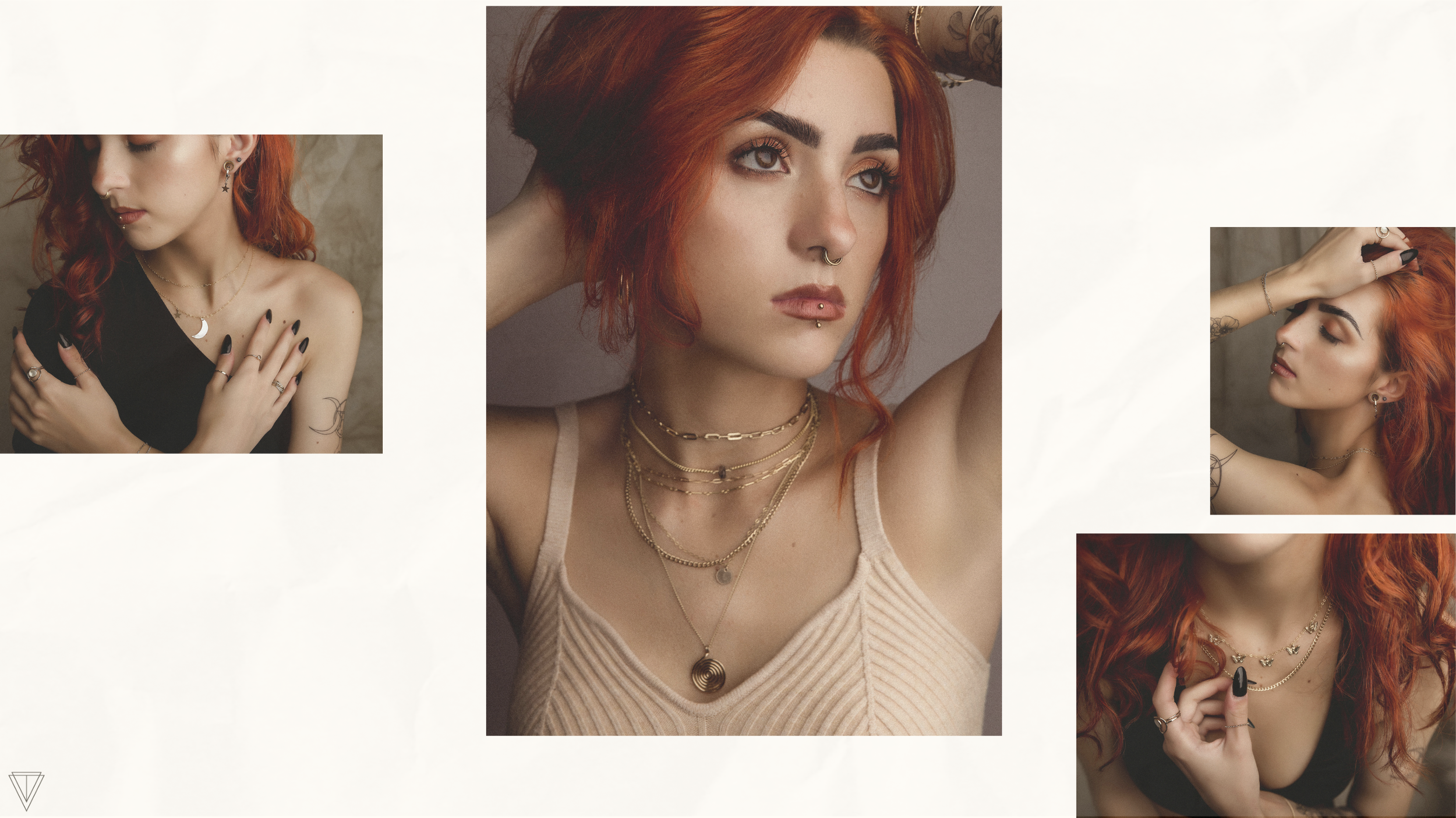
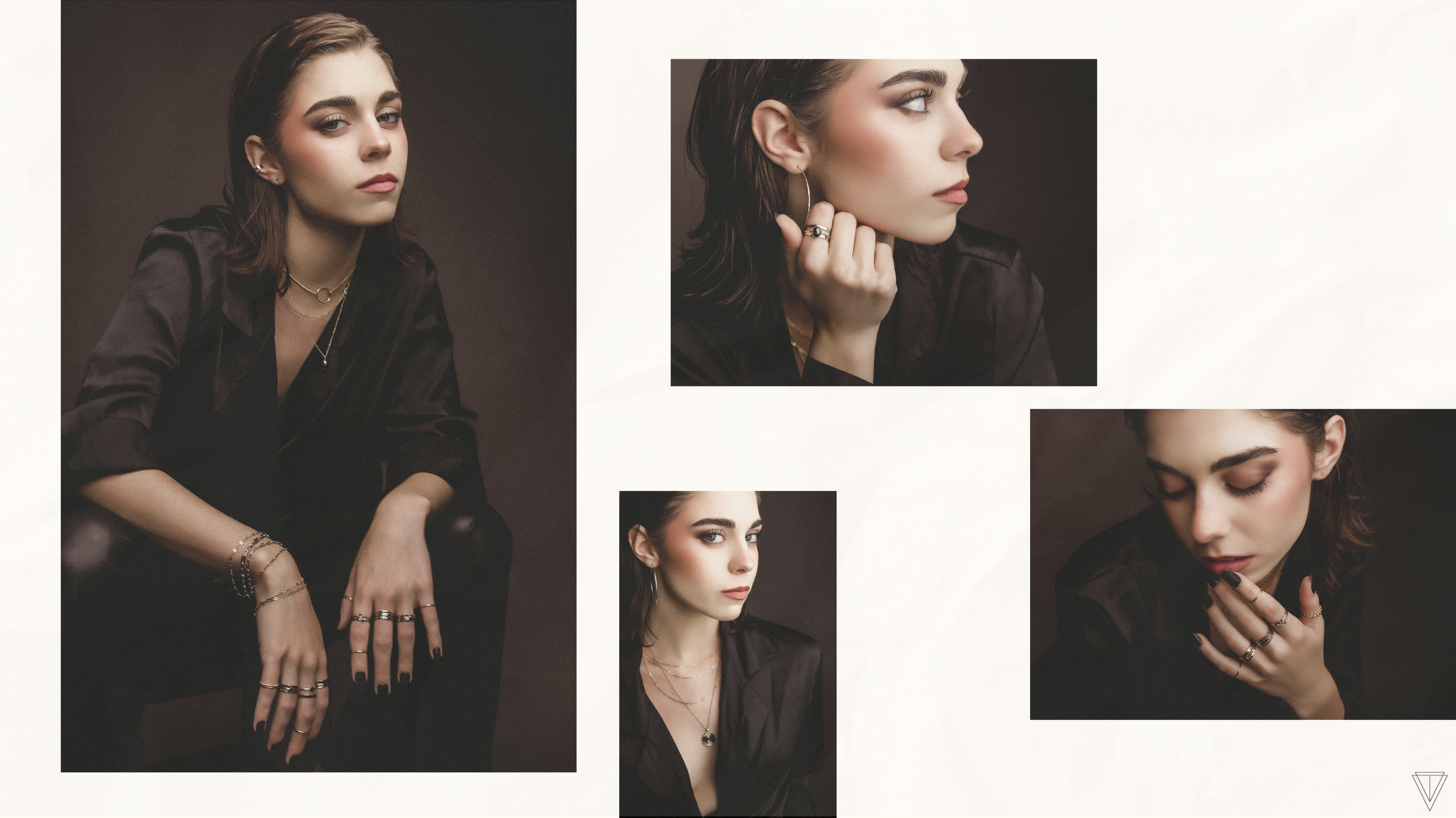
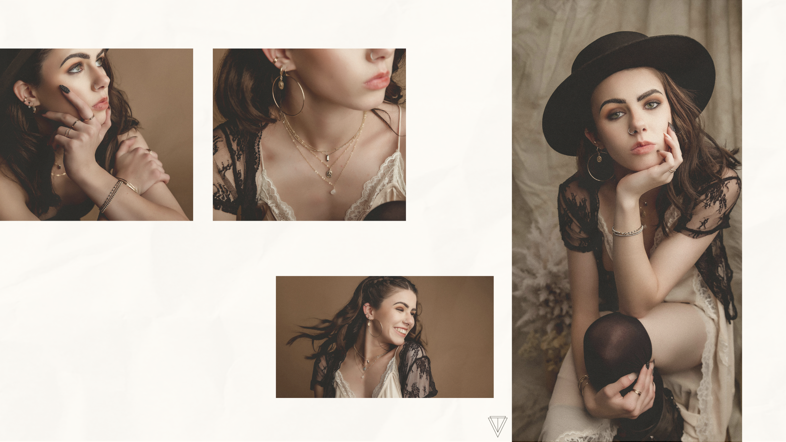
For the photography, we directed and styled a series of shoots that played with reflection, texture, and natural light, capturing the jewelry in its truest form: luminous against quiet shadow.
The end result: a cohesive visual system that elevates every touchpoint, from packaging to product listings, and positions VAEL as a brand of intuitive luxury.
Brand Identity System (logo suite, color palette, patterns)
Product Photography + Styled Shoots
Packaging Design (jewelry cards, tags, boxes)
Video Direction & Styling
Reusable social media templates for product launches