brand + web + print + photography for nail artist// EAT the MENU
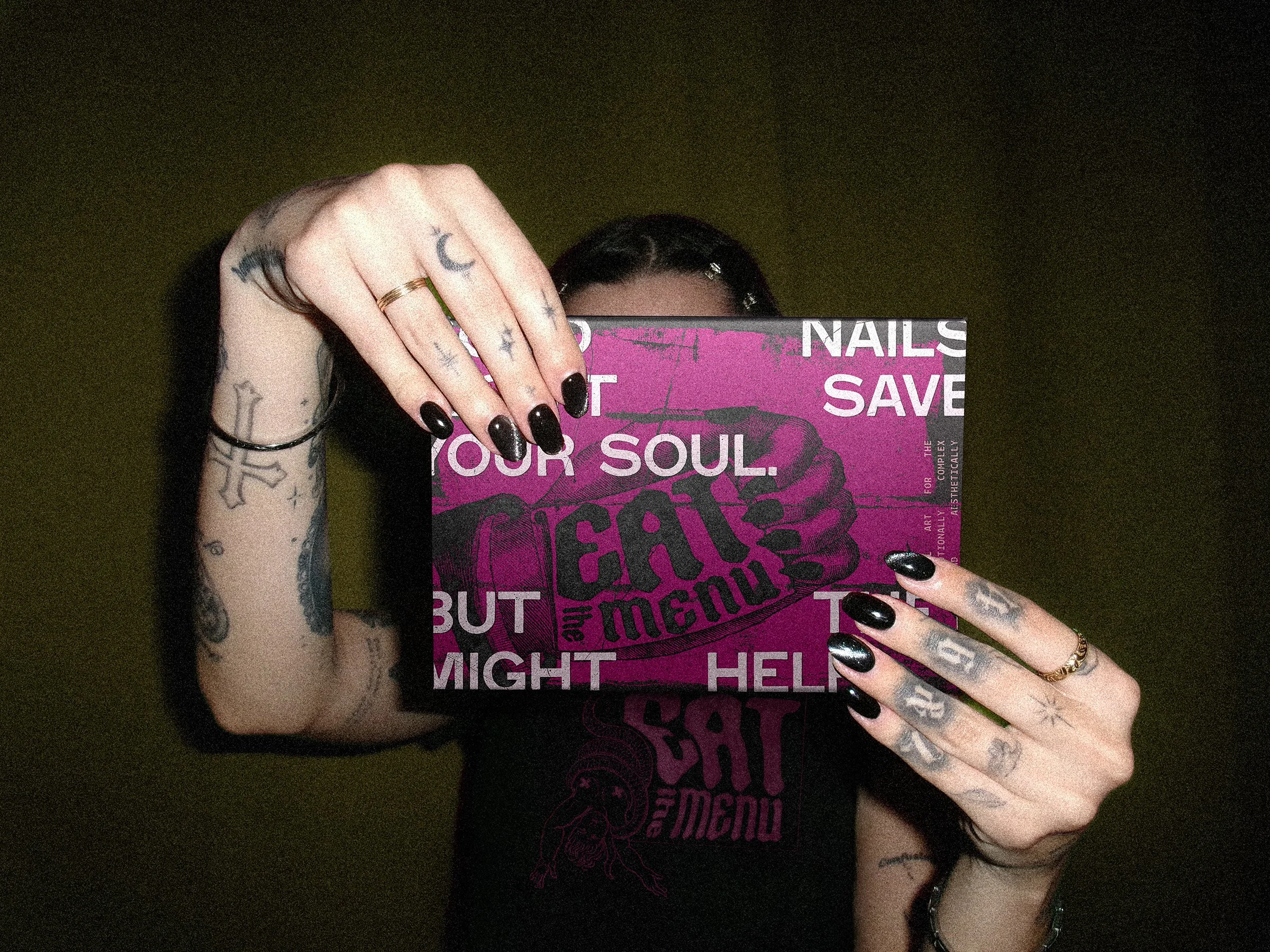
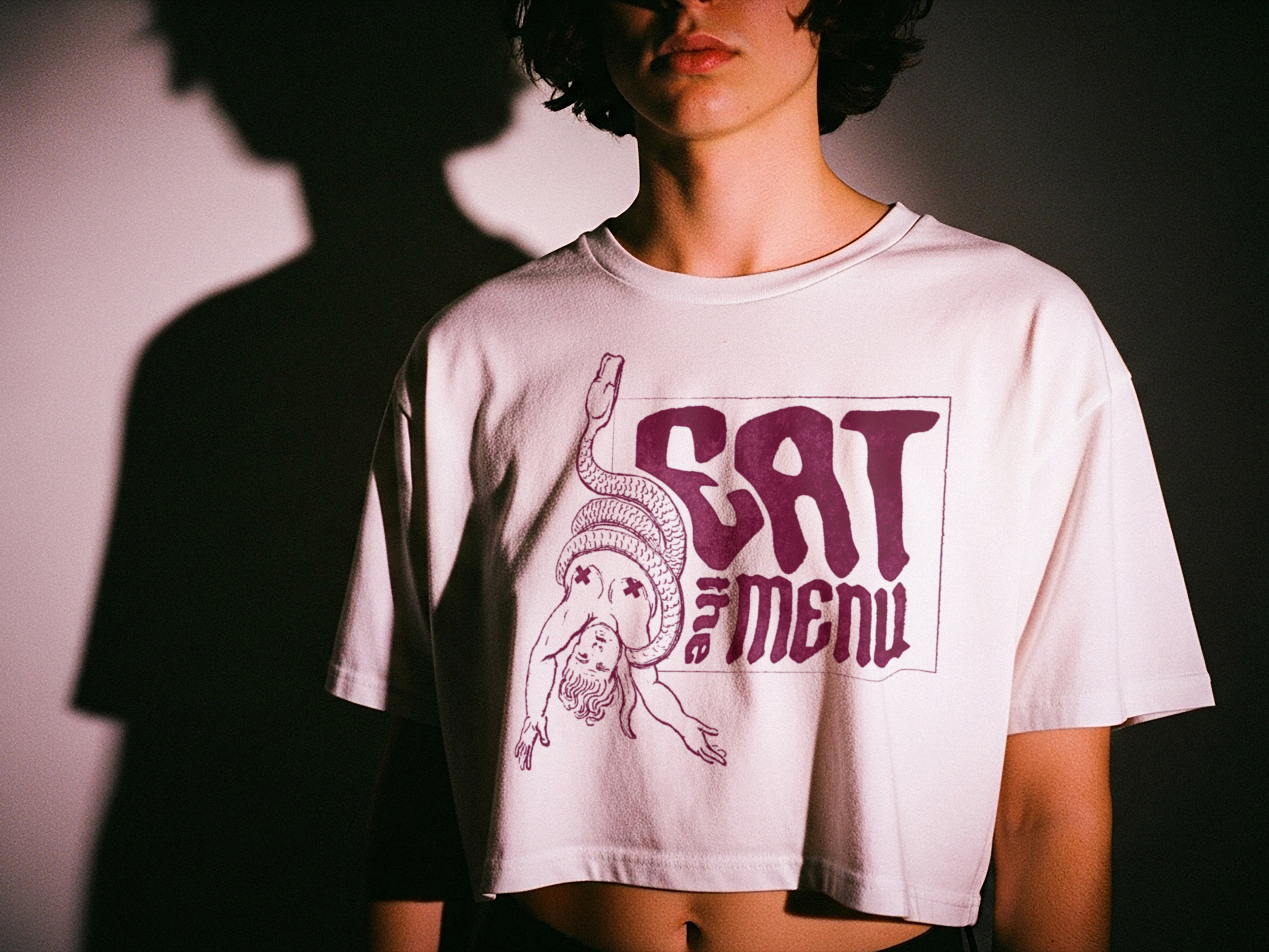
Eat the Menu is a nail art studio built for people who are bored of playing it safe. Instead of leaning into polished salon minimalism, the identity pulls from tattoo flash, vintage engraving, punk zines, and deadpan copy to create something louder, stranger, and more intentional.
The idea behind the brand is simple: nail art should feel less like maintenance and more like self-expression. Eat the Menu invites clients to stop overthinking, commit to something weird, and choose detail on purpose.
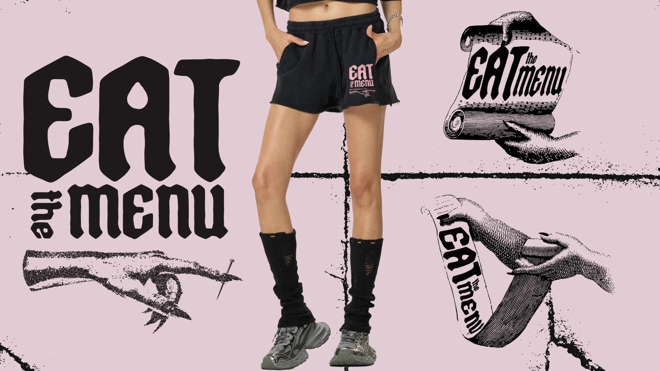
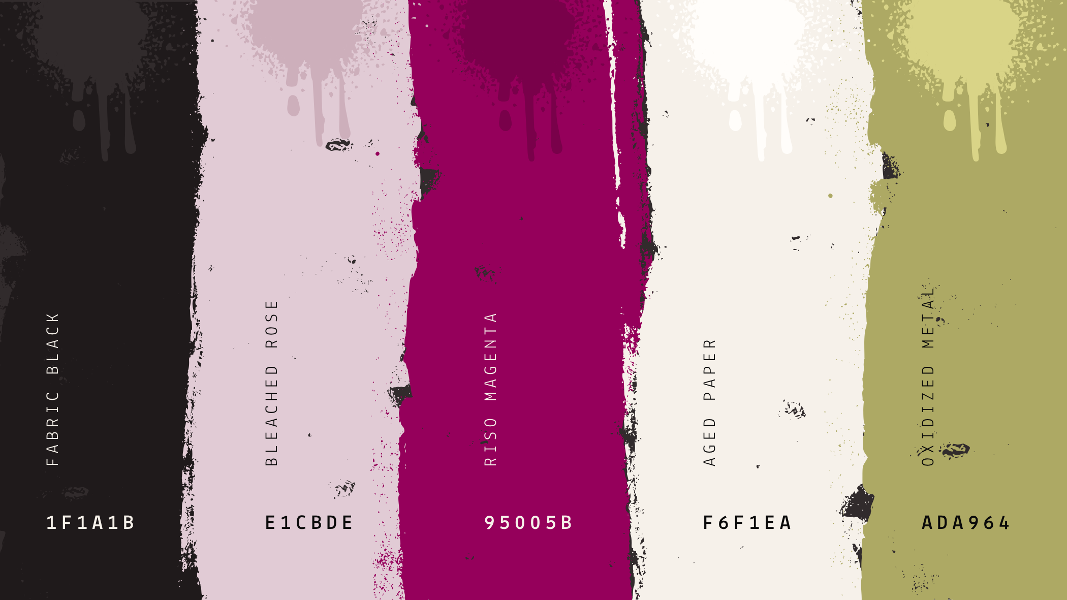
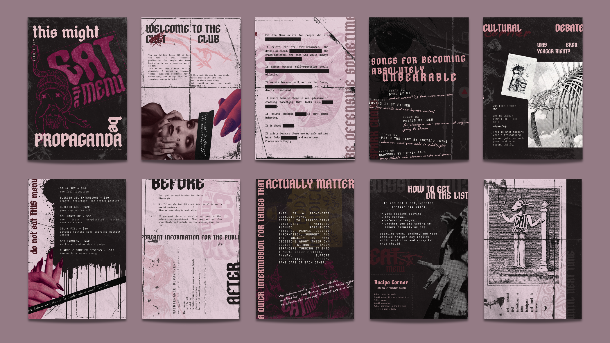
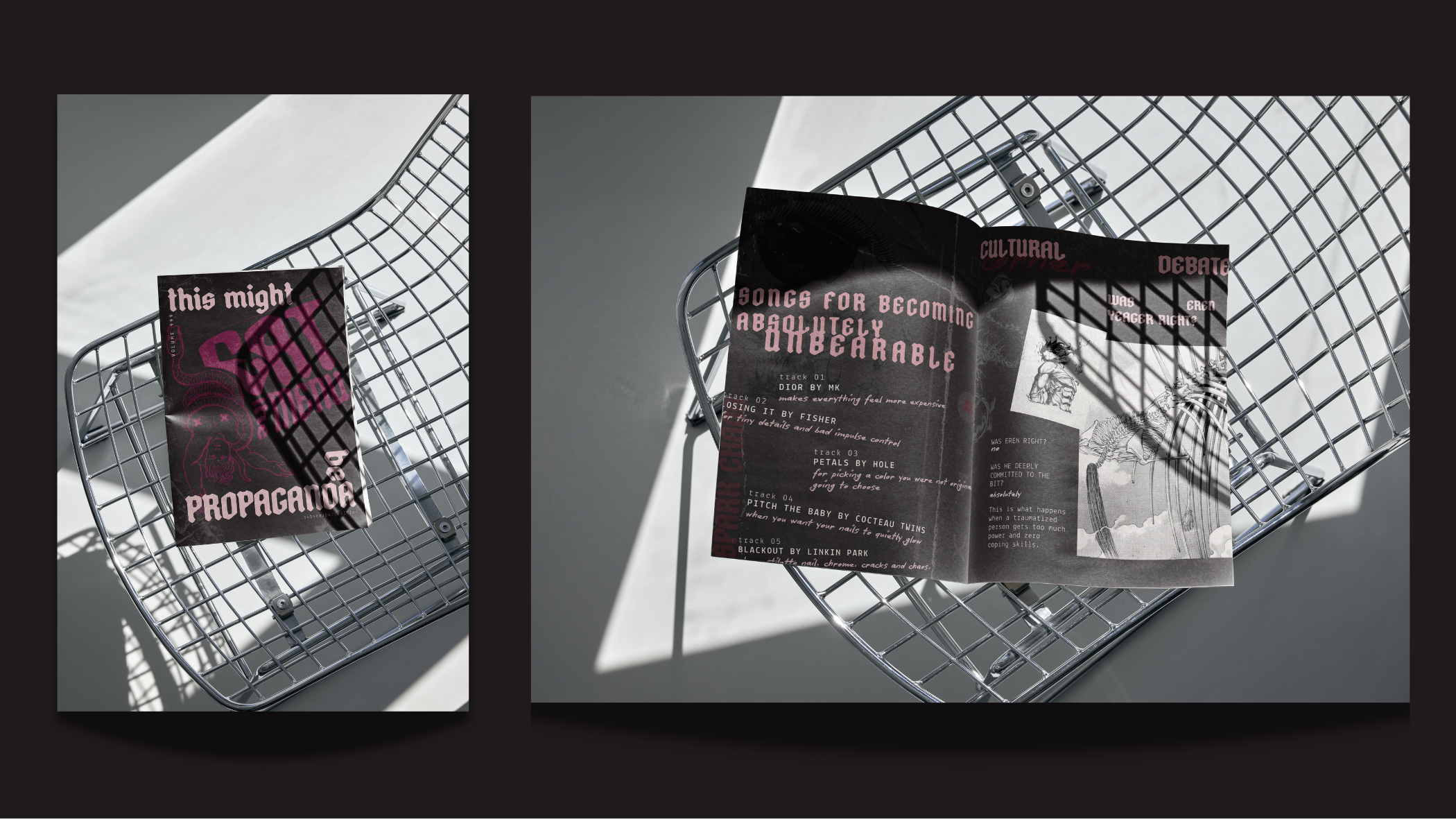
The visual system combines distressed textures, modular illustrated elements, bold typography, and a limited palette of faded black, bleached pink, acid magenta, aged paper, and oxidized green. The result is a world that feels collectible, rebellious, and slightly unhinged in the best way.
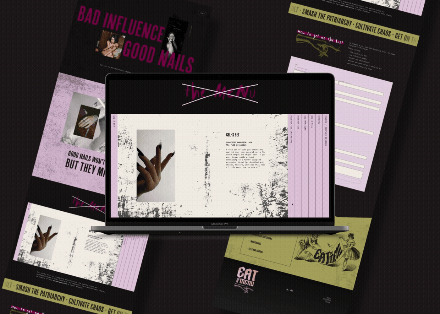
This project includes brand identity, art direction, social media concepts, apparel, print collateral, zine-inspired promotional pieces, and website design. Every touchpoint was designed to feel like part of the same universe: expressive, referential, and a little confrontational, while still staying playful and inviting.
Eat the Menu is for the over-decorated, the detail-obsessed, and the people who know that “too much” is often exactly enough.
Brand identity system
Logo suite
Color palette + typography
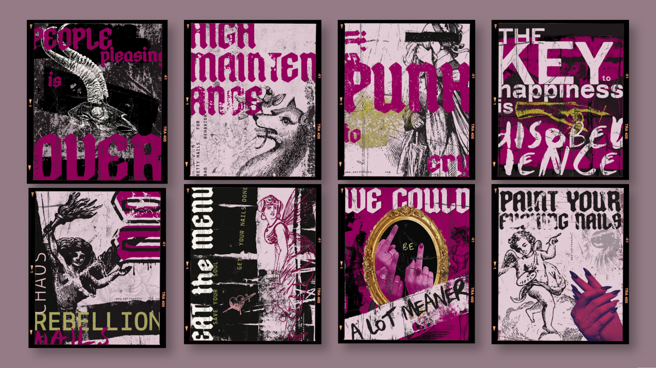
Art direction
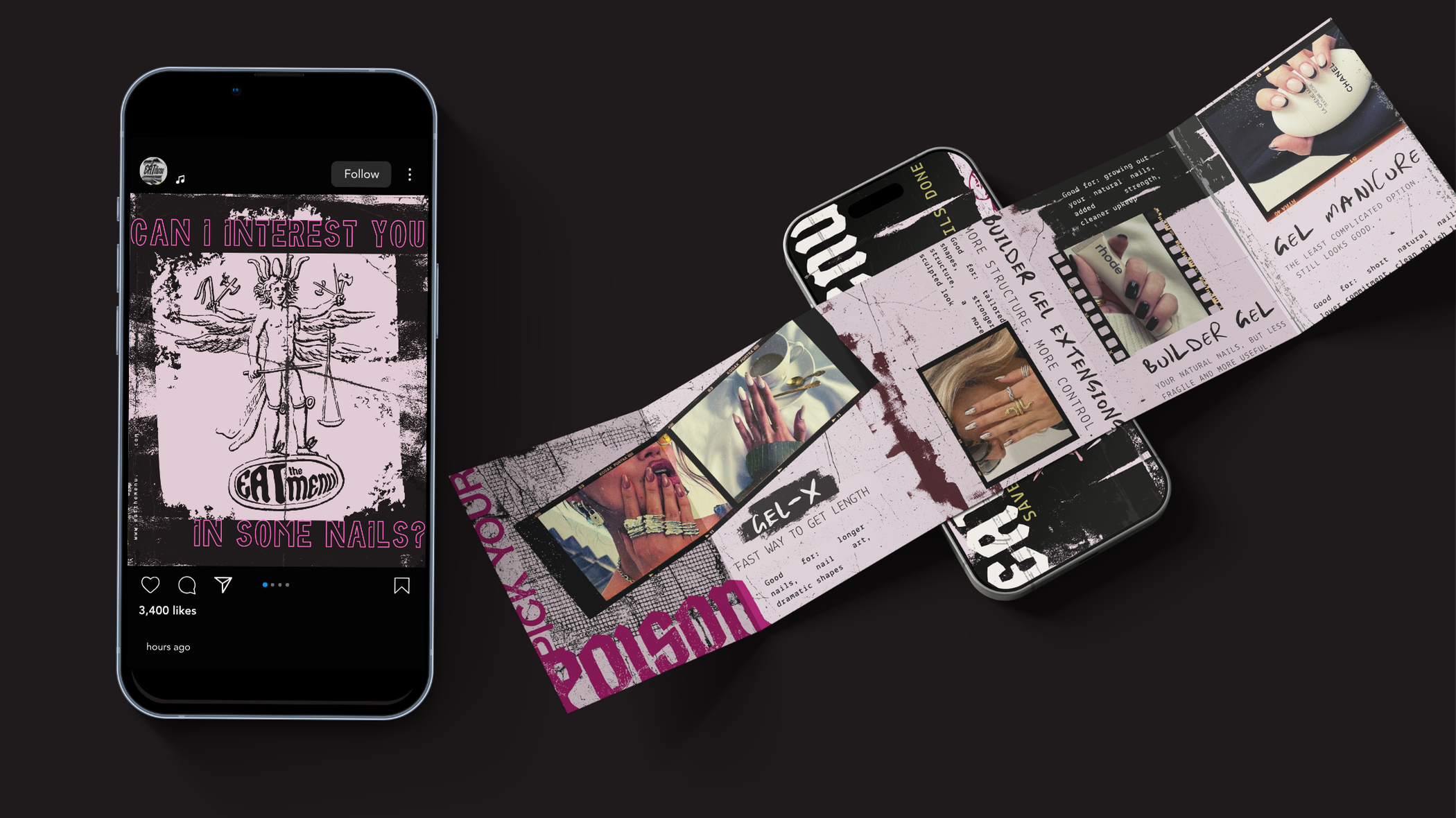
Social media design
Print + promotional collateral
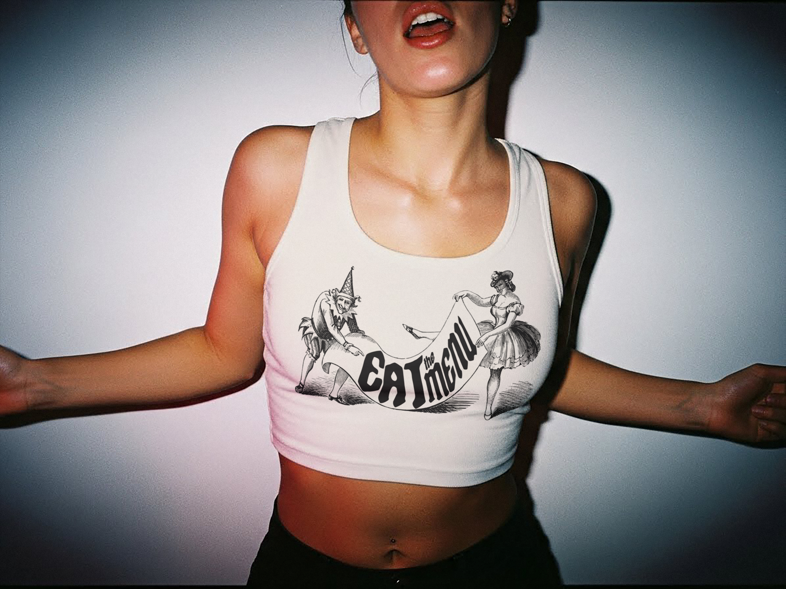
Apparel / merch mockups
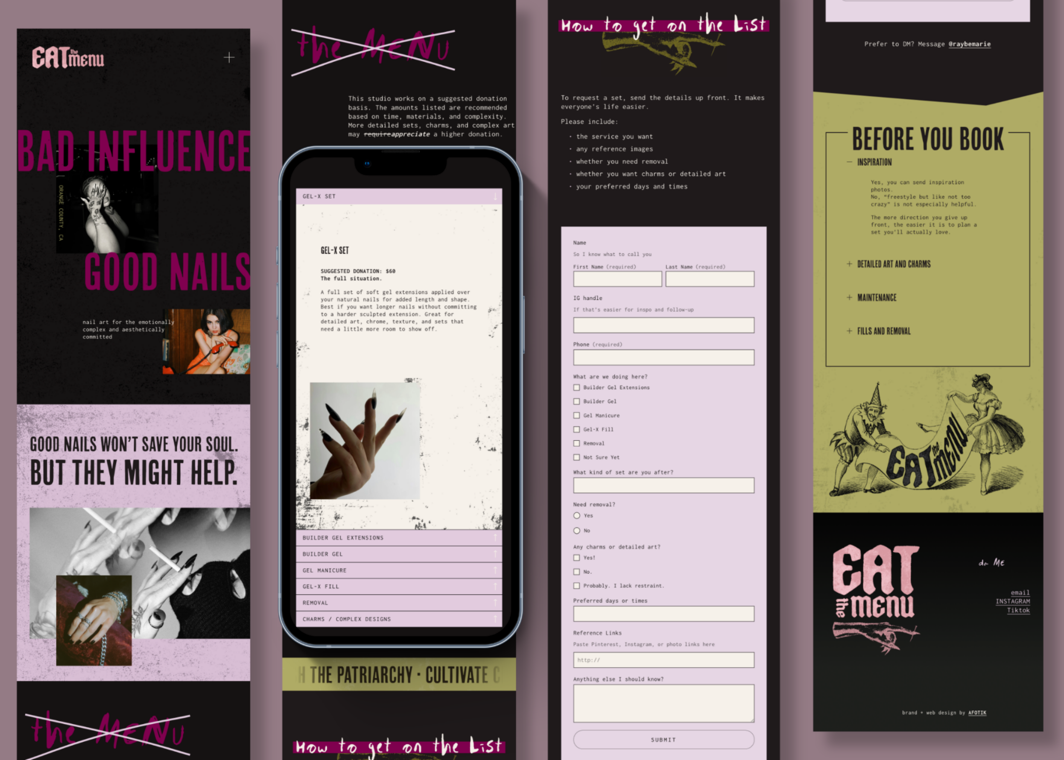
Website design
WEBSITE
password: nails